Decorating in Natural Shades
From time to time a subtle shift occurs in decorating trends; almost imperceptible at first, but month by month it gradually comes into focus until fully formed as a fresh new look. This can be a genre of style like Mid-Century Modern or Modern Country, or a style popular in the United States called Modern Farmhouse. Or it can be specific items like mirrored furniture, venetian style mirrors or Moroccan rugs that appear, becoming ubiquitous before waning and finally disappearing as an item of aspiration.
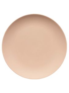
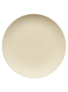
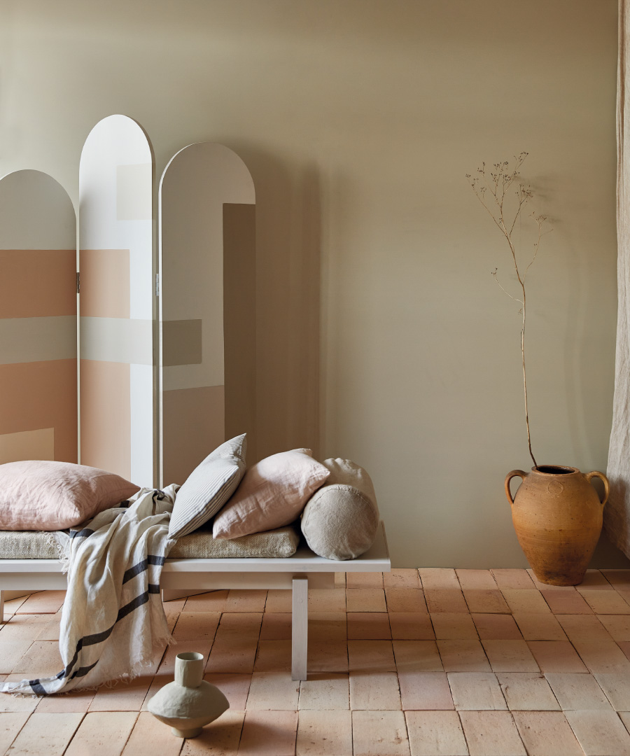
The colours and tonal variations used in interiors has crept away from white and grey recently, towards warmer, earthier shades in one of these gradual decorating shifts. Hues like apricot and cream have seeped into many projects we have worked on this year.
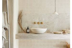
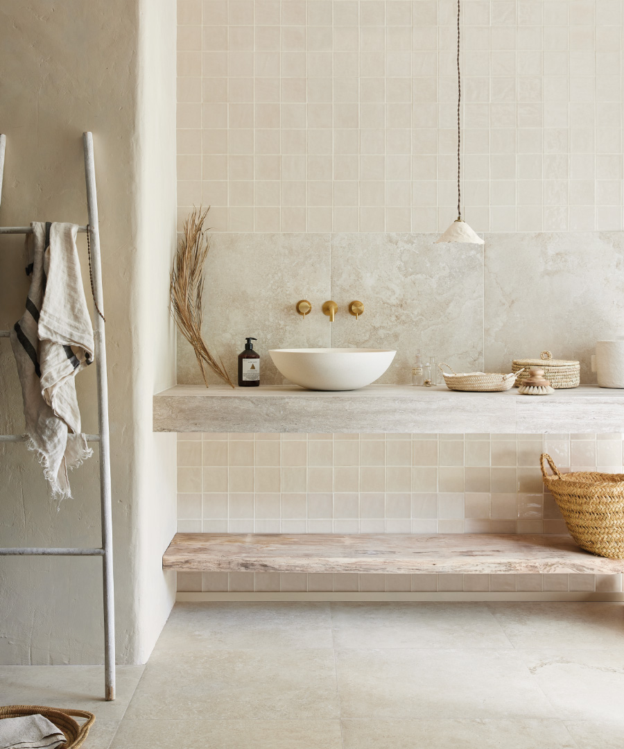
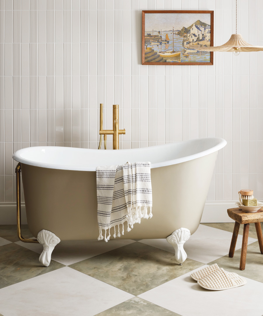
These paler colours act as the perfect backdrop to stronger paint shades or darker furniture, but are also increasingly utilised layered together; creating quite neutral looking spaces. Paint used alongside tiles of similar tones can also aid the formation of calming rooms, without getting too minimal for modern life, like the serene but tactile bathroom above.
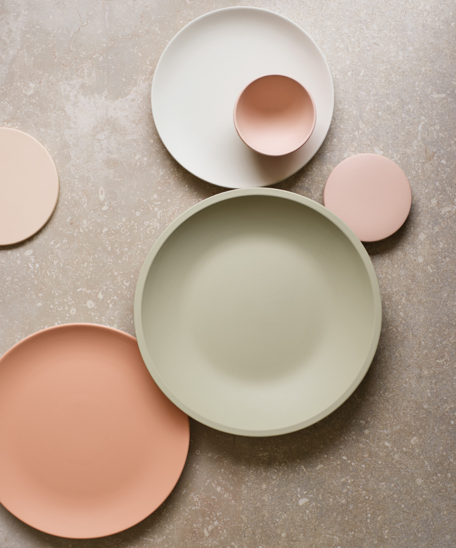
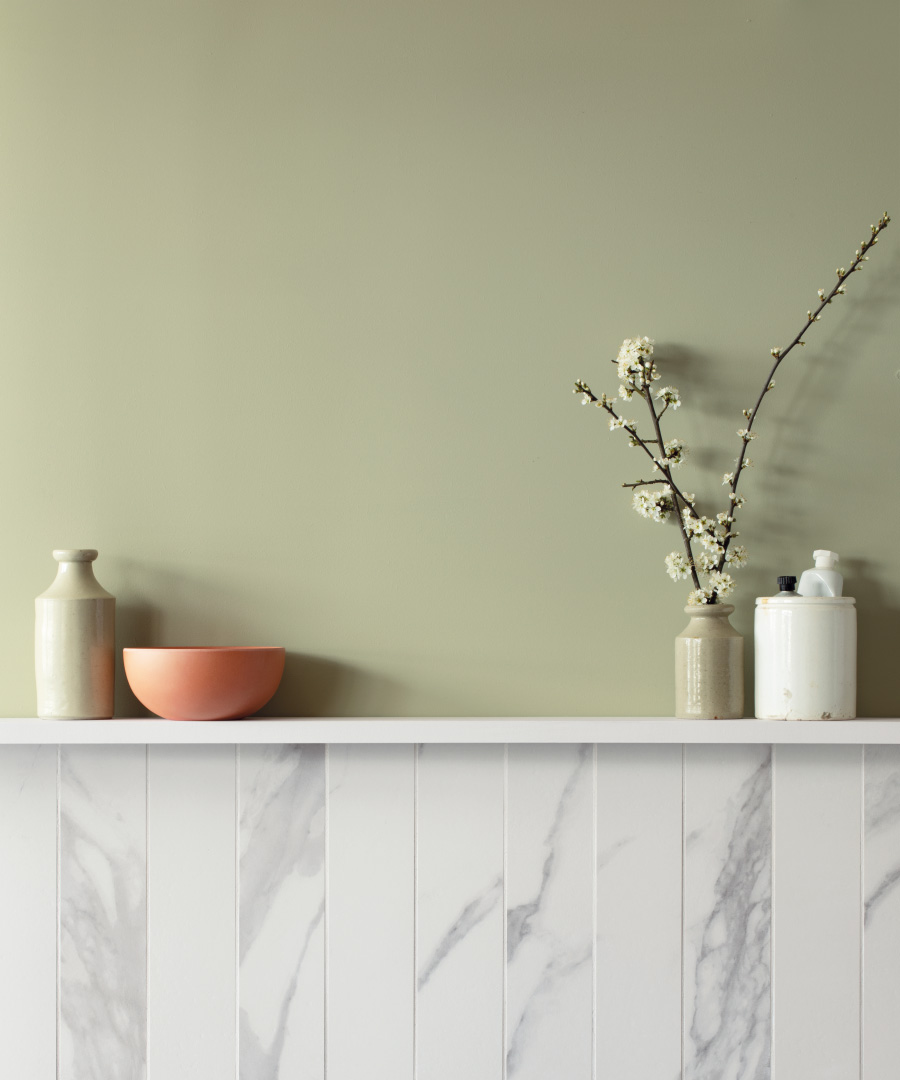
As the darker days of winter turn to spring, it’s natural we view our homes with an air of optimism and renewed focus. One way we do this is to clean, repaint and retile as sunlight highlights corners we have been ignoring, or have just not noticed need refreshing. Lighter tones feel fresh and have a sense of renewal. Pairing of artichoke and olive with paler tones, for example, is a combination that’s decoratively pleasing, while been easy to live with. Perfect for setting a new scene at home.
Paint is such an effective way to ring the decorative changes, creating a whole new feel without breaking the bank. Produced from quality bases and highly pigmented, our eco-conscious paint portfolio of over 50 options ooze both bold and more subtle colours, whilst happily being vegan friendly too. The paints come in emulsion for walls, or eggshell for areas that need a little extra protection like woodwork or hallway walls that get more wear and tear each day. They can work well used alone, or combined in complimentary groups like the colours seen here.
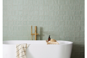
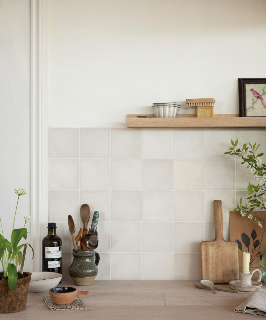
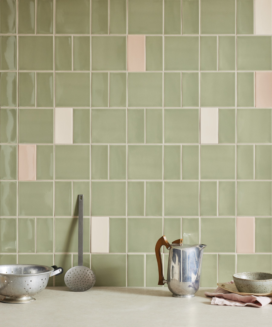
Many of the hues in our paint palette were inspired by shades found within our own gorgeous tile collections, which contain just these pastel colours that work well together. The modular style glazed wall tiles below are a good example, with tones influenced by those seen out of doors, particularly in warmer climes.
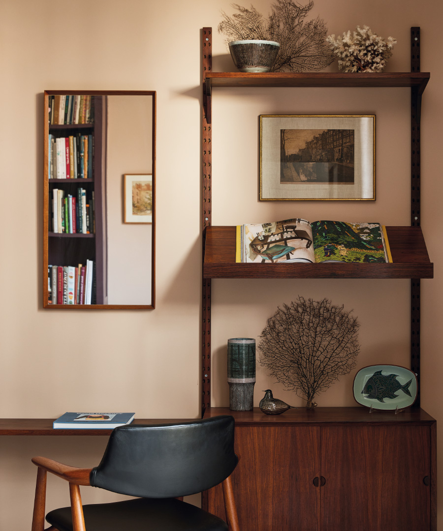
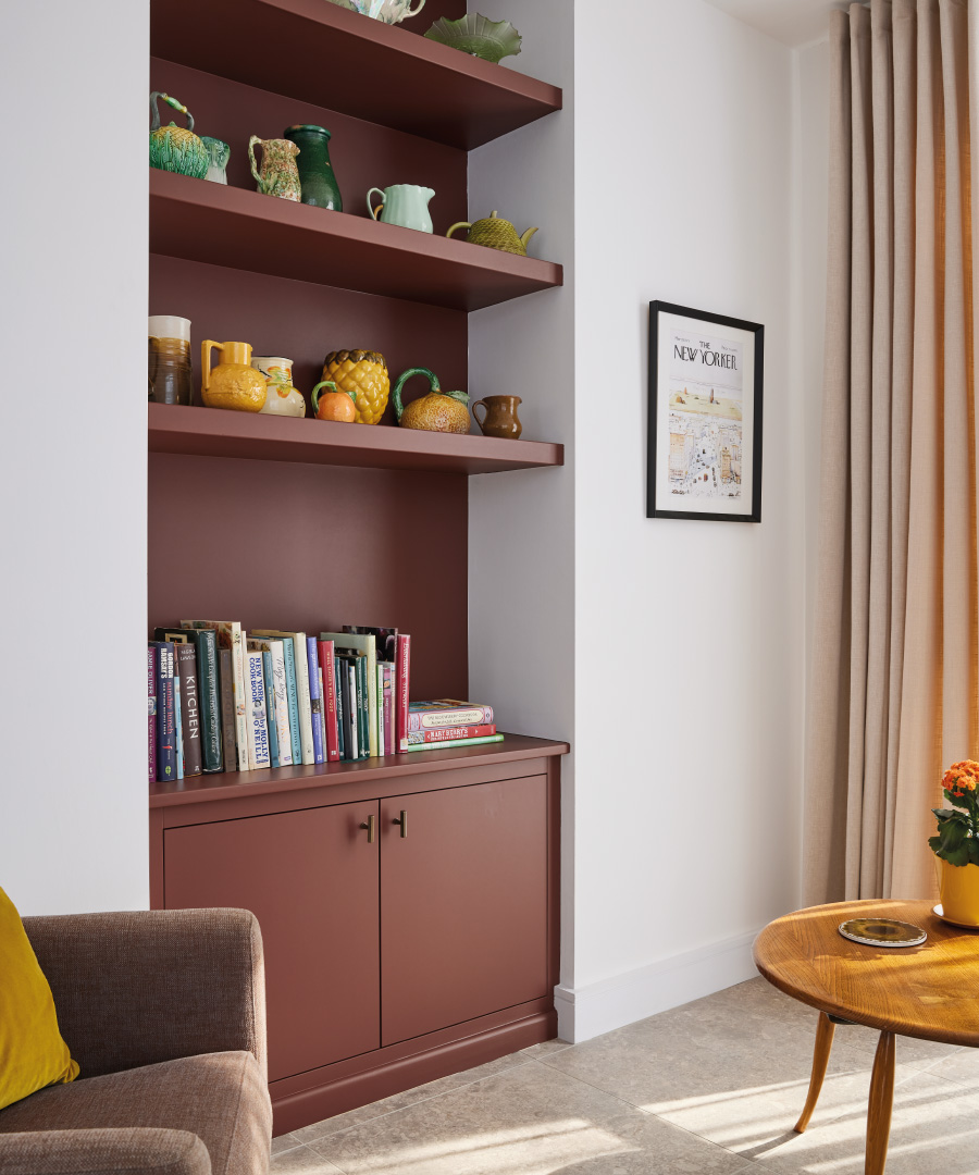
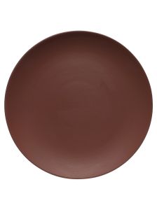
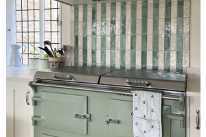
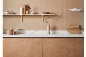
Darker tones can also be used for refreshing and re-imagining our homes without becoming too overwhelming, in moody but mellow options. Ochre, brick or terracotta colours help to create spaces with an underlying sense of sophisticated cosiness without becoming too dungeon like. Even browns with a hint of aubergine reflect the use of peachy tones, like the cabinetry below painted in our Sweeney Brown eggshell. The room at bottom left was painted in Isabel’s Bloom, a shade that’s lovely day and evening, as the light levels drop.
For homes big and small, country or city situated, implementing visual change in line with the change in clocks for British summer time is a fantastic way to create renewal.