Check it out
Those of us who have been on the planet a few decades can recall when chequerboard floors were the preserve of bathrooms, and usually quite chilly bathrooms at that. If you were lucky enough to stay in a hotel, you may also spot a two-tone lobby floor in this recognizable grid pattern. You might also have seen pretty kitchen floors, possibly in lino, in red and white or blue and white. Or, if visiting Scandinavia, the look was more prevalent with painted floors and furniture almost a given in many homes.
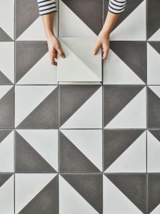
The look is due a major revival in the UK and we can see why, although the feel now is more elegant than playful or utilitarian; pairing country style with an urban aesthetic. We find that adding a grid-like tile design is an attractively striking element, but one that’s not too overpowering in the overall scheme.
Black and white floors need not result in a chessboard dynamic when a holistic design is devised; using other colours and textures in the scheme will create a statement space, but without too much graphic drama. Or using an option like our Semaphore porcelain collection, where each tile is half dipped in a colour and half in plain white, creates what might be called ‘new’ chequerboard; a more kaleidoscopic effect.
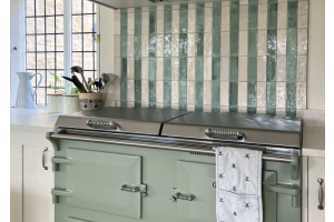
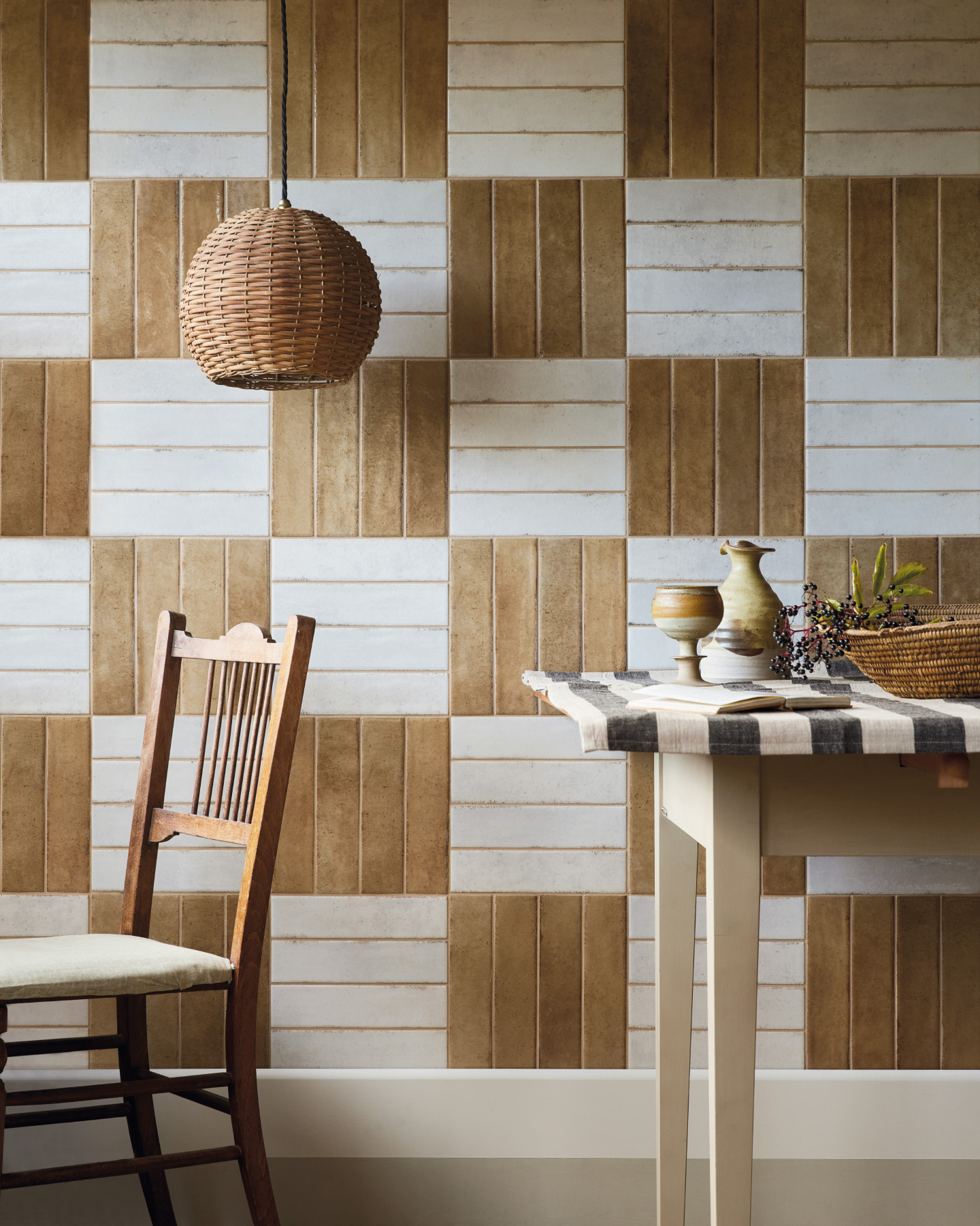
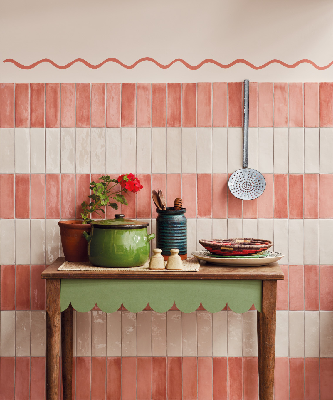
 The look need not be confined just to floors. Walls come alive when a little thought goes in to tile layouts. By taking two colours of the same tile and laying alternate shades, a quick and easy patchwork effect is created. Alternatively, stack 3 or 4 brick shaped tiles horizontally on top of each other, then use the same tile in a different colourway vertically in a row, creating an interesting look for walls, like the space pictured here.
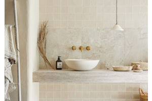
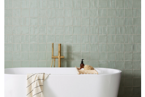
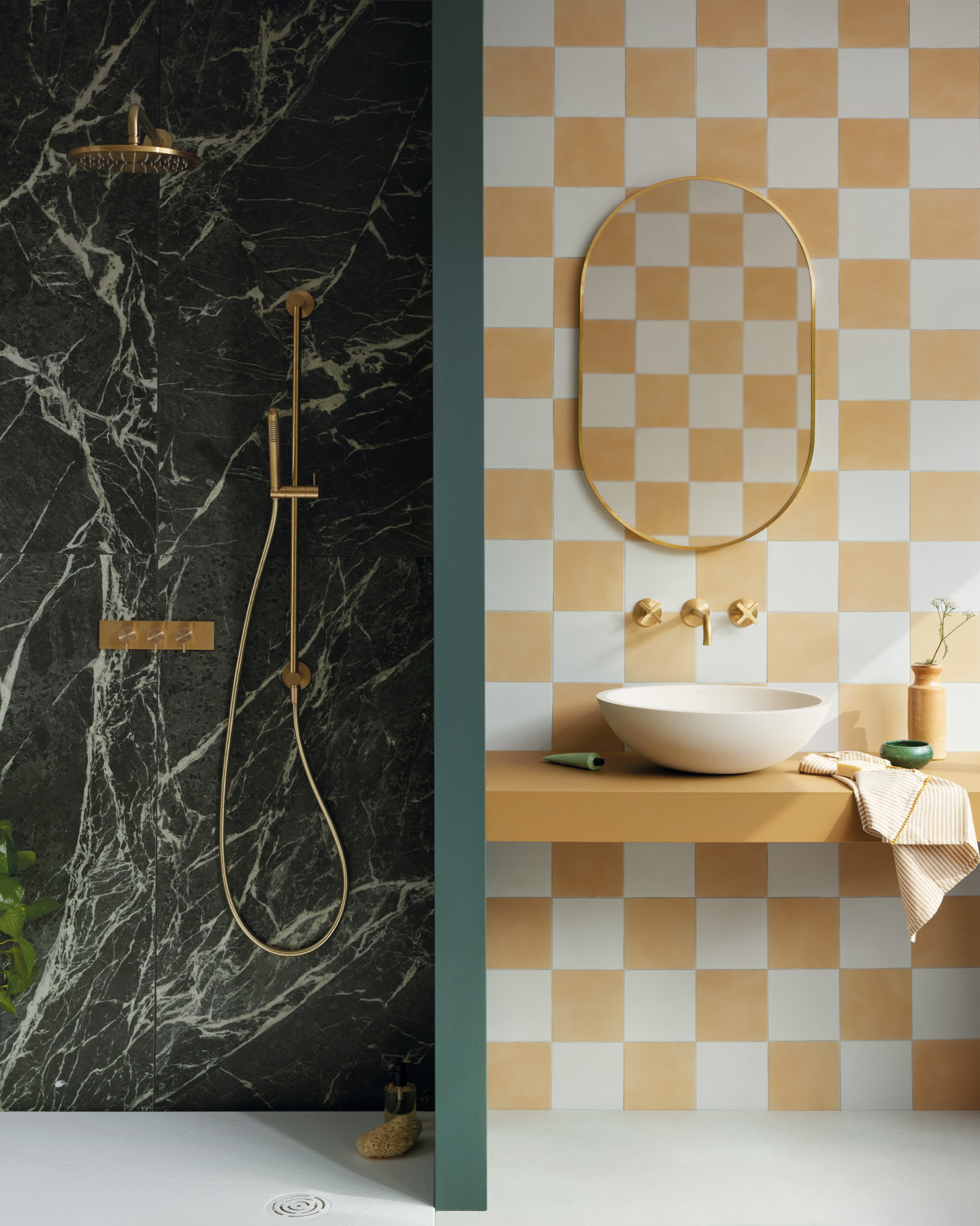
 Using contrasting scales can help the eye travel throughout the space, rather than land on one element. If using a larger format floor tile, use a smaller tile for walls or contrast a bolder wall scheme with a quieter shade for floors. Or combine different size tiles on the wall, like the shower room seen here. A chequerboard wall, using two shades of the same tile, in one part of the space is combined with a large format marble porcelain in another.
Pezzulo tiles and Vintage Vibes tiles
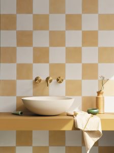
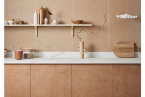
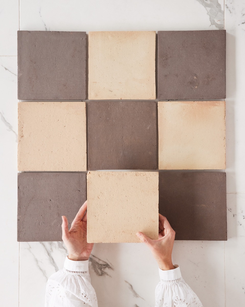
Creating a chequer floor need not rely on crisp edged porcelain. For a textured and natural look try using two-tones of terracotta, which can add warmth as well as embodying a sense of global style.
 Or run the two colours in horizontal bands like this kitchen, another clever way to add colour and movement without compromising on practicality. The scallop motif on furniture and paint effect breaks up the linear feel, and adds to the pretty sense of fun.
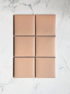
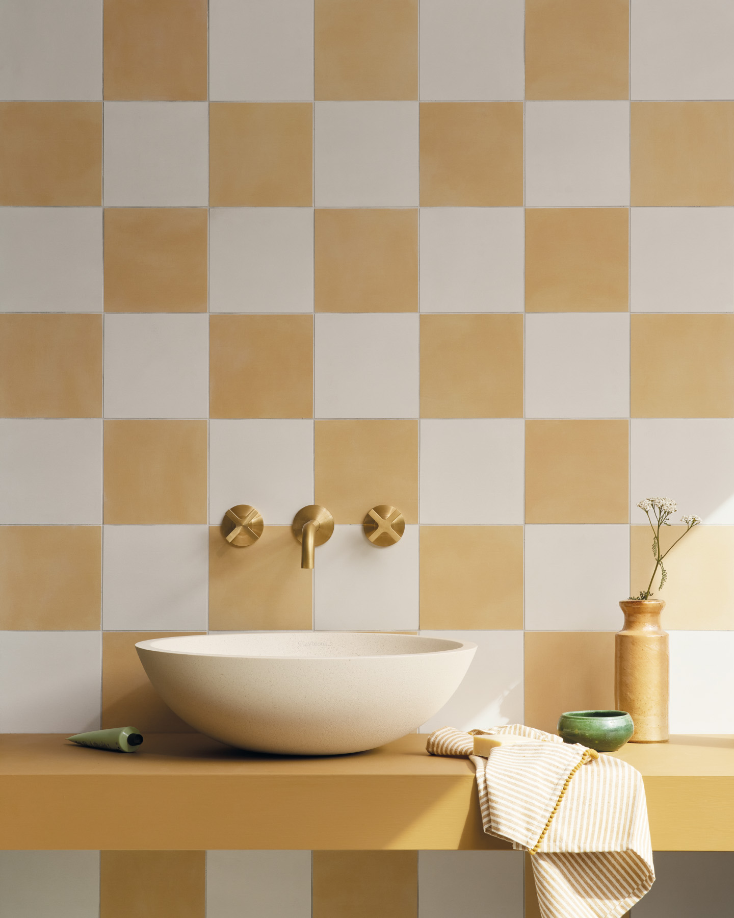
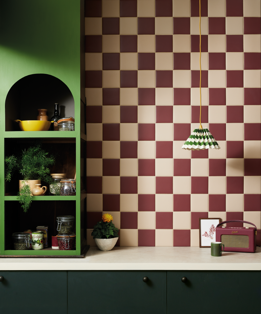
 This chequerboard wall was created using two shades of our matt glazed Kromatic tile. The burgundy Wine shade and the Canvas pair brilliantly for a distinctive and eye-catching choice. Could also be used on the floor.
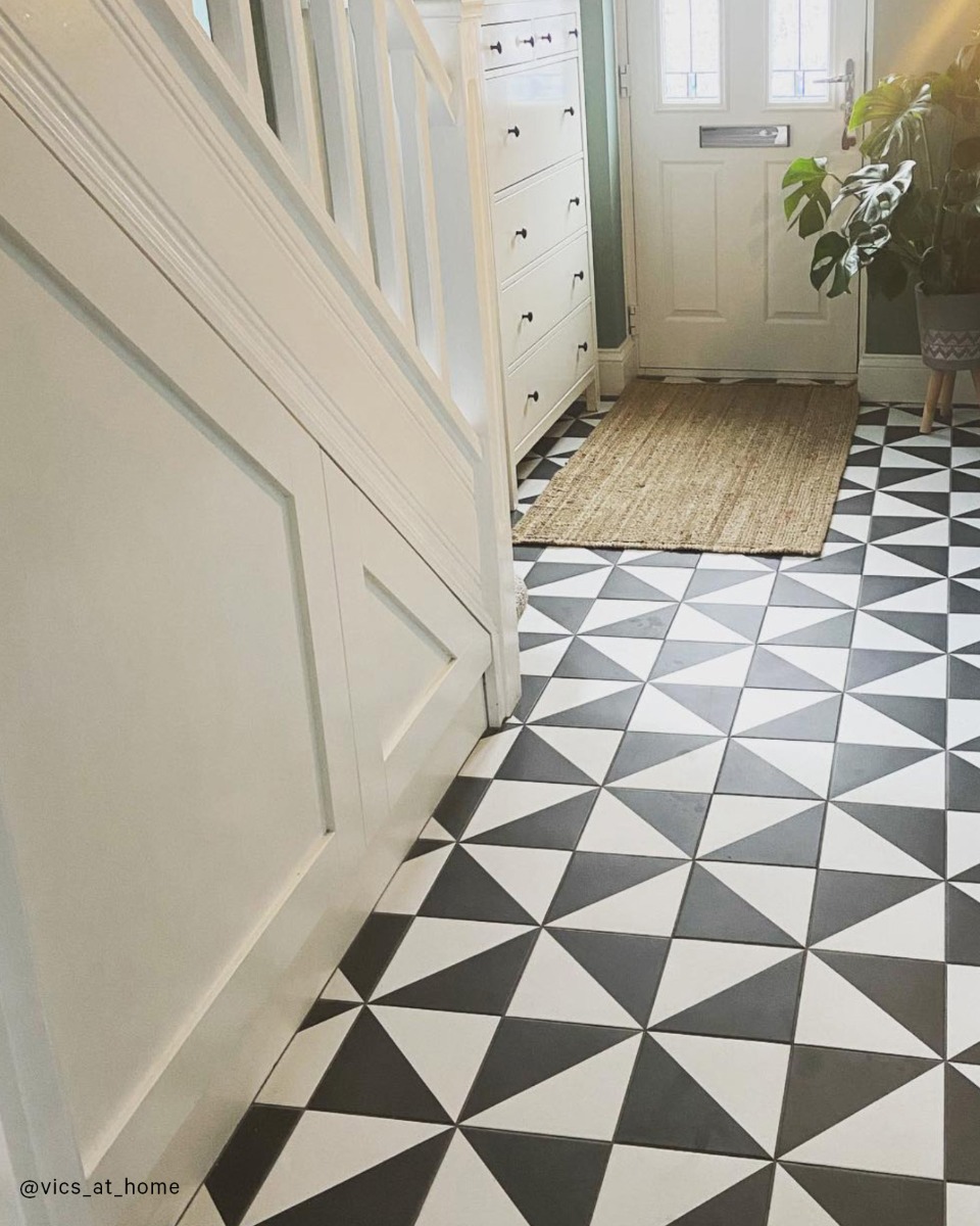
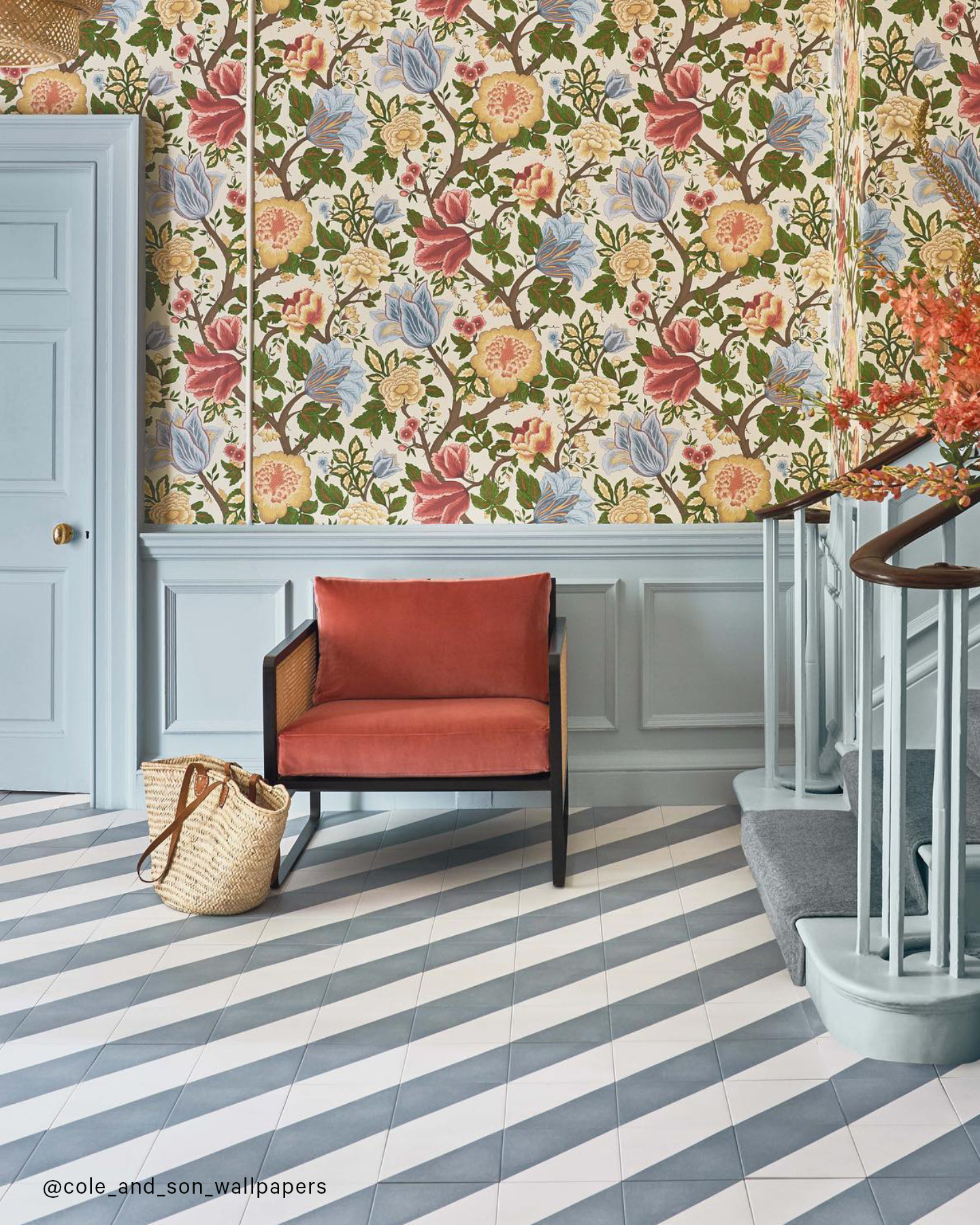
Diagonal tiling can create movement and fluidity like in this beautiful hallway floor. Contrasting a modern stripe with traditional wallpaper creates an eclectic design mix that’s really visually effective.
These check and stripes interiors create casual spaces in which to relax, banishing monotony and adding a little decorative excitement; almost amusement, and that cannot be a bad thing.