Biased against beige?
We’ve recently launched a whole series of ranges in neutral and natural shades, some of them pictured throughout these musings. This got me thinking; how did it happen that it feels so right to be decorating with paler beige-like shades again?
When you’ve been on the planet long enough, you live through multiple cycles of colour trends in both fashion and interiors. I can remember my mum buying me a pair of creamy beige corduroy trousers and matching sweatshirt in 1980, and being thrilled that I looked a little like someone from Buck Rogers in the 25th Century or Space 1999, or so I thought. Both were playing on TV at that time with outfits that mirrored not so much 1999 or the 25th Century, but more like the clothes familiar to anyone walking the streets in 1979 or 1980. Apparently imagining fashion 500 years ahead is so impossible that it’s easier for costume departments to reference current and recent trends, or at least they are referenced subconsciously. And so it is with interiors.
There is no such thing as a new colour, not perhaps since international Klein blue in 1960, it’s simply that colours and styles develop over time and reappear under a new guise or combined in different ways. The neutral shades I so loved on my new party outfit of 1980 reflected the recently hung wallpaper in our sitting room. Out went the brown geometric patterns of 1978 and in came cream with pale olive. My father was a decorator and my mother excellent at spending money, so our interiors changed faster than most people have new underwear.

These neutral tones in our sitting room gave way to other shades as the years rolled by; pastel pink and grey of 1985, black and grey stripes of 1989, yellow and blue flowers of 1992, terracotta and Mediterranean cobalt blue of 1996 and the mirrored furniture fad of 1998 and then… like a tsunami washing away everything in its path came the neutrals of 2001. The most famous exponent of this style was perhaps, and still is, Kelly Hoppen. She espouses a design look that is unapologetically and wholeheartedly made up of neutral and natural shades, often rather awkwardly characterised as ‘East meets West’. These colours do, however, encompass quite a wide spectrum from the brightest white, through endless creams, beiges and taupe’s through to tan and caramel hues. Some general tips for the look might include; don’t overdo fussy patterns, keep it simple overall, use natural materials like cotton and marble, make it comfortable, create balance in the scheme through tonal layering, object placement and the use of different size and scale. It’s actually not as dull as it sounds, and can be easily lifted (Kelly would say ruined) with a pop of colour or the use of other elements and materials. I was once at a function and heard her exclaim ‘who painted that wall such a hideous blue?’. It is admirable how she forged her career with such single-minded drive and personal elan.
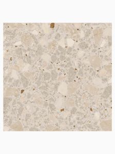
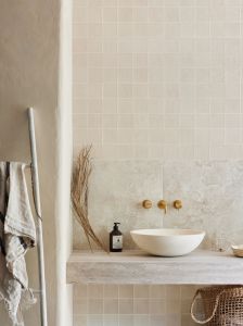
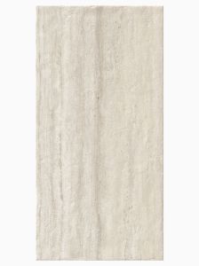
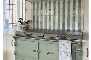
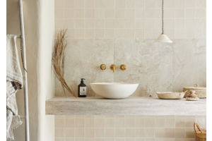
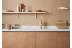
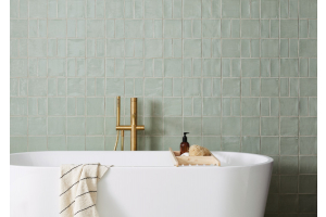
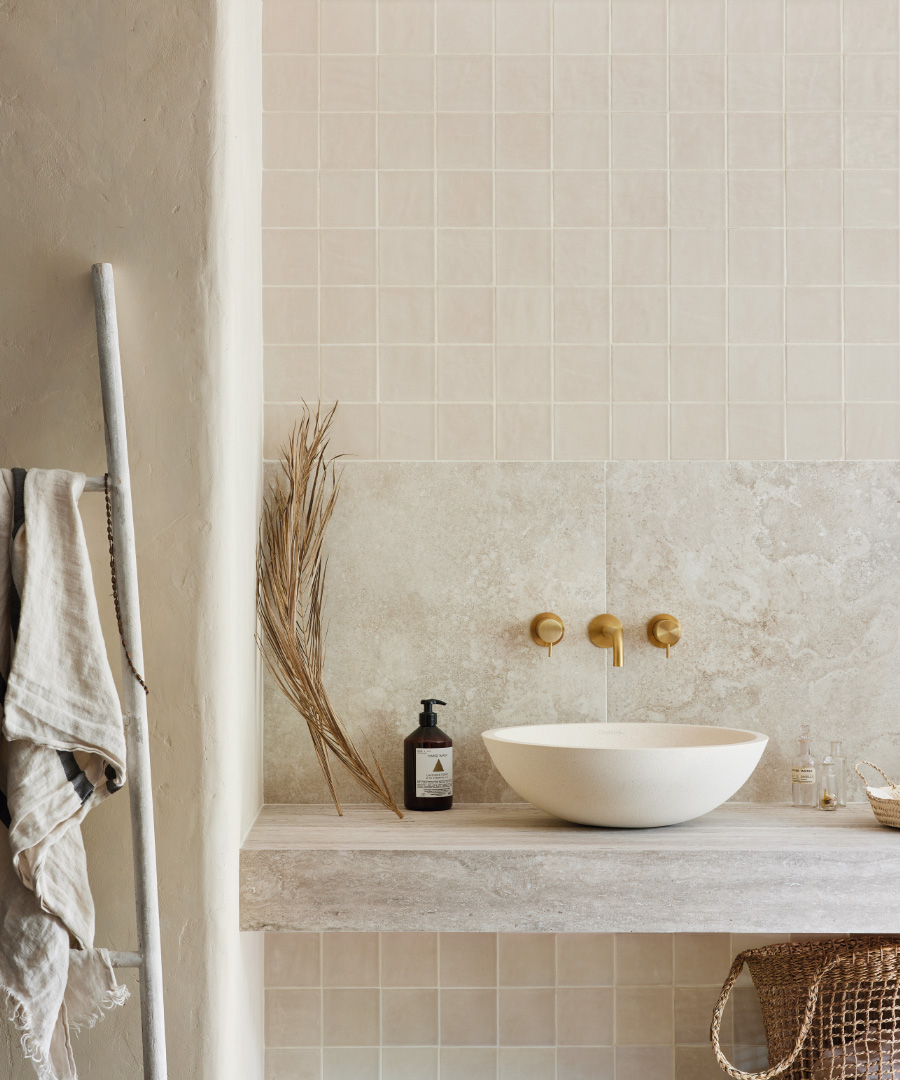
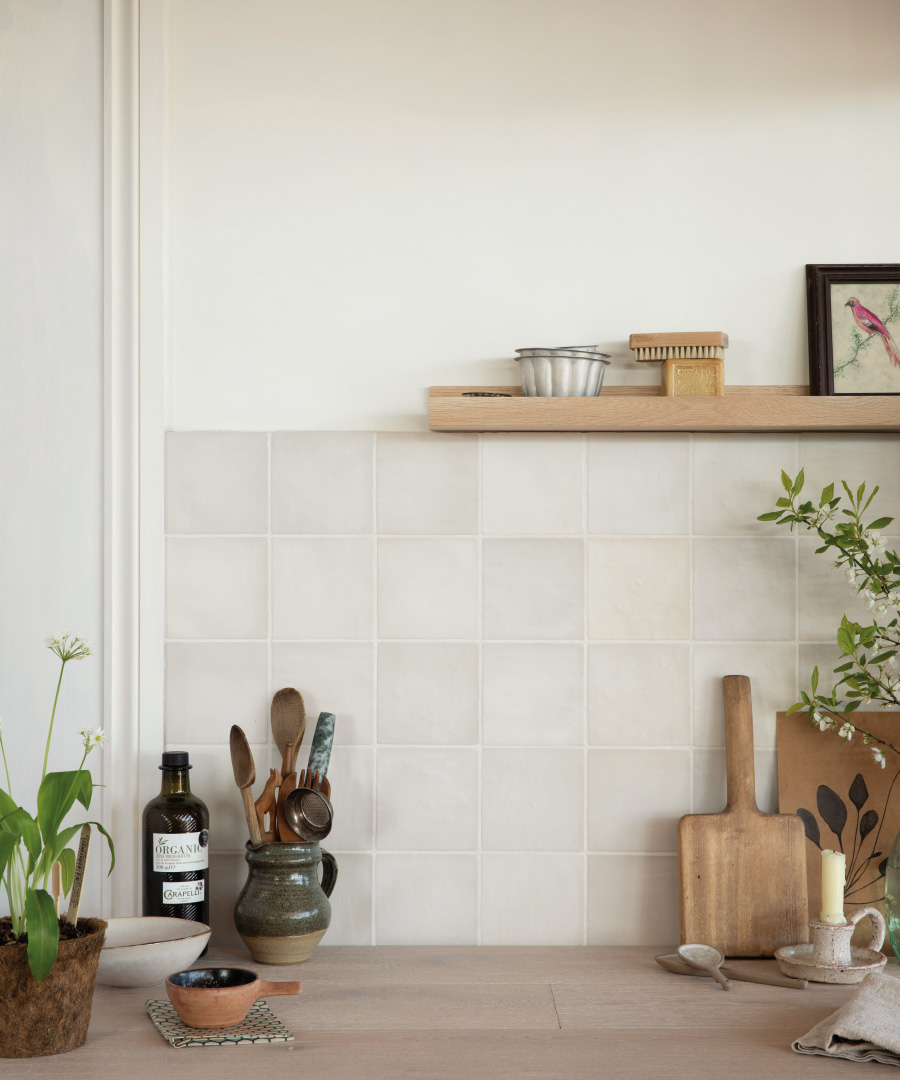
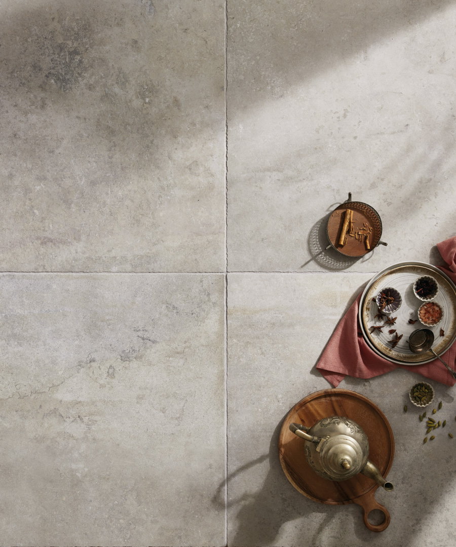
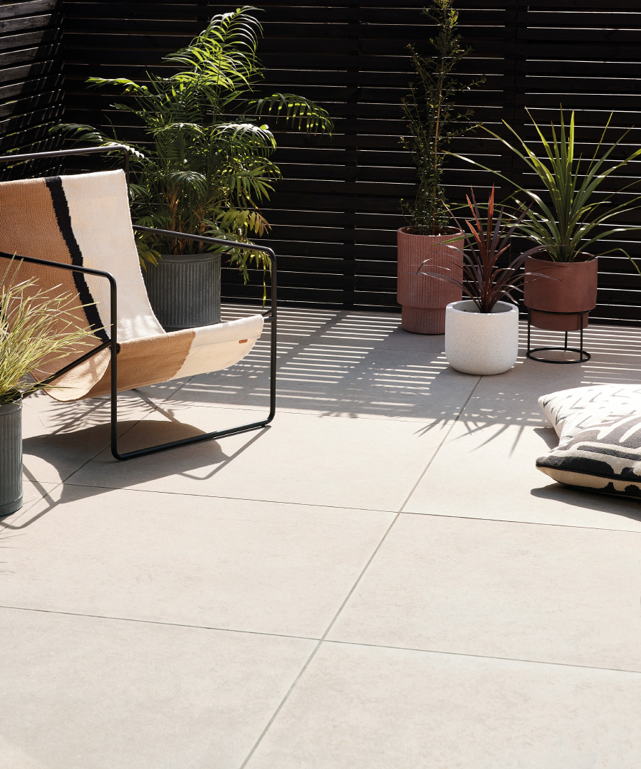
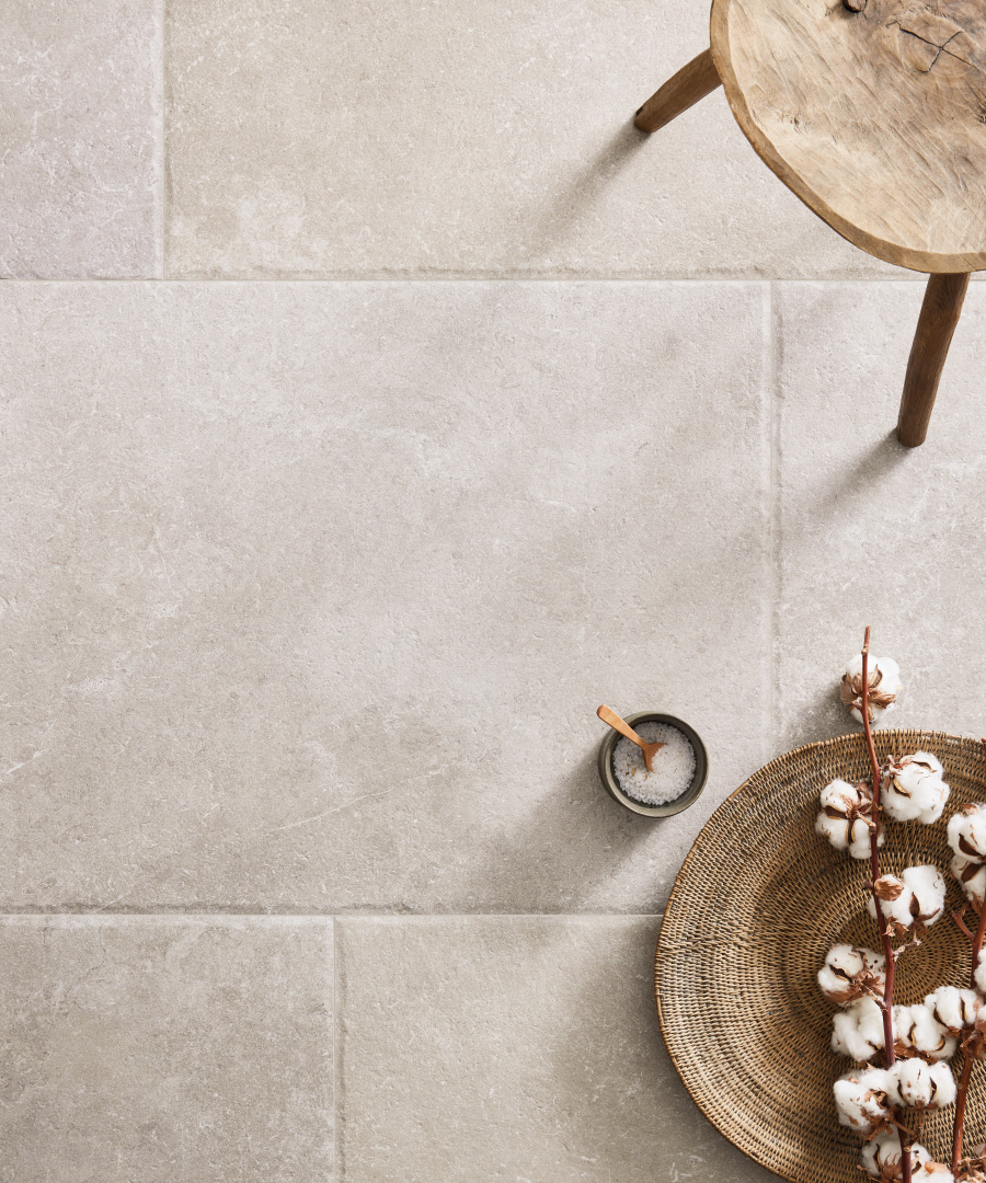
Fast forward through the grey dominated years following 2002, the scandi obsession of 2010 and the Moroccan fetish of 2015 and you arrive at... well... back at neutrals again. For reasons known only to the design gods, natural and simple shades are very much back in vogue. Think travertine, organic linen throws and pale paint shades alongside lighter toned glazed wall tiles in soft matt finishes in hues from off-white to off-brown, beige, greige and stone.
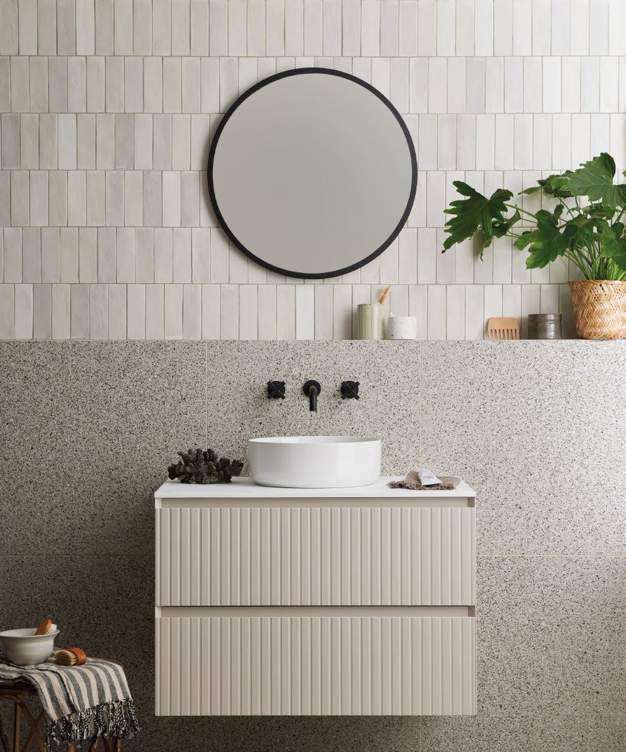
It may seem like this style is a diluted or diminished version from 20 years ago, but I’d say that in the same period the passion for interior design, not to mention a global pandemic that forced us to stay home, has increased our sophistication at introducing different elements into the look, from zellige style tiling through to using texture on furniture and tactile ceramics as accessories. We’ve been working hard on bringing tiles to market to meet this demand, or we’d like to think, create the appetite. These collections encompass both indoor and outdoor ranges in shades from palest cream and stone to darker neutrals like greys and browns, all of which would work brilliantly in schemes that have a hint of past decorating, but which feel updated and fresh for years to come.
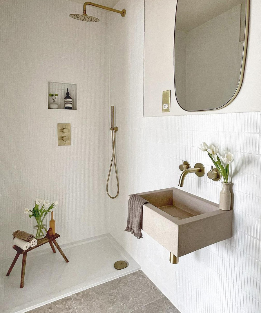
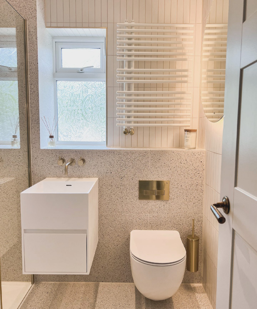
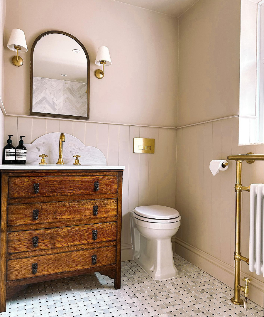
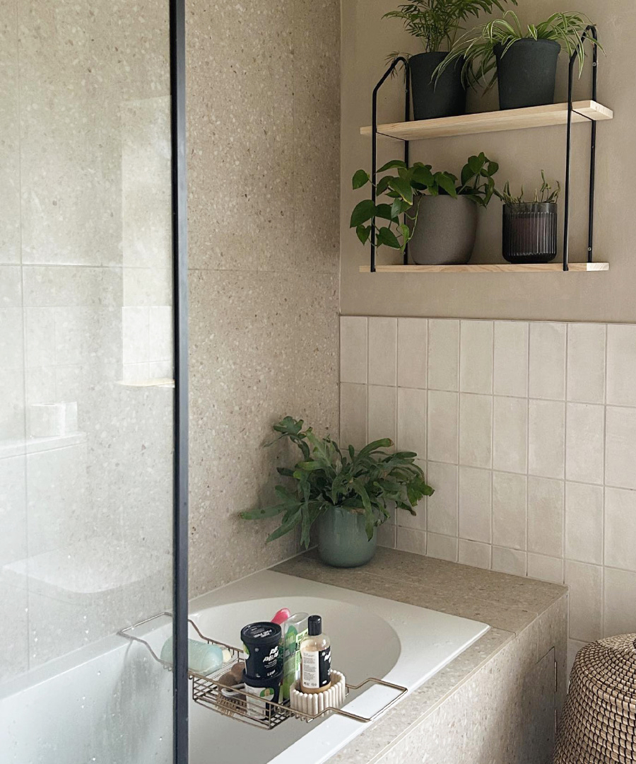
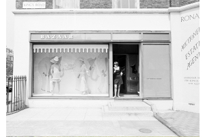
Real Life Projects
We get a real kick out of seeing the amazing and beautiful ways in which you have chosen to incorporate our designs into your space. Tag us using #claybrookstudio to share images of your completed Claybrook creations.