Earth Tones... A Force of Nature
Some shades seem timeless and are always an anchor to interior schemes no matter what the prevailing fashion, fad or zeitgeist. For example, white will always be in demand.
In recent years, grey emerged victorious firstly as the wall colour of choice, and then the wall and floor tile and next came kitchen cabinet colour and then, well just the everything colour. Our lust for grey seemed insatiable. Like tulip mania in the early 17th century, demand seemed to outstrip supply for a while around 2015. Is it simply herd mentality or a coming together of circumstances that creates the perfect situation for a colour to emerge as a dominant feature? It is well recorded that trends emerge and filter throughout society in something akin to waves across the country, and if grey started as a trend in the highly populated urban centres of the UK, it took a year or two to disseminate into the subconscious minds of customers further afield, as their favourite choice when refurbishing. However, things change, and a process of almost natural selection occurs, where a new shade comes out on top as super popular to replace the last.
Are brown and terracotta tones the new grey?
We probably reached peak grey a couple of years ago, and a newer and somewhat warmer series of colours started to unfold as the preferred alternative. Brown and earth tones in particular.
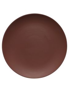
Now this may not at first appear rousing or compelling, but brown comes in an astonishing variety of hues so there is really endless choice. Also, by brown we are really referring to colours as light as sand and as deep as treacle or the darkest chocolate. In the middle are perhaps spicier hues of paprika, caramel, almond and gradations of taupe; not to mention browns with a hint of aubergine.
So, is grey dead?
Don’t worry, if you have a grey sofa or accessories, painting the walls in brown or biscuity butterscotch tones won’t mean having to source new seating, they will still complement one another so grey is here to stay a good while yet. Likewise, deep grey walls still look great paired with sand and earth shades on accessories or in upholstery.
Why have earth tones triumphed over other shades to be the go-to for the 2020’s?
In a post-pandemic world, interior design commentators suggest that we seek comfort, stability and a cocooning sense of safety, something that these brown-like shades may psychologically trigger. For interiors it can create a timeless sense of grounding and earthiness, not only for our mental wellbeing but in tying together differing elements throughout the home. There is no doubting that a neutral paint shade on the wall can act as an ideal foil to sumptuous jewel like velvet upholstery or drapery at the windows in a stripe, check or natural finish.
Are these brown and tan tones for maximalists or minimalists?
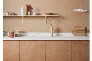
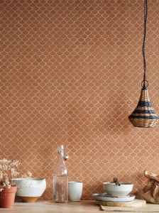
Both. It is not difficult to pair a reddish-brown wall or painted shelf with simple colours like white or cream. Equally, strong shades like sunny yellows and eye-catching corals look great when used with brown. Layering colours together can work brilliantly, like the storage system pictured in Sweeney Brown from the Claybrook Colour paint palette. Here a collection of ceramics stands out against the warmth of the paint in a home decorated with a mid-century aesthetic. The seventies, as a decade of style, had a look that is still influencing the decorators and their clients of today, possibly as it too was a time of upheaval, social change and fuel crisis. Think terracotta floor tiles, tactile cane furniture and grass cloth walls all in tones of toffee and dried grass. The look is comfortable, but can either be simple and paired back or more voluptuous by adding or subtracting upholstered furniture, drapes or sympathetic accessories.
But isn’t it all a bit gloomy?
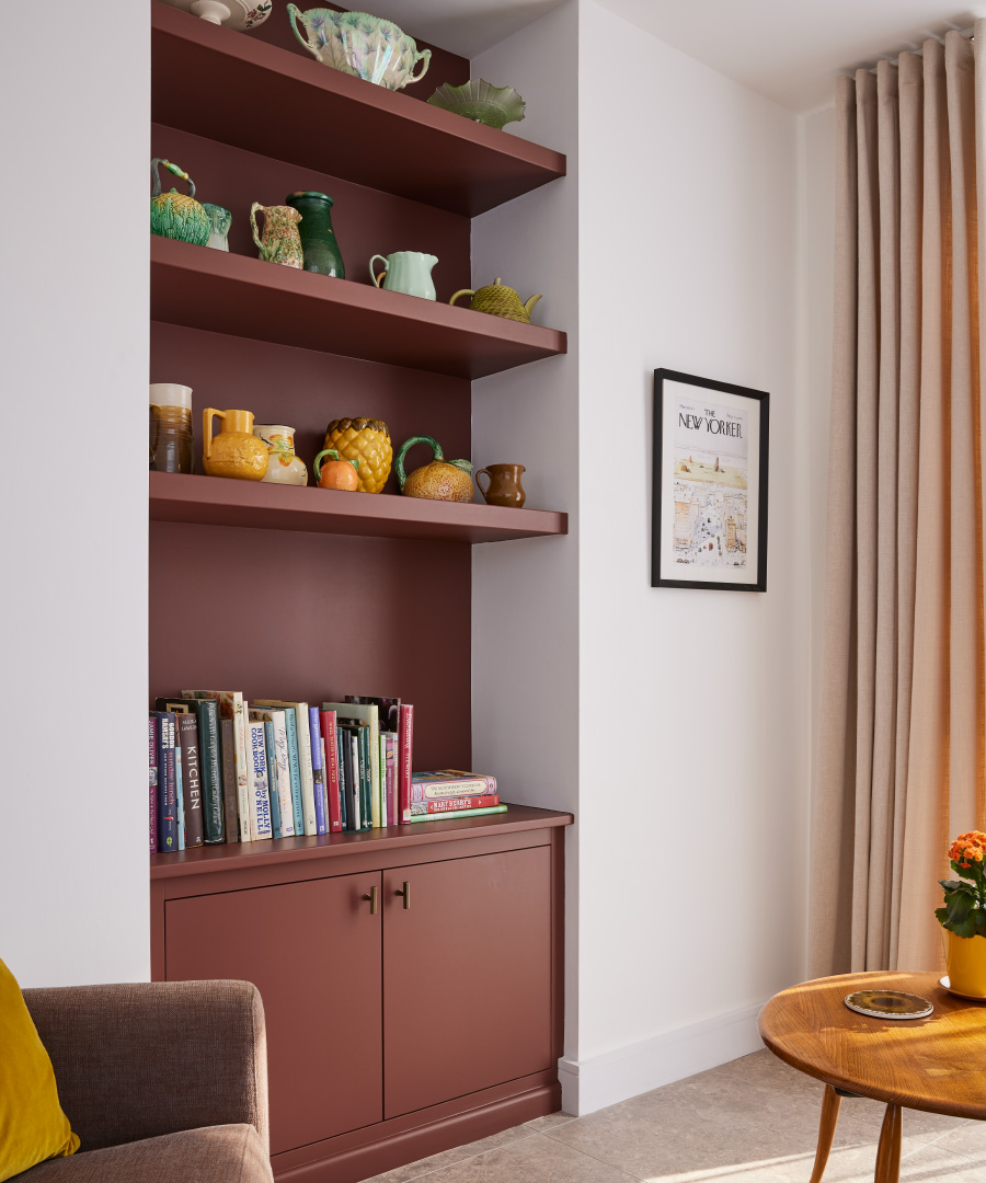
Well, no. Larger rooms can take lots of colour, even darker painted ceilings, whereas smaller spaces could take an accent of ochre or tobacco tones on smaller items of furniture, or a painted wall. Check out shades like Carly’s Loafers or 1974 from the Claybrook paint collection; paints that rock the brown vibe but with less visual impact and with a little spice. Combine with paler shades like Uniform Blue or Kate Blush to create pairings that are subtle and have longevity.
Is it a short-term trend or something that will last? I don’t want to spend money to only refurbish again soon.
At Claybrook we are big fans of this mellow collection of shades as they create interiors that are comfortable and stylish and that can work well alongside many other colours. We certainly don’t feel it’s a flash in the pan idea to decorate in tones of tan, brown, terracotta or even aubergine. The look will feel fresh for a long time and be something you will be happy to come home to many years hence.
Your Homes
Decorated in hues of toffee and spice
We get a real kick out of seeing the amazing and beautiful ways in which you have chosen to incorporate our designs into your space. Tag us using #claybrookstudio to share images of your completed Claybrook creations
Click on the images below to shop the look.
-
-
-
 Xanadu Terracotta MosaicRegular Price £7.38 each Special Price £5.17 eachTotal Price £5.17 total
 -
 Macaron CaramelRegular Price £1.25 each Special Price £0.88 eachTotal Price £0.88 total
 -