10 Colourful Kitchen Splashback Ideas
10 of our favourite bright and beautiful kitchen splashbacks to give you some design inspiration
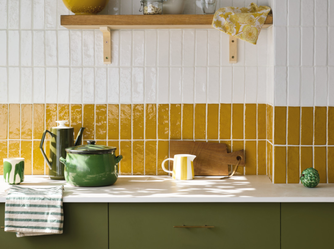
A kitchen splashback using colourful tiles can instantly become the focal point of the space, adding warmth, texture and personality. Using zellige-style glazed tiles adds depth and variation, with their handcrafted look and uneven finish catching the light in subtle ways. Kit-Kat mosaics offer a linear look that feels modern yet tactile, while decorative porcelain tiles can introduce intricate patterns or painterly detail. Zig zag layouts meanwhile, add movement and energy, turning even simple colours into a dynamic design to elevate the room. Here are ten fabulous looks to inspire your own refurb.
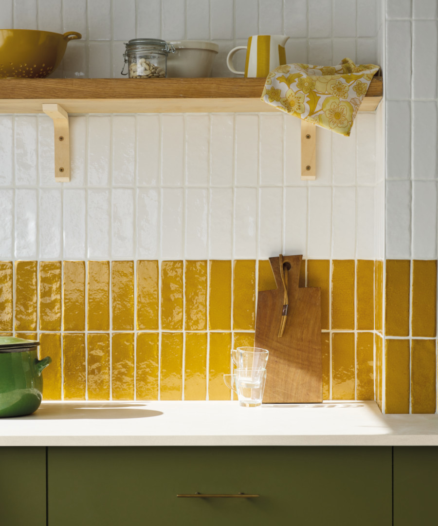
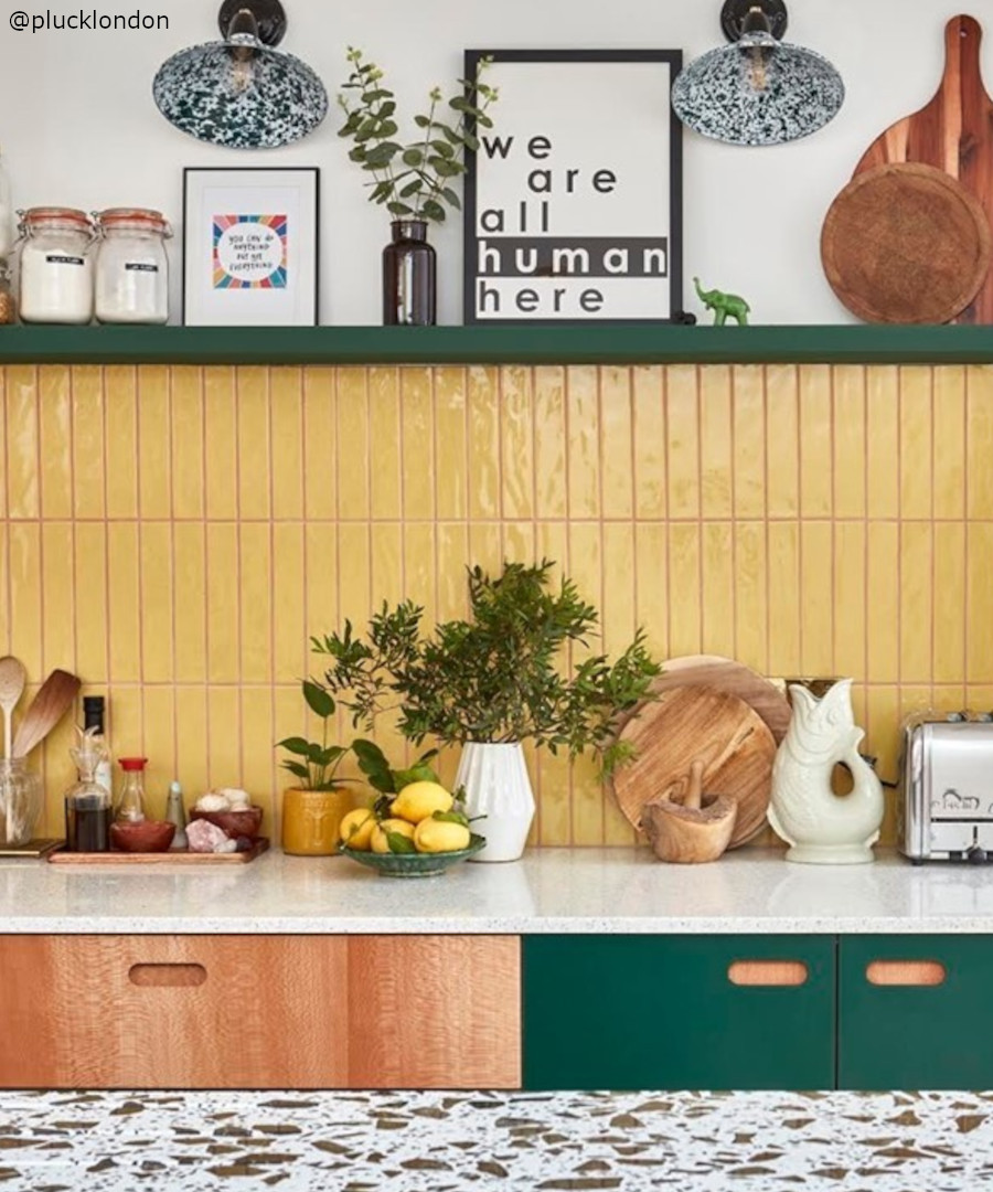
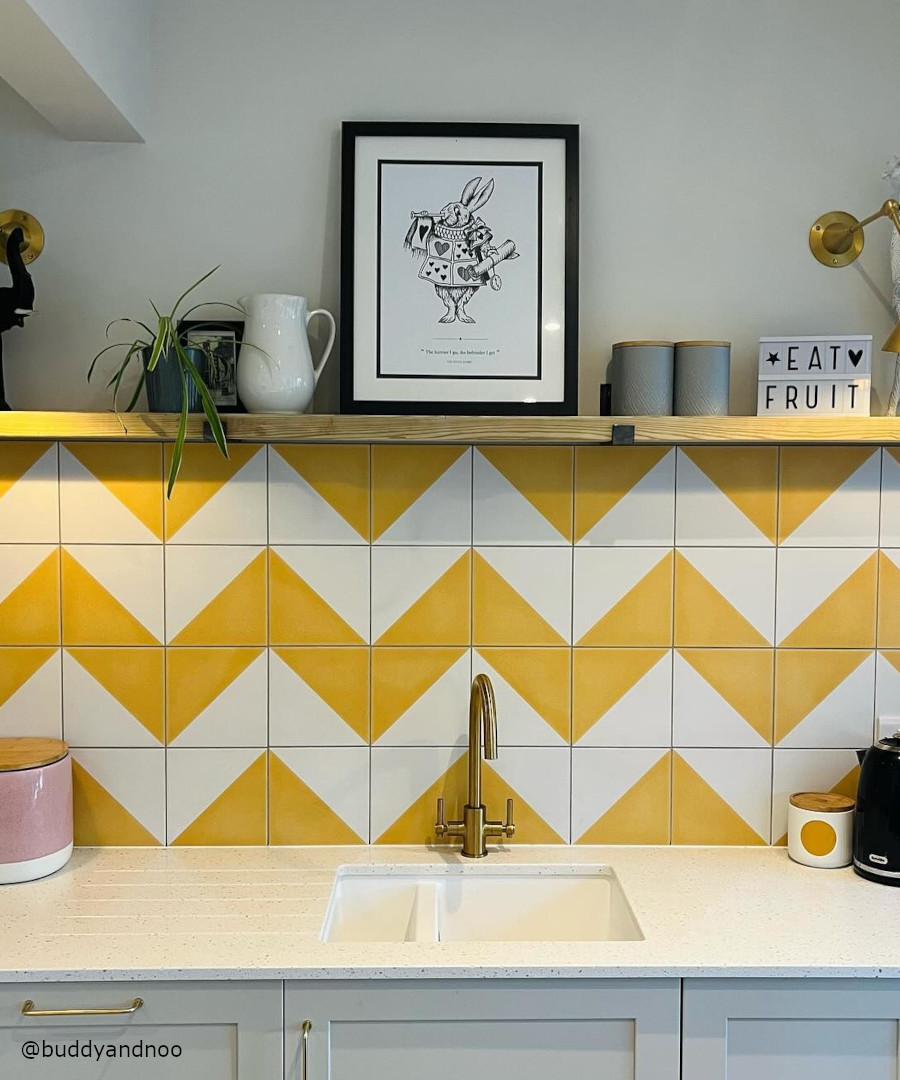
sunshine yellow
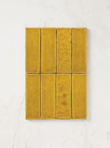
Sunshine yellow tiles bring warmth and brightness to a kitchen, and when paired with crisp white, they feel fresh, clean and balanced rather than overwhelming. Arranging the tiles in a zig zag pattern can also add movement and visual interest, breaking up flat surfaces and giving the design a playful, energetic rhythm without needing extra decoration.
chocolate and tan
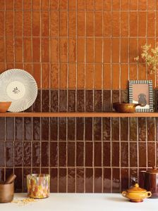
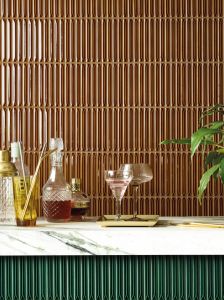
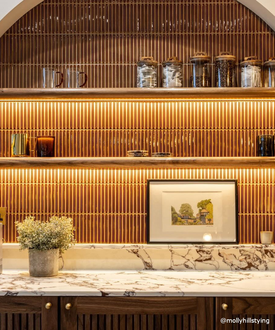
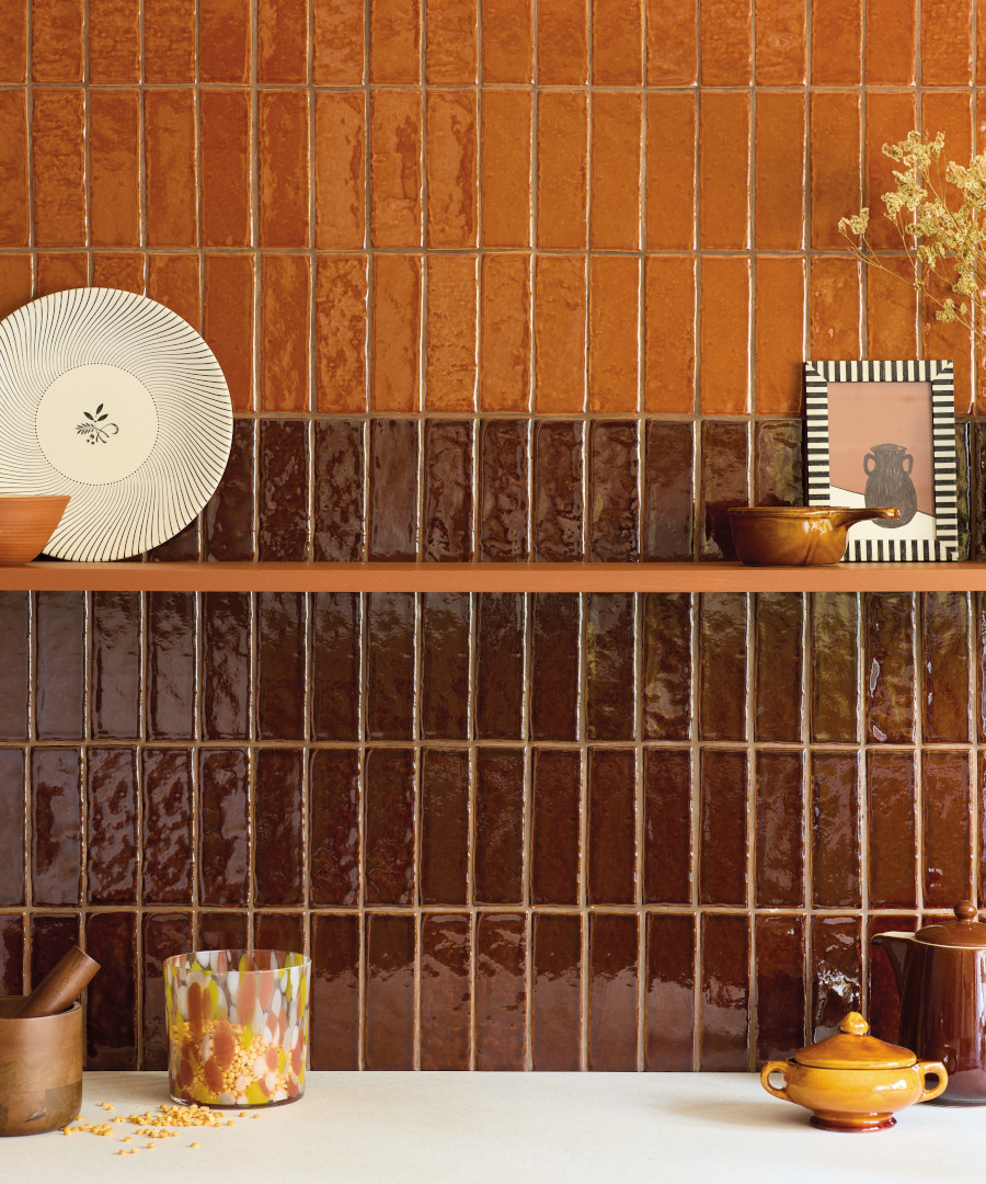
Chocolate and toffee shades create a rich, comforting palette for a kitchen splashback, either blended together or used separately for different effects. Combined in tile form, they offer a warm, layered look that feels natural and inviting. In a Kit Kat-style mosaic, deep chocolate tones bring an architectural form, while toffee hues add a softer, caramel warmth. Both options work beautifully with wood, stone, and neutral cabinetry and also have a somewhat retro or mid-century feel.
pink and pretty
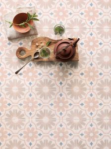
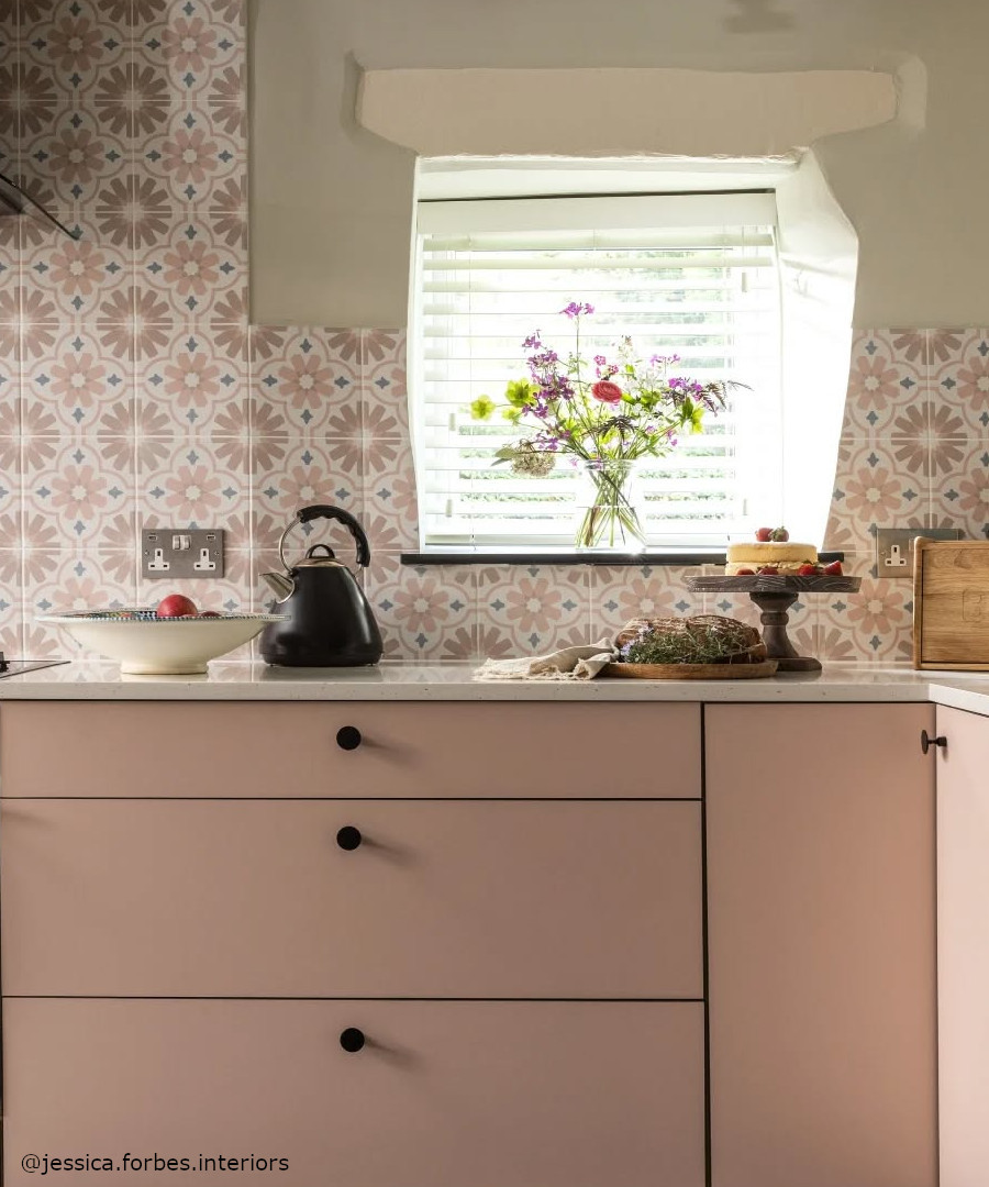
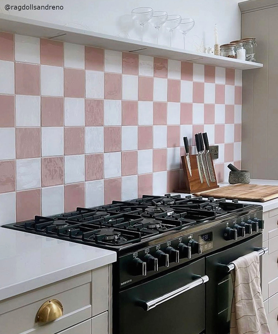
Pink and blush tones provide a soft, uplifting warmth to kitchens and utility spaces, especially when expressed through zellige-style tiles that vary subtly from piece to piece. These natural variations add depth and a handcrafted quality that works in traditional or more up to date schemes. Decorative patterned tiles can introduce extra character, while square formats keep the look structured but with a charmingly eclectic feel.

glossy green
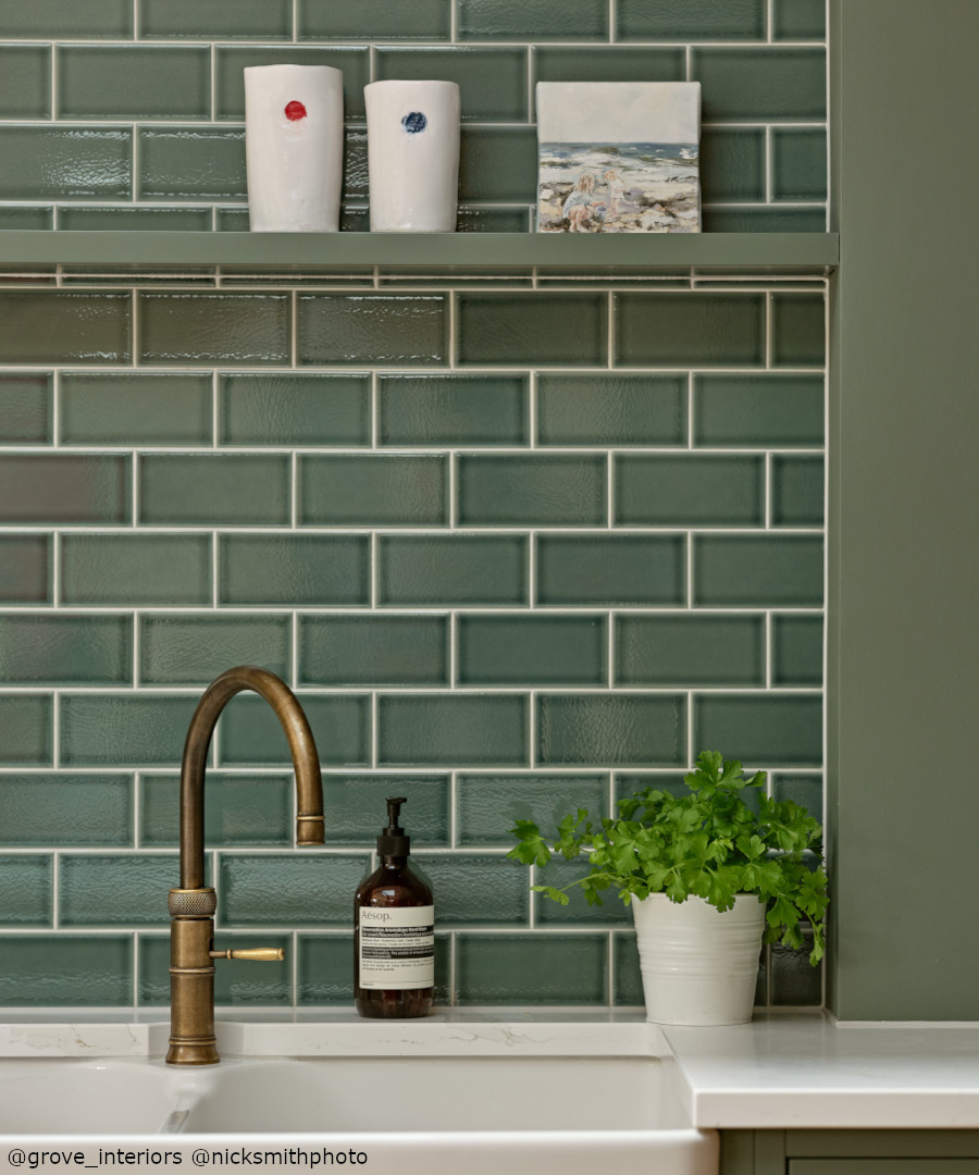
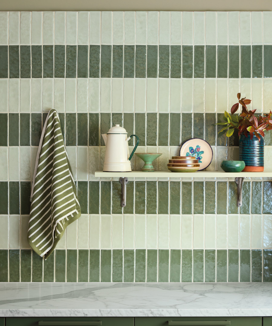
The first image shows how a lush green crackle-glaze tile laid in a classic brick bond pattern adds depth with a handmade, organic feel. The second features green tiles inspired by Moroccan zellige, arranged in horizontal alternating stripes of two tonal shades, creating a rhythmic, layered effect alongside gorgeous shades.
Pattern and Colour Splashback Q&A
Claybrook's head of design, Tara Rees, answers your questions about creating a colourful splashback.
- Which colours look best for a chequerboard splashback?
Choosing colours for a chequerboard pattern will be determined by the look that you want to achieve. While black and white is more of a classic timeless option, you could opt for tiles with more subtle tonal variations such as beige and cream or terracotta hues. These shades can add a more subtle sophisticated look to your space. Or why not channel the bright shades of mid-century design with pops of colour in turquoise or mustard. Both high contrast and low contrast options work perfectly, so it's all about whether you want to achive a more modern contemporary vibe or keep to the more classic options.
- Will using just one bright colour for a splashback look overpowering?
Choosing a tile with variation in one colour is a great choice for a splashback as it adds subtle changes of tone and hue across the space. Our ranges such as Bungalow 22, Fellini or Moulay tiles are great options as each tile has variation created by the soft wash of colour and glaze. You could also choose to use a modular design or interesting tile layout to add additional visual interest.
- What colour grouts should I use for a splashback?
I would suggest opting for a complementary colour grout that closely matches the tone of the tile chosen. There is of course the option to contrast the tile with the grout colour, but this look could age quickly, so I would keep to a safer option to give the space longevity. If you've opted for a chequerboard look then you can choose either colour tile to match the grout to. We have a range of grout colours available, you can order a swatch here.
- Should I choose kitchen cupboards before I choose tiles?
Kitchens are an investment so planning and design play an extremely important part. Your chosen scheme will determine the colours and style of kitchen, but it is a good idea to look at all the materials and colours you would like to use in the space as a whole, to make sure that the look is cohesive and the flow of colour not only works in this space but with adjoining rooms too.
- Which colours look good in a light, bright kitchen?
Light toned tiles give an elevated classic look to a light bright space. Marble looks particularly beautiful, as natural light really captures the colour and subtle variations inherent with stone. Satin and matt tiles are also a good option as they can help soften the space and reduce glare, many of our ranges feature tiles in both a gloss and matt or satin finish. Moulay, Sunset Strip or Tavolozza for a range of matt and satin finishes.
- Which colours look good in a darker kitchen space?
Glossy reflective surfaces in pale shades are a good option for dark kitchens as they can help bounce light into the space. You could also embrace a darker/moodier vibe and use a dark tile in brown or burgundy which can create an warm enveloping and cocooning feel. Our Mediterrano Molasses or Bungalow Wine Time would be a perfect option to create this effect.
Your Projects
We get a real kick out of seeing the amazing and beautiful ways in which you have chosen to incorporate our designs into your space. Tag us using #claybrookstudio to share images of your completed Claybrook creations. Click on the images below to shop the look.