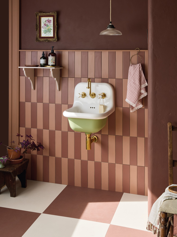

Red and Burgundy Tiles
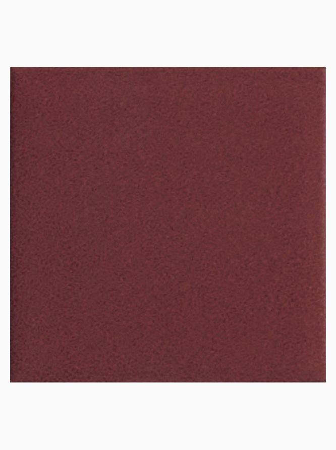
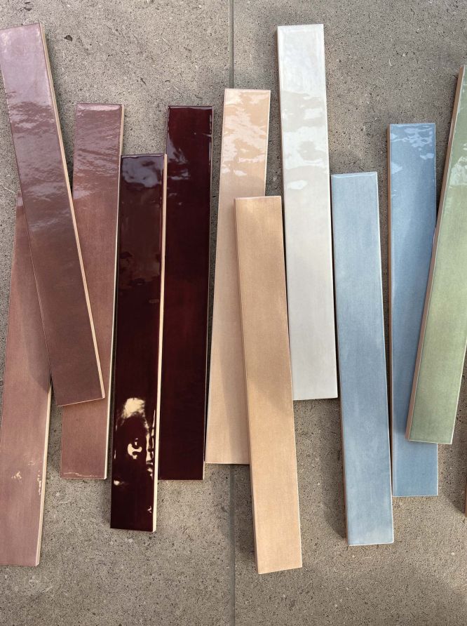
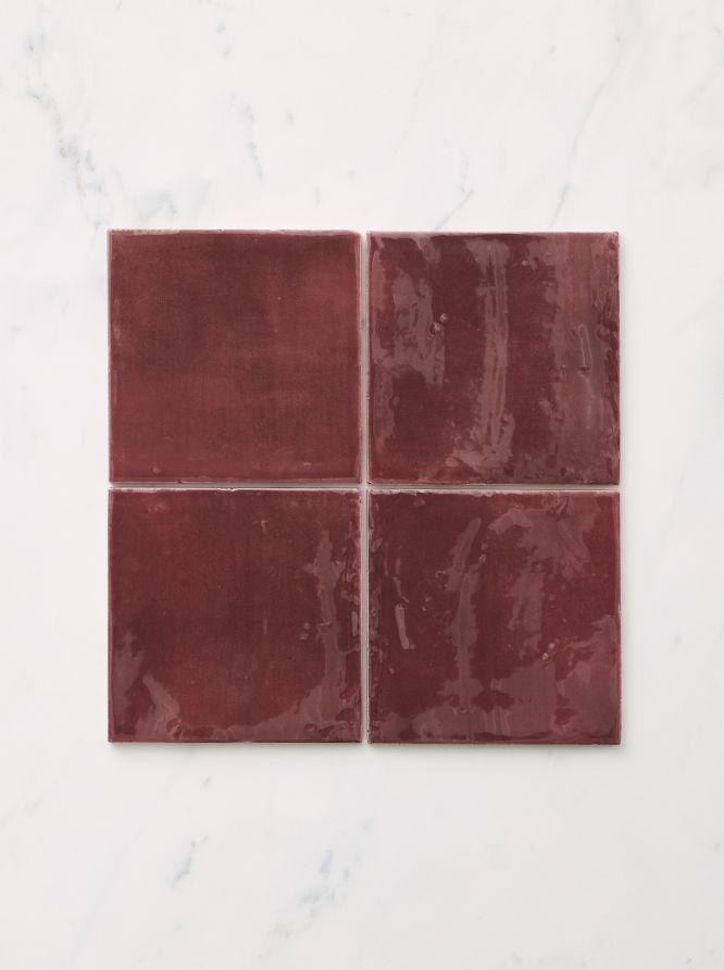
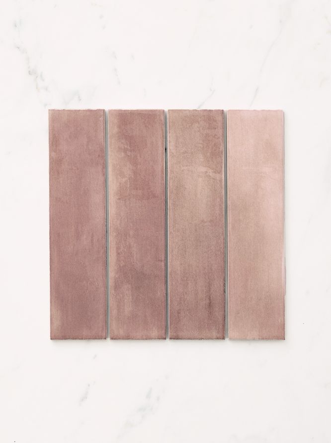
From the deep and mellow tones of tiles the shade of red wine, through to lighter toned options that might be more claret or maroon, we have many options for wall and floor in these burgundy, plum and cherry tones, some with a hint of purple.















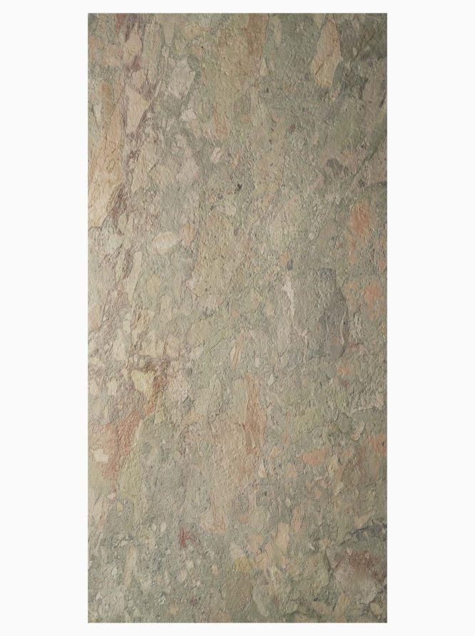
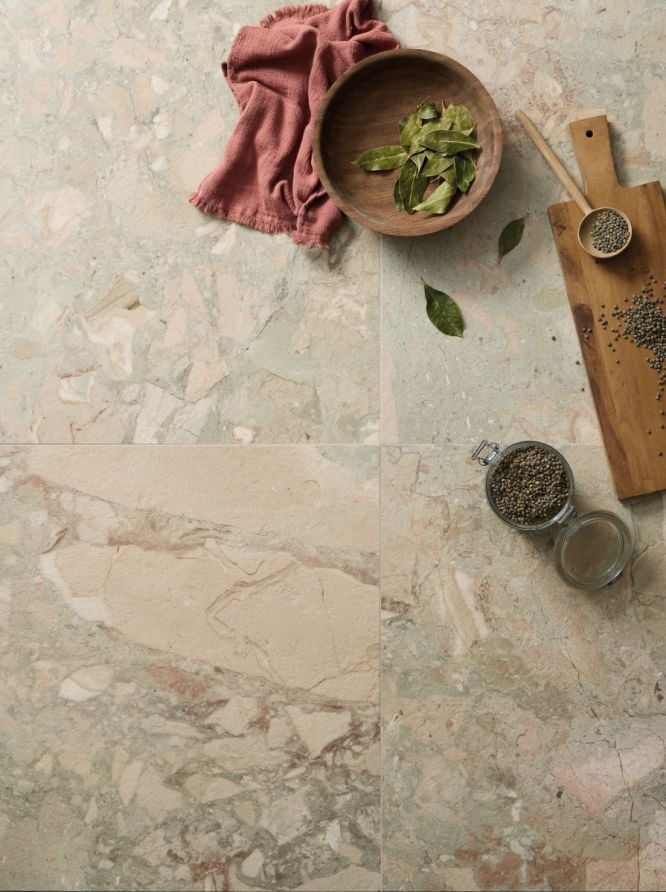
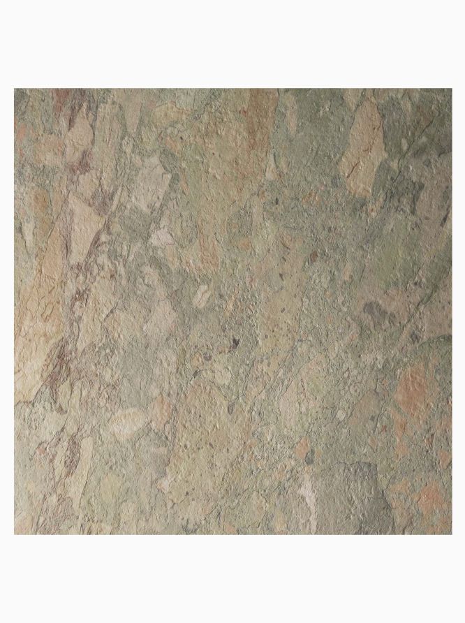

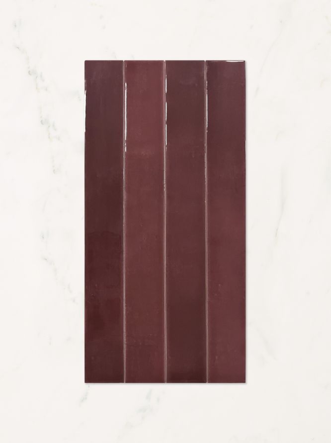






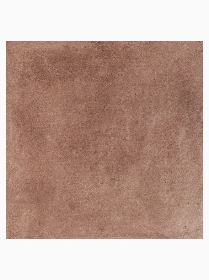
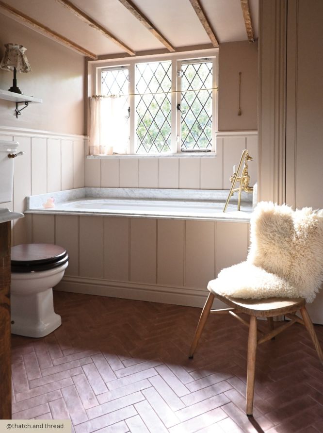
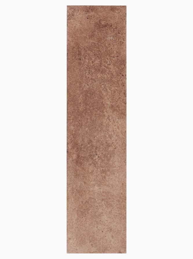
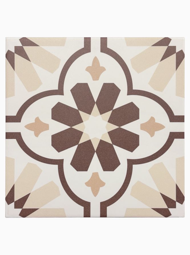
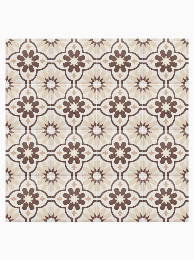

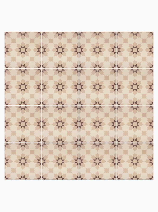
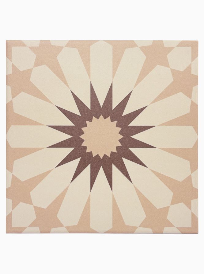
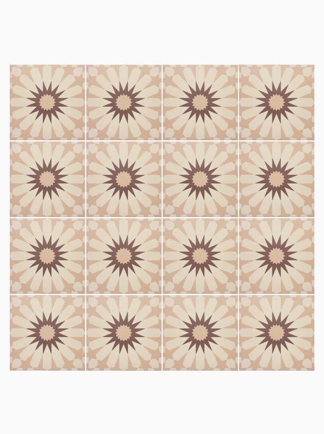

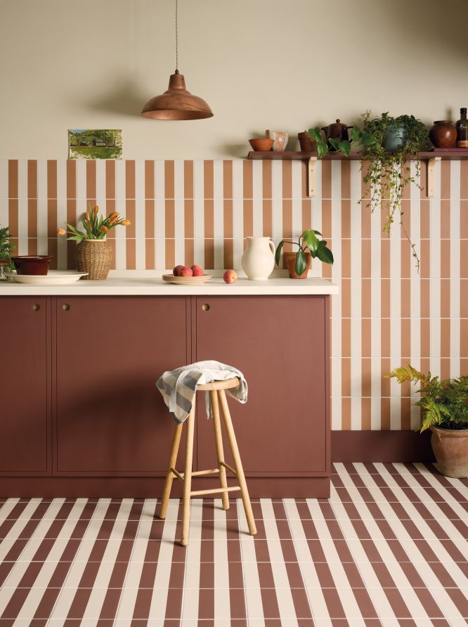


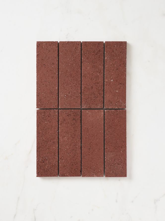

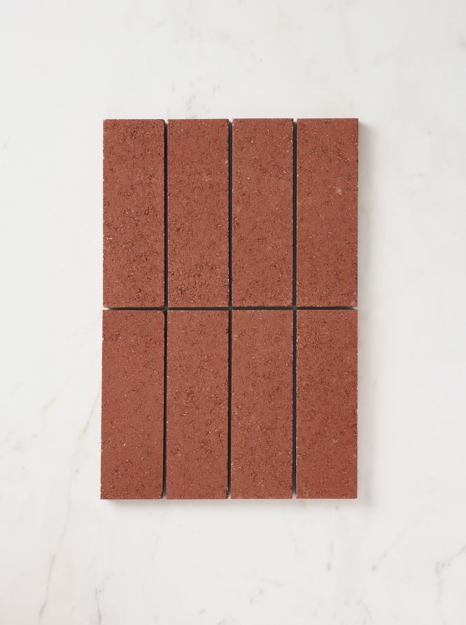
Burgundy Tile Inspiration
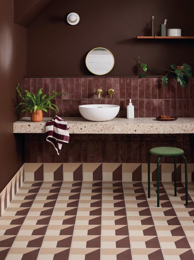
Burgundy is a rich, sophisticated colour that brings warmth and character to interior spaces, making it an excellent choice in both residential and commercial settings. Deep tones such as berry, and claret introduce the same sense of depth, offering versatility across both modern and more classic interiors.
These darker red and aubergine-inspired shades can include durable porcelain floor tiles, ideal for kitchens, bathrooms and other high-use areas where practicality matters as much as design. Porcelain provides excellent resistance to wear, moisture, and daily traffic, making it suitable for family homes as well as demanding commercial spaces.
-
How to use burgundy tiles on walls
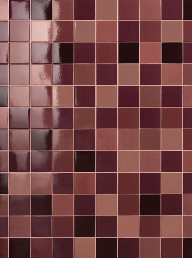
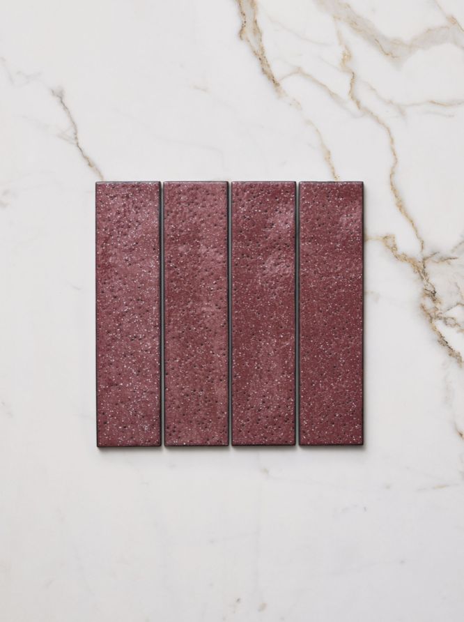
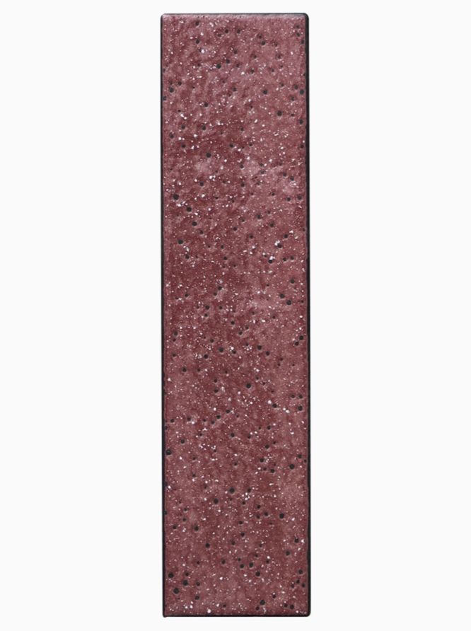
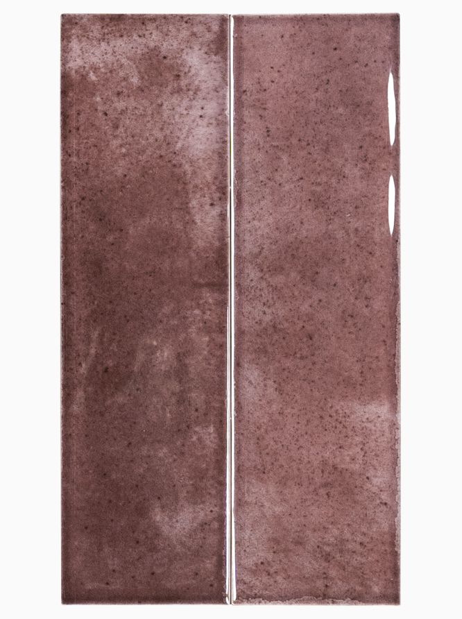
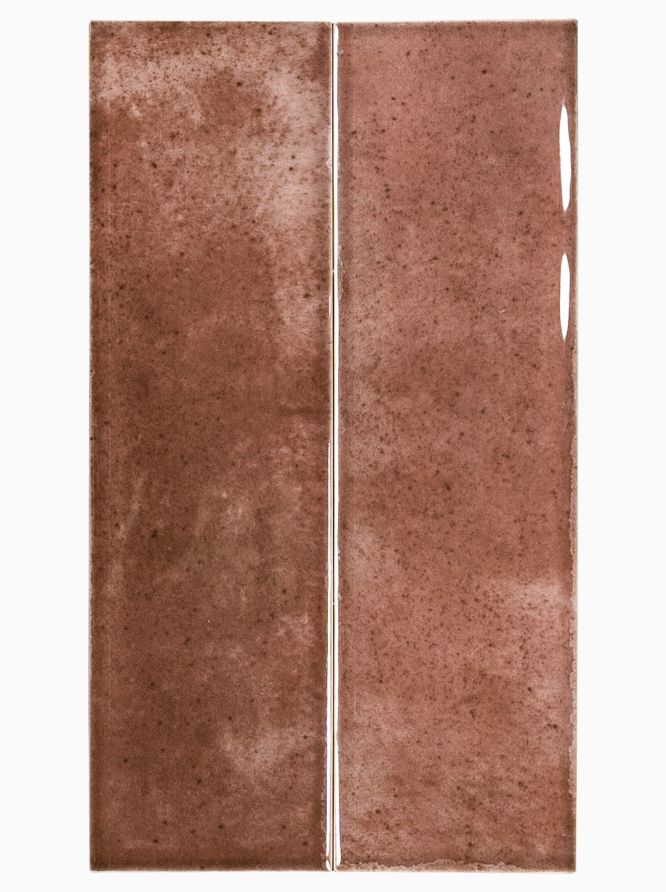
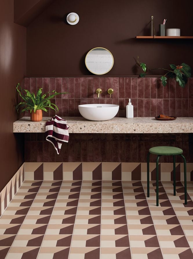
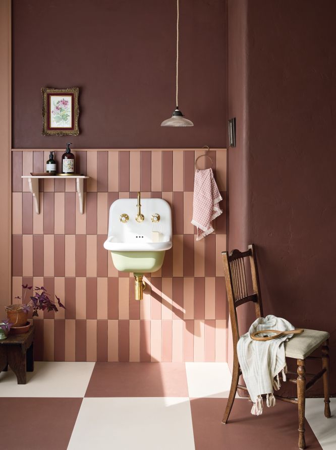
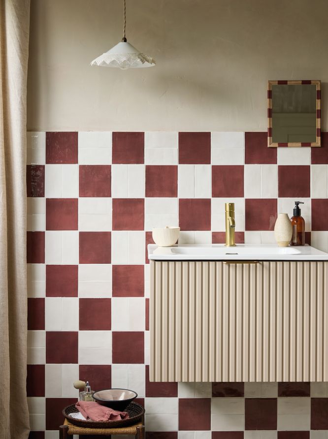
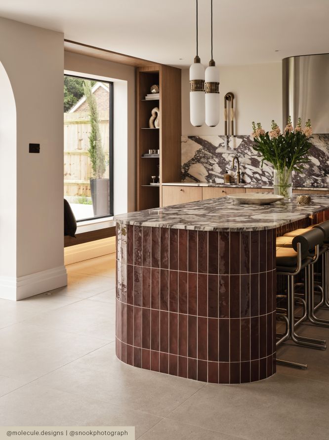
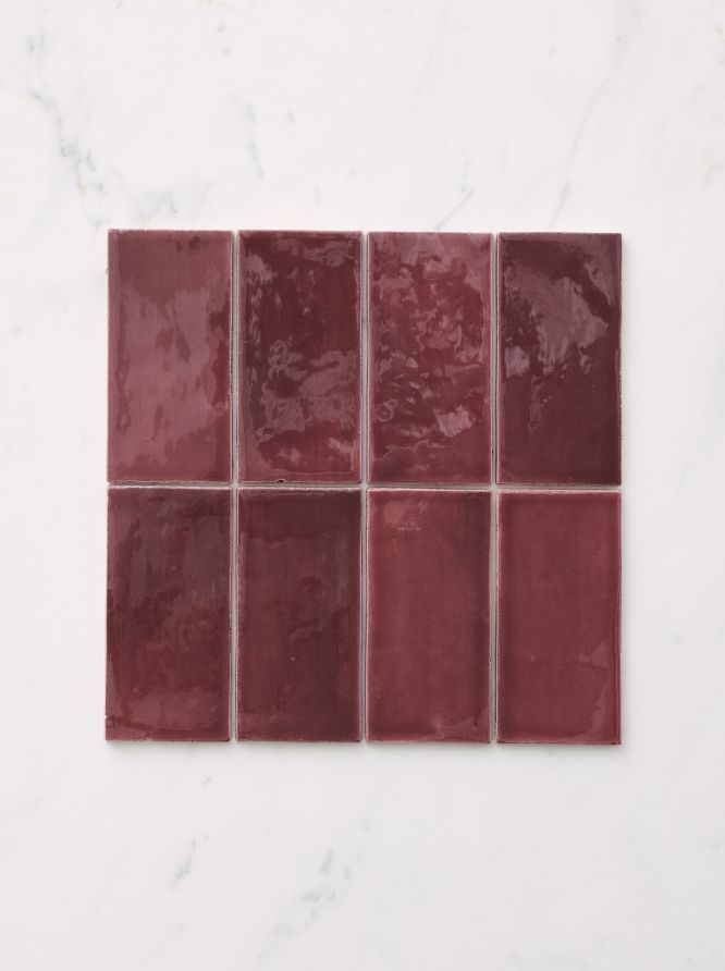
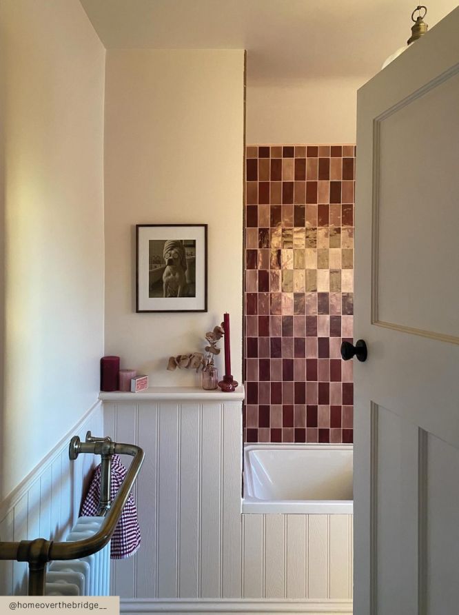
For walls, glazed brick tiles in fig, auburn, or plum tones add texture and subtle shine, helping to reflect light and create depth. Tiles like our Fellini and Bungalow 22 have a glazed surface making them especially effective for kitchen splashbacks , shower walls, and feature areas where easy maintenance is essential. The brick format also introduces a handcrafted decorative quality that suits both modern and traditional schemes.
-
Can you use burgundy tiles on the floor as well as the wall?
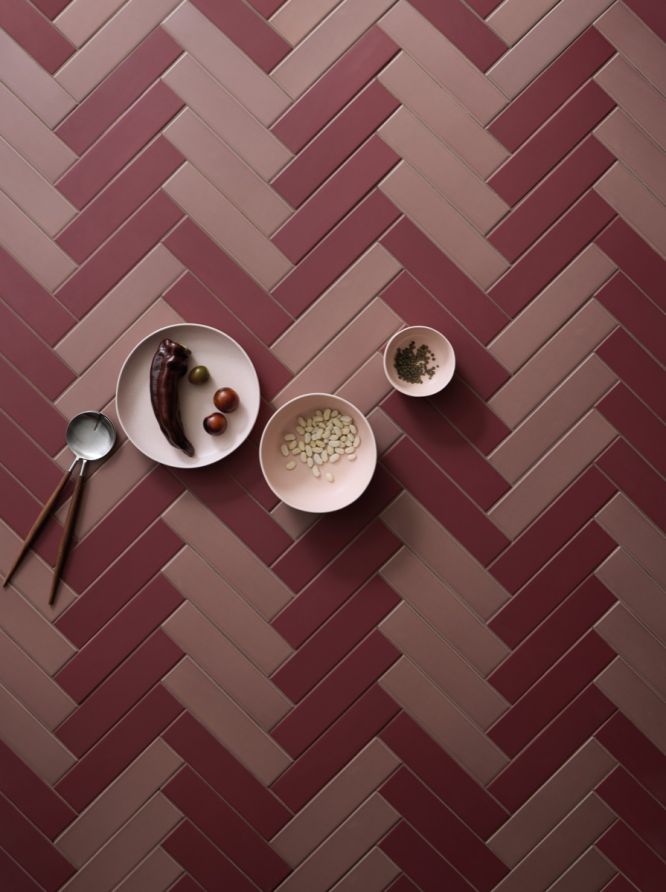
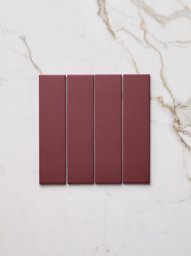
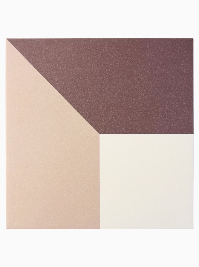
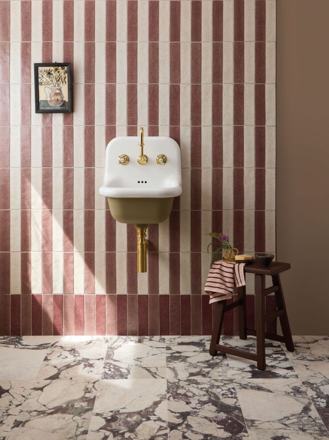
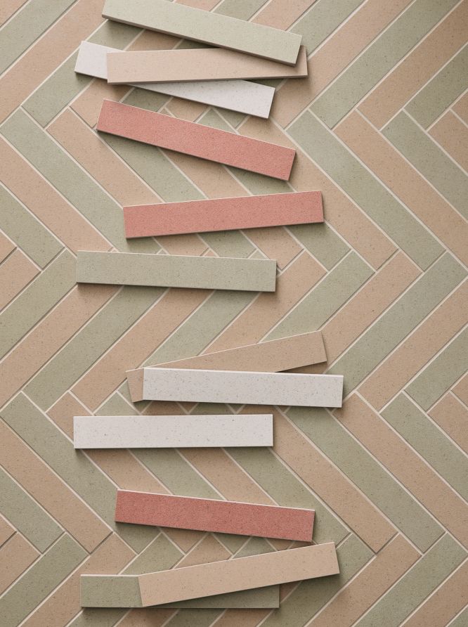
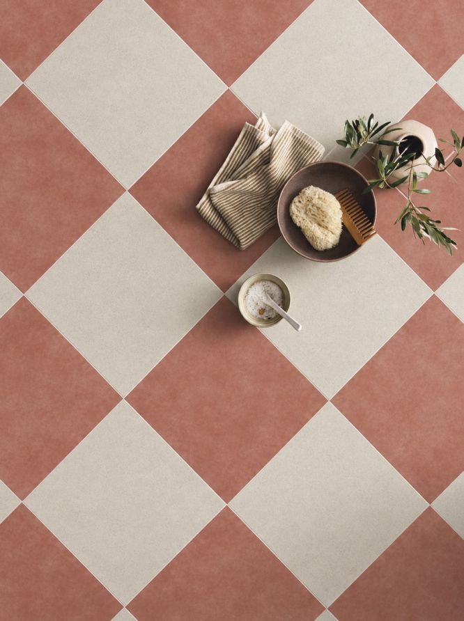
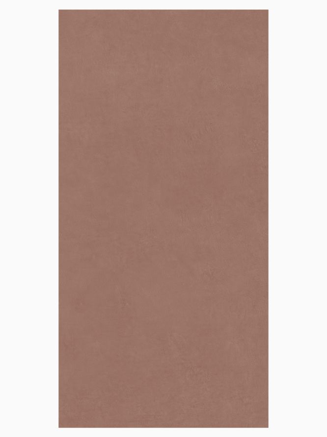
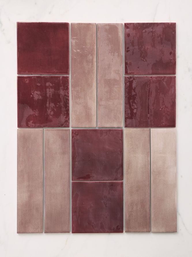
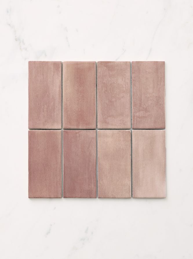
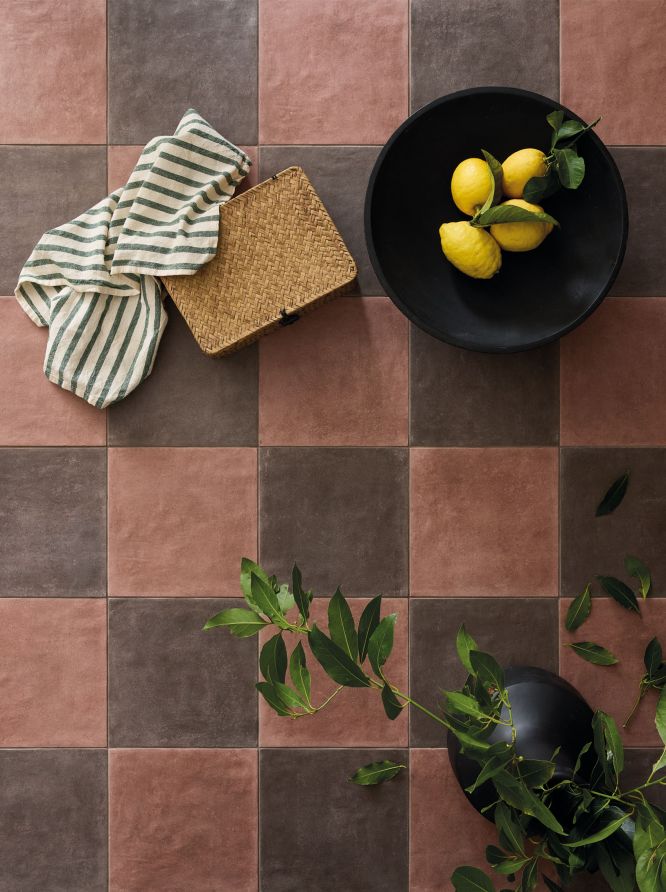
A coordinated range for walls and floors like Kromatic expands design possibilities further, allowing these richer shades to flow through a space with consistency. Used across both surfaces, they create a unified look while pairing easily with softer neutrals, stone finishes, or contrasting lighter colours. Try using different shades from the collection which can be paired together creating striped or chequer looks.
-
What if I don't want solid colour burgundy tiles?
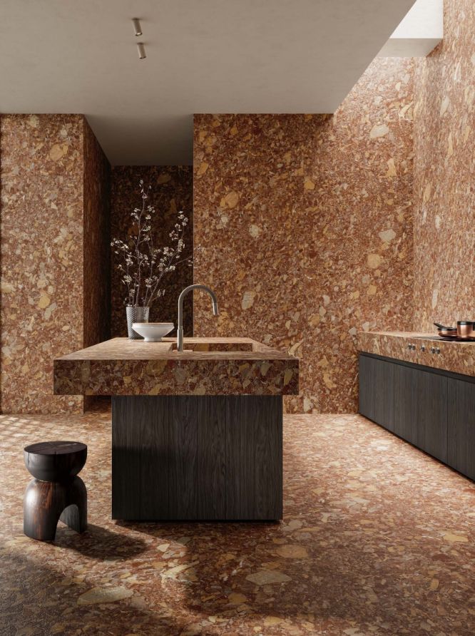
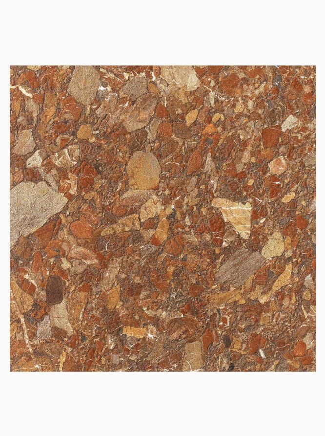
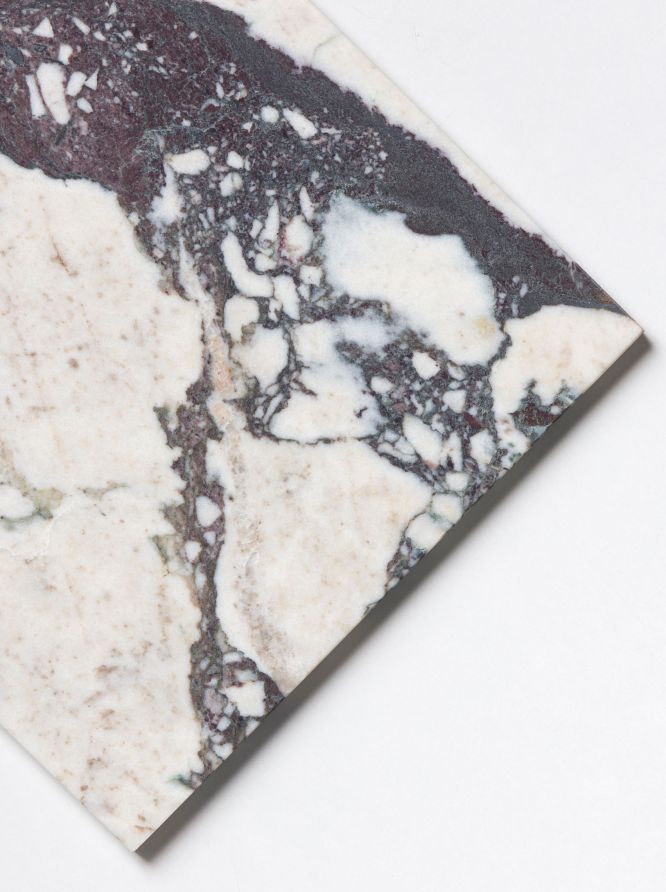
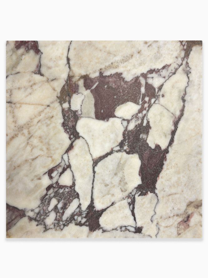
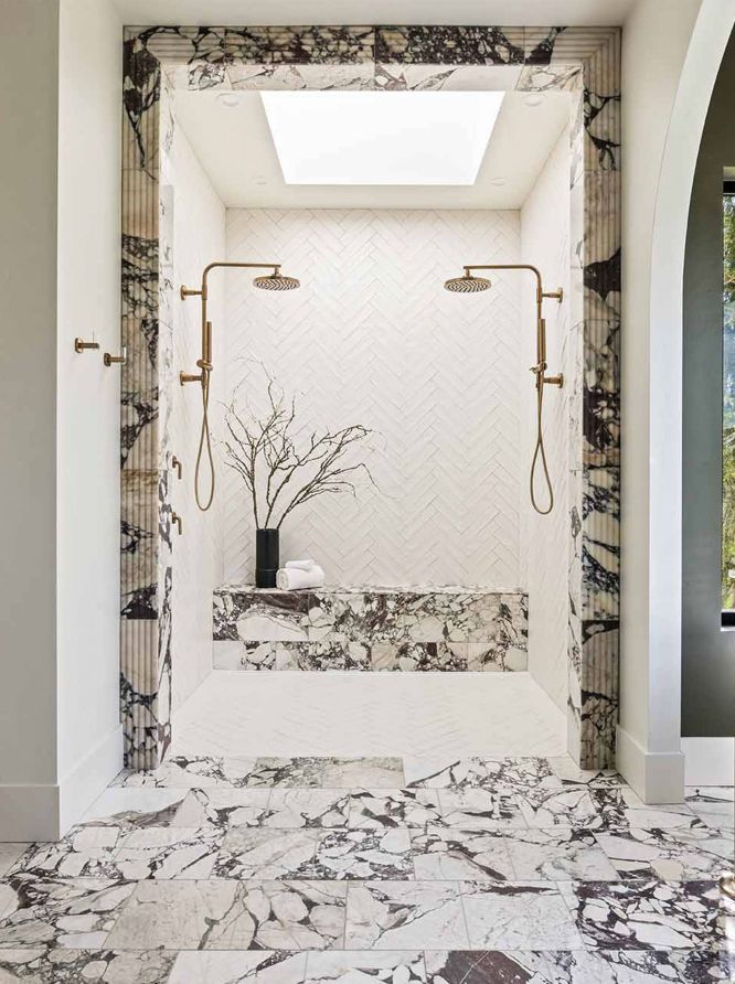
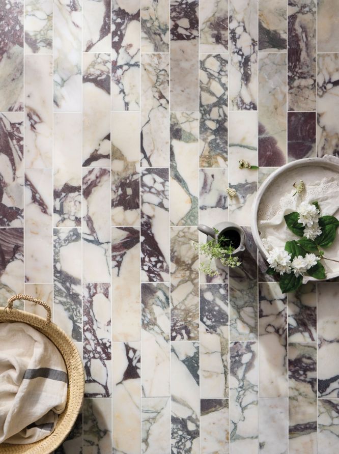
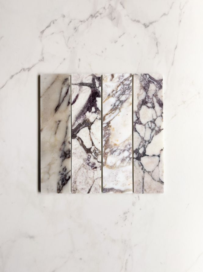
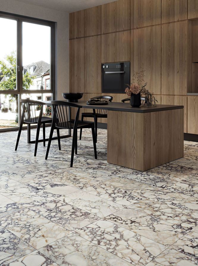
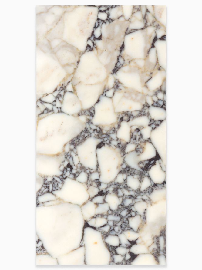
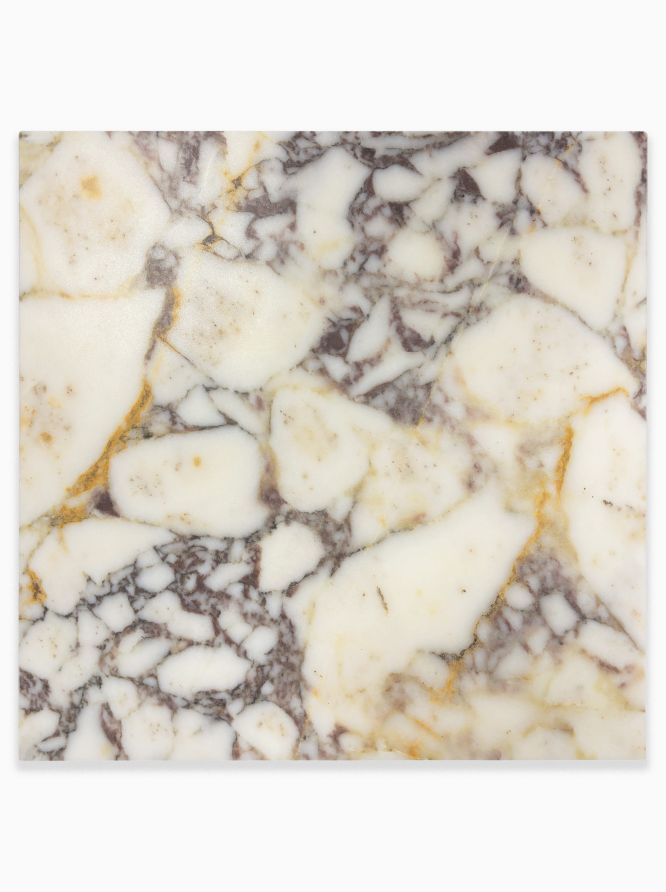
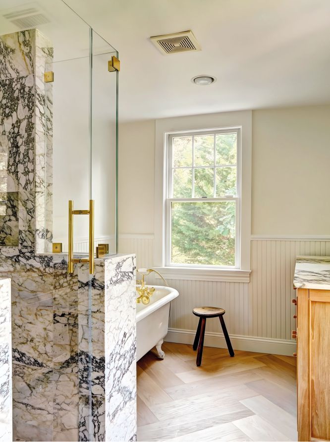
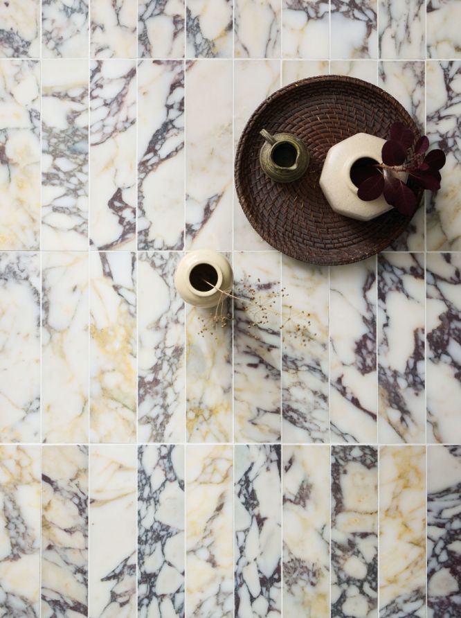
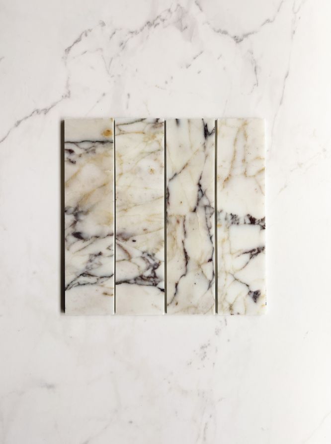
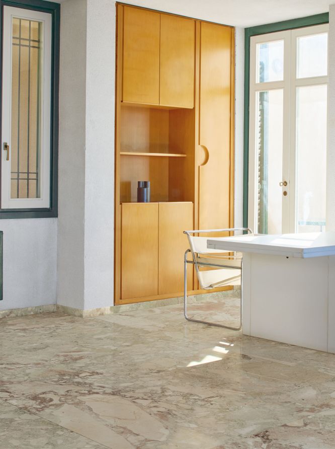
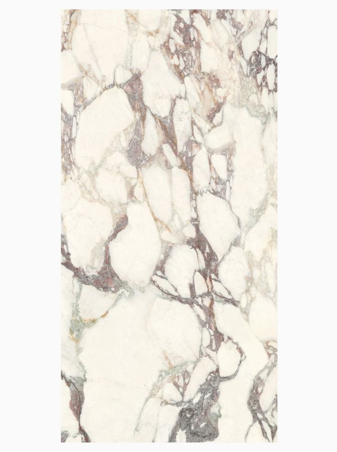
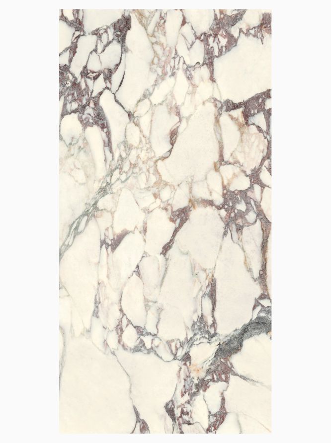
Ranges like Rigoletto and Traviata replicate natural marble with options that have these attractive wine tones in the veining, while fluted collections like Tutti Flutti have cherry toned tiles for wall that reflect light beautifully. Real terrazzo like our Tolentino has some lovely warm reddish colours, while Cornucopia is a porcelain that looks like real terrazzo but with the practicality of porcelain.
-
How can burgundy tiles be used in commercial spaces?
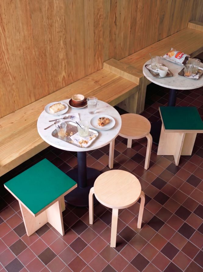
Beyond domestic interiors, these tones work especially well in hospitality spaces such as hotel interiors, restaurants, cafés, and bars where atmosphere is as important as durability. These shades can add warmth to dining spaces, while slightly darker aubergine and oxblood tones bring elegance to reception areas, bathrooms or feature walls.