Back to Burgundy
How burgundy has taken over and where you can incorporate the trend in your home with Claybrook tiles and paint.

Not since the early 1980’s has demand for burgundy and plum shades in interiors been so obvious. Back then, the shade was ubiquitous in fashion from knitwear to outerwear down to shoes and boots. The cover of the Duran Duran music album ‘Rio’ tells you everything you need to know about design of the time. An image of a smiling woman by American illustrator Patrick Nagel is pictured, itself based on an original photograph of the time. Cool, stark but sensual, mysterious; it’s contradictory and utterly contemporary. The hues are naturally in claret and black. Burgundy hues were also being combined with black ash furniture and shades of grey, for what was meant to be an aspirational and urban style of home decorating around the early and mid 80’s. Think yuppies on their enormous mobile phones, power suits, glass fronted stacked hi-fi systems and vases of red plastic tulips.
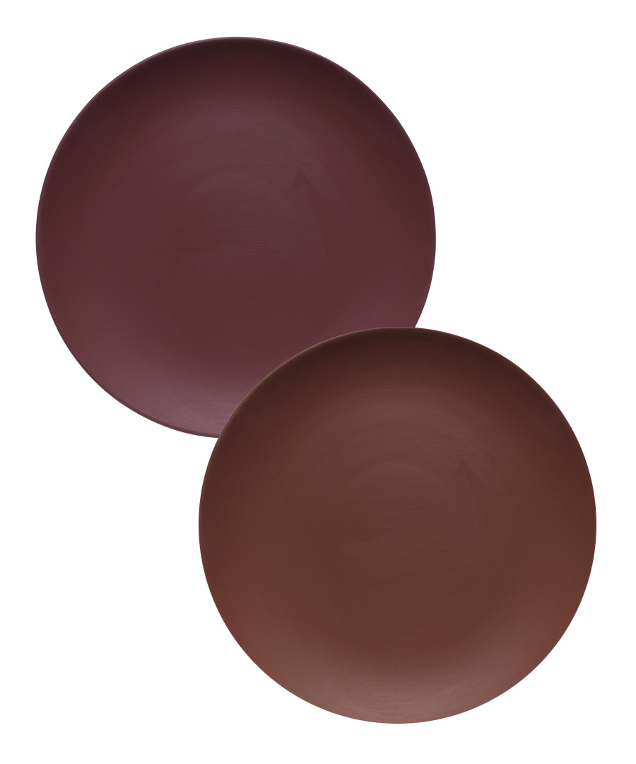
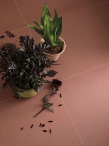
Traditionally used in dining rooms with shimmering candlelight, this red-based burgundy colour is actually quite versatile and comes in a large number of tonal variations. It pairs brilliantly with blush pinks and soft peaches as well as mustard yellows and chocolate browns; even bold cobalt blues and dark greys look great alongside these shades. The flat-lay here shows some of our tile options, and how well they blend together in terms of colour.
A layering of these warmer tones, from terracotta through to oxblood and auburn, can create a room with drama and appeal without being too overpowering.

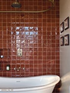
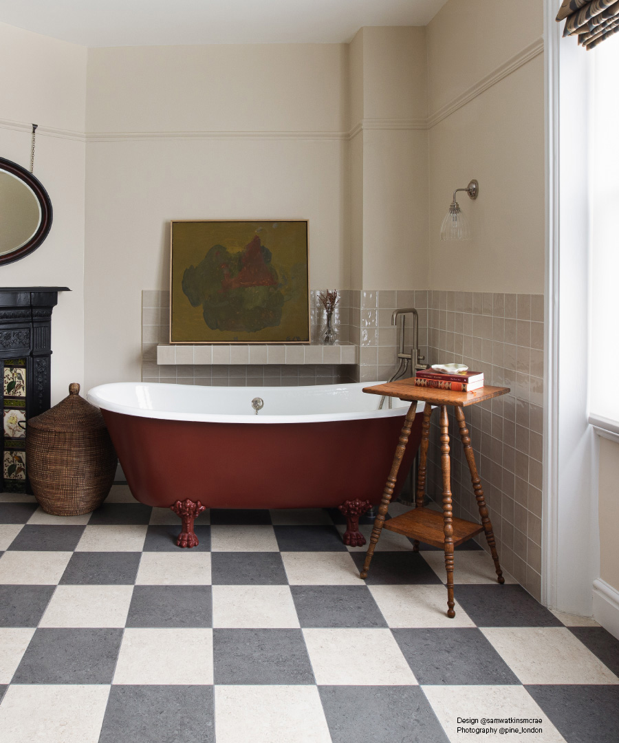
This same bold layering of colours is evident in a number of schemes we’ve designed recently, albeit in concepts with a more toned-down palette, and quite considered when it comes to the quality of materials and finishes. The bathroom here is a good example when it comes to pairing tones in this complementary way. By using our Tan-Tan glazed wall tiles and a neutral wall shade, the look is calm but tailored, with our Cockleshell porcelain on the floor in a chequerboard style. The result is a bathroom just as crafted in terms of layout and design as any other room in the home. Similar maroon paint shades to that used on the bath are available from the vegan-friendly Claybrook Colour paint collection.
New Tutti Flutti Collection
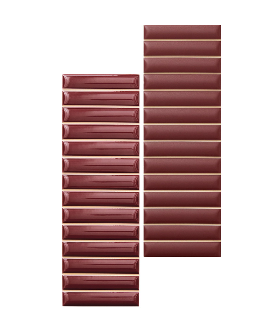
These Italian-designed tiles have a fabulously fluted surface design, perfect for creating walls with a fluid sculptural feel in both matt and gloss options. Relevant to our current fascination with the colour, the tiles also have wonderful shades reminiscent of Bordeaux wine or Claret. The look may have a sense of past decorating styles but the shape, moulded surface and style feels wholly up to date for refurbishment schemes currently underway.
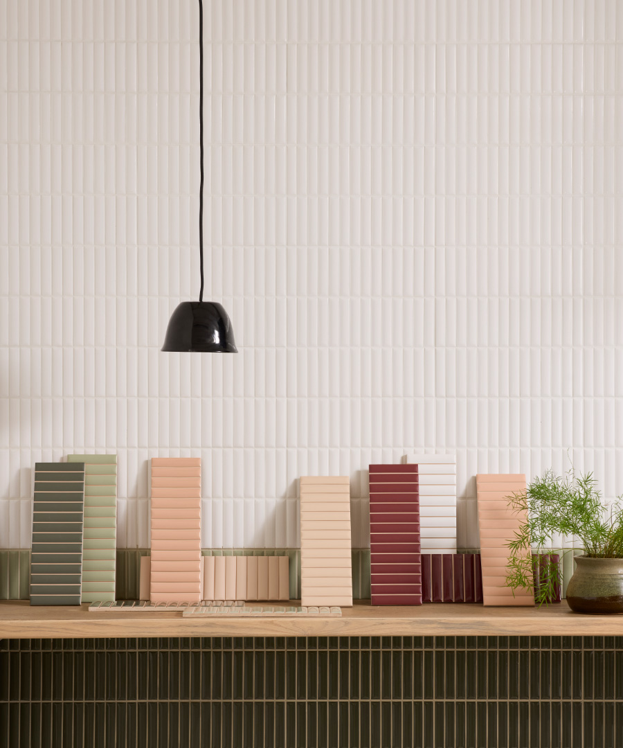
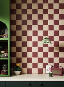
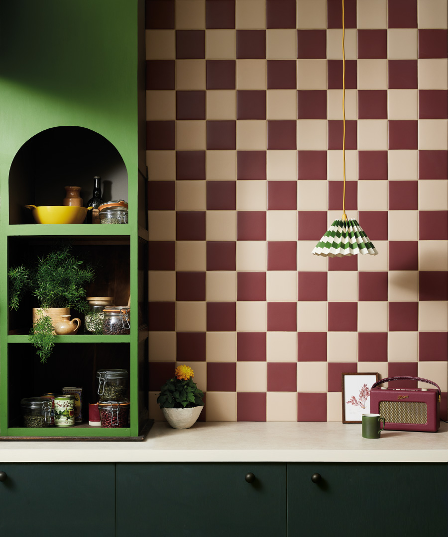
Fusing darker reds with cream or peach colours can create wonderful chequerboard patterns, like the splashback here in two tones of our Kromatic collection. The darker shade adds a sense of depth to the scheme which could be replicated for floors too, as these tiles are wholly suitable for walking on.
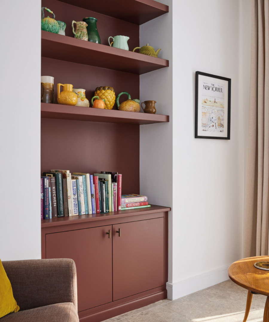
All of these rich burgundy shades from fig and damson hues through to velvety red chocolate tones add warmth and depth, without situating a project in too closed a narrative style.