Adding bravado, with avocado
Shades of green are a great choice, being impactful but liveable, and one tone in particular is something a little special: Avocado green.

How do you pick a colour for your walls or floors that is not white, but is rather more of a statement? Shades of green are a great choice, being impactful but liveable. One tone in particular is something a little special. Avocado green, once synonymous with 1970s kitchens and bathroom suites, has been making a stylish comeback in UK interior design. No longer considered a dated relic, this earthy hue has been reimagined for contemporary spaces. Offering a fresh yet nostalgic alternative as a green kitchen tile or bathroom tile or paint, the hue is deeper than the more neutral palettes that have dominated in recent years.
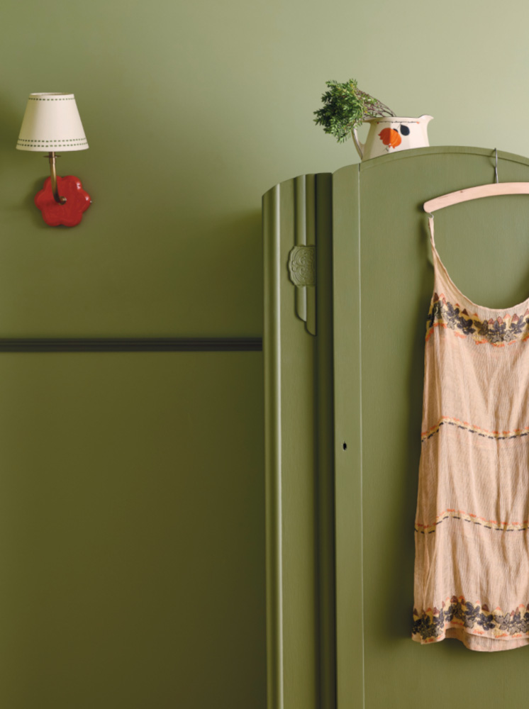

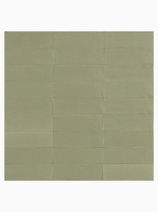
As seen in the space above, in this case the colours Barney Bear and Baby Olive were chosen, green paint is a standout choice for designers and homeowners looking to inject personality and warmth, and to evoke a sense of retro charm without the kitsch. Rather than the glossy avocado appliances of the past, today’s applications favour matt finishes on cabinetry, feature walls, and soft furnishings, pairing wonderfully with peach and apricot tones like the Fellini wall tiles pictured in a fun striped design.
Avocado shades can be complemented with warm pinks and tans.

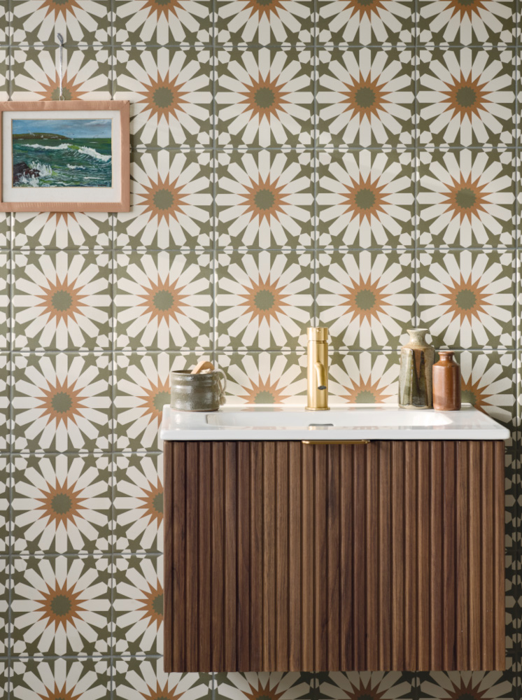
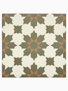
The resurgence of avocado in UK interior design speaks to a broader shift towards colour confidence and a desire for interiors that feel personal, tactile, and enduring. As homeowners continue to move away from stark minimalism, avocado green offers a nostalgic yet modern palette; reflecting a deepening appreciation for comfort, individuality, and timeless design. The decorative tiling seen above, part of our Discotheque patterned porcelain wall and floor tile series, is a good example of how avocado tones can be introduced to schemes without being too dominant. The wall hung unit is the beautiful new Wychwood unit from the Claybrook bathroom series.

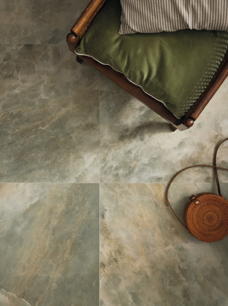
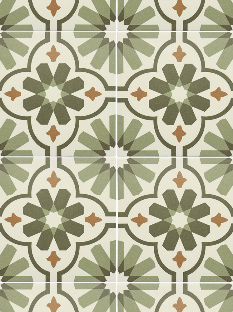
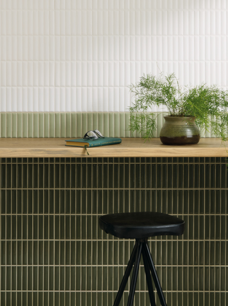
Lighting plays a critical role in how avocado green is perceived. In rooms with ample natural light, it appears fresh and vibrant, while in moodier settings it can take on a more sophisticated, olive-like hue. This chameleon quality means it can be adapted to various interior styles - from bohemian and vintage to modern rustic and urban contemporary. In the UK, where natural light can often be in short supply, colour choice plays a crucial role in shaping the mood and atmosphere of a space. Avocado green, with its mid-tone depth and subtle warmth, provides a grounding and comforting quality that’s particularly appealing, as seen here in the coloured marbleform basin. When paired with soft creams, dusty pinks or taupe and tan, avocado creates a layered, harmonious aesthetic and has the benefit of reducing stress and promoting balance and harmony.

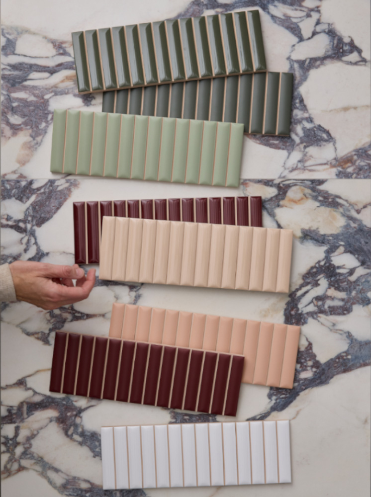
Green works well with bungundy tiles or paints, or paler tones of peach as seen here in both of our Kromatic and Tutti Flutti wall tile collections. Avocado, which comes in myriad shades, is not a mainstream neutral, but it acts like one. Using avocado green can make a space feel unique, curated, and stylish without screaming for attention.
Customer Projects
We get a real kick out of seeing the amazing and beautiful ways in which you have chosen to incorporate our designs into your space. Tag us using #claybrookstudio to share images of your completed Claybrook creations
Click on the images below to shop the look.