Case Study - Kate Spiers
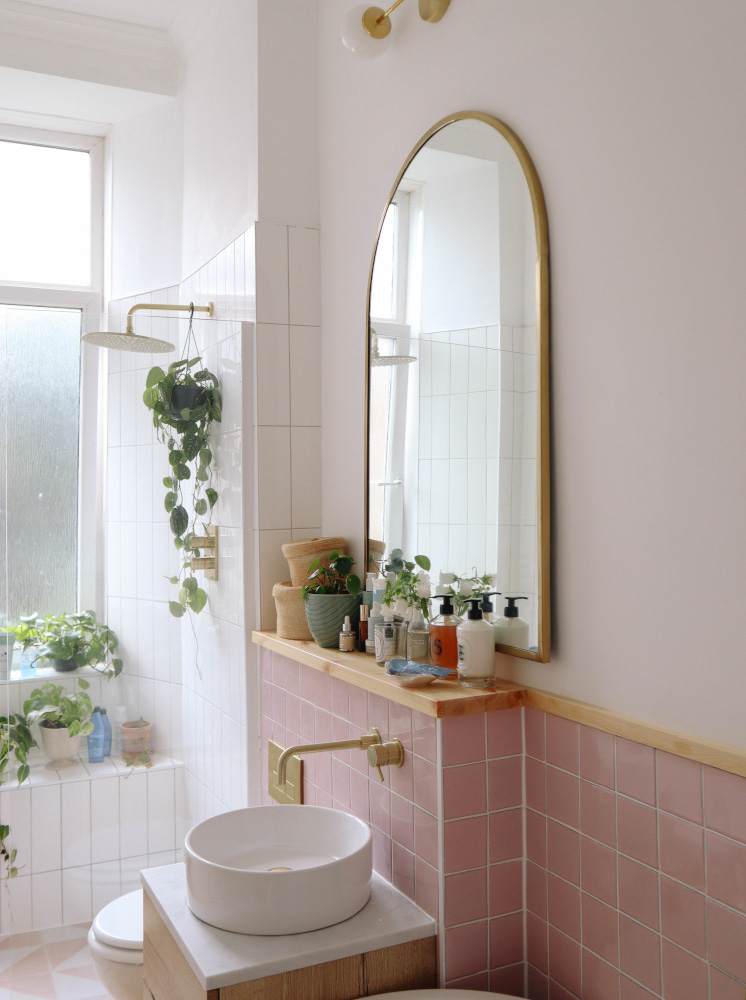
Five years ago, Kate Spiers created the perfect pink bathroom in her home in Scotland; now she's designed another timeless and inviting bathroom.

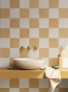
Five years ago, Kate Spiers created the perfect pink bathroom in her home in Scotland. Skip forward to the present, add in two big life changes: a relocation and a baby; and Kate has designed another timeless and inviting bathroom, this time in a delightful chequered yellow and white.
Creative Director Rob Whitaker chatted to Kate about creating home from home in the south.
It doesn’t seem that long ago that home was Scotland for two, in your apartment with the iconic pink bathroom…how times change! What prompted the move to the coast, could it be the addition of a little one?
Oh we were so sad to say goodbye to that beautiful bathroom, I was very tempted to go for pink this time around as it really was such a charming space. But yes, our girly Dahlia arrived and we felt like it was time for a new chapter. So we found a house we loved, right by the sea, and here we are, all settled in our new home!
What are the biggest differences now you’ve relocated?
The weather! We get so much more sunshine down here, it really has made a huge difference. And we have a gorgeous garden now too, so it’s lovely to have that outdoor space - especially with a toddler! We throw open the patio doors and we’re out there all day when the weather is good.
Have you discovered Snoopers Paradise in the North Laine by the way? Any other top tips for secret interiors hideaways in Brighton our readers may enjoy?
Yes, an old favourite of mine. I love it there, always good for a snoop! But my favourite finds are the salvage yards in the outskirts (so good for old doors, sinks and other random finds!), and the incredible Ardingly Antiques Fair which is on every month and is always full of treasures.

Did you choose the new home because of what it looks like now or what it could become? Does it need a lot of work or is it more superficial?
A bit of both - it had great bones but also ticked a lot of boxes for us in that it had the big jobs completed. The garden was thriving, there was a log burner installed and the original details were mostly intact. It was such a beautiful blank canvas, and I knew I could have a lot of fun making it feel like home to us.
We’ve been doing a lot of decorating so far, which has been so much fun. Our bathroom was the biggest job we’ve completed, and it turned out beautifully - it’s my favourite room in the house.
We’ve noticed your use of flower prints both for your fashion and your interiors, is this a new love?
I definitely feel more confident with my interior choices after decorating two properties already - and this time around I’ve made decisions for myself, rather than a potential future buyer. I guess in our last flats, we always knew it was short term (although we did live in our last home for ten years!) so I didn’t go too wild with florals. But in this house, I’ve wallpapered and painted to my hearts content.
Your last home featured some of our tile collections in a quite a visually bold way, has your style changed do you think?
I think I’ve gone for a more traditional, almost vintage, spin this time, maybe it’s because our house is Edwardian or that we’re living down south, but I really have fallen in love with English country home interiors! So while I do still love to have fun with colour and patterns, I think it’s a bit more of a refined way perhaps… although I’ll always, always love chequerboard!
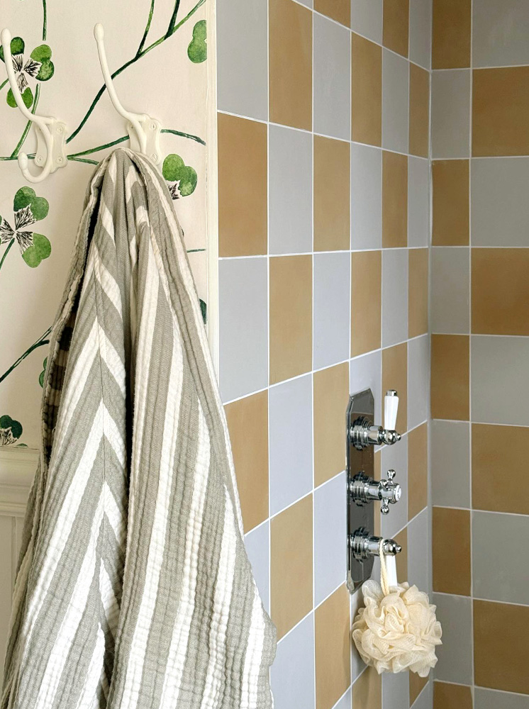
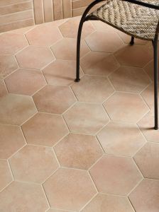
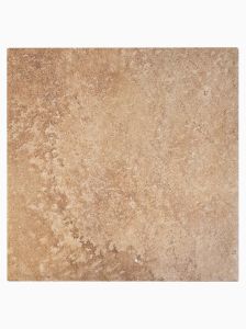
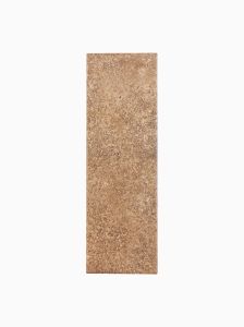
For the new house you’ve chosen both of our Vintage Vibes in a chequerboard design, and Georgetown tile ranges. What made you pick those porcelain ranges this time?
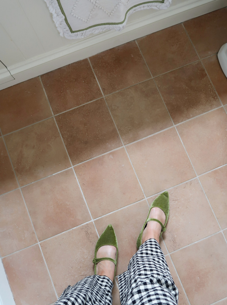
When I thought about what I wanted from a bathroom, I realised I wanted something that felt timeless but fun. I wanted marble surrounds, a vintage-inspired vanity and lots of traditional style fixtures, but with a twist. I originally thought of painting the woodwork yellow to complement the green clover wallpaper, but in the end I decided to inject colour with the yellow tiles. The Vintage Vibes tiles are subtle and added a sunny hit of colour without being too much, and I loved the warmth of the Georgetown tiles - they work so well with the warm and grey tones around the room. I’m also a big fan of a square tile (which you’ll have seen from my last bathroom too!), they just seem so chic to me.

How would you describe the style of this new home?
Floral, fun, timeless, homely!

Do you have a favourite colour combination or do you mix and match from a wide palette?
I really love muted tones, the softer shades that add warmth to a space - I usually reach for soft pale blues, pastel pinks, mellow yellows and muted greens.
Have you considered a career in interior design or fashion, or is it more family and home-based influencing for you for now?
I always love to share a bit of everything, creating content is so fun and I consider myself incredibly lucky to get to do what I do and call it work! Working with incredible brands like Claybrook help me bring my dreams to life, and I hope I can create more beautiful spaces in years to come.
What is your next home project to tackle?
The downstairs loo! I’m thinking green zellige tiles on the wall and a really fun mirror. Teeny tiny WC’s are meant to be fun and a little out there, if you ask me!
Is this your forever home? Or tempted to tackle another big makeover?
Probably not, I think I’ll always be on Rightmove looking for my next project...
Check out @katespiers on Instagram to find out more or visit https://www.katelavie.com/;