Why Green is Always in Style in Interior Design
Green is an enduring colour in homes and interiors and there's a shade for every style.
The enduring beauty of this ever-popular colour
Green is one of those rare colours that feels both timeless and fresh, traditional and modern, familiar yet surprising. It’s a shade that runs the full spectrum of moods—soft sage can feel calm and restorative, while deep emerald reads as glamorous and dramatic. Moss, leaf, olive, mint, forest—green comes in countless variations, each with its own personality and design potential. Little wonder it continues to be one of the most popular colours in interiors, with designers and homeowners returning to it again and again. From North African mosques adorned with intricate tiles to the avocado kitchens of the 1970s, green has a history of shaping the spaces where we live, gather, and celebrate. And in today’s design world—where natural influences and soothing palettes reign—green feels more relevant than ever.
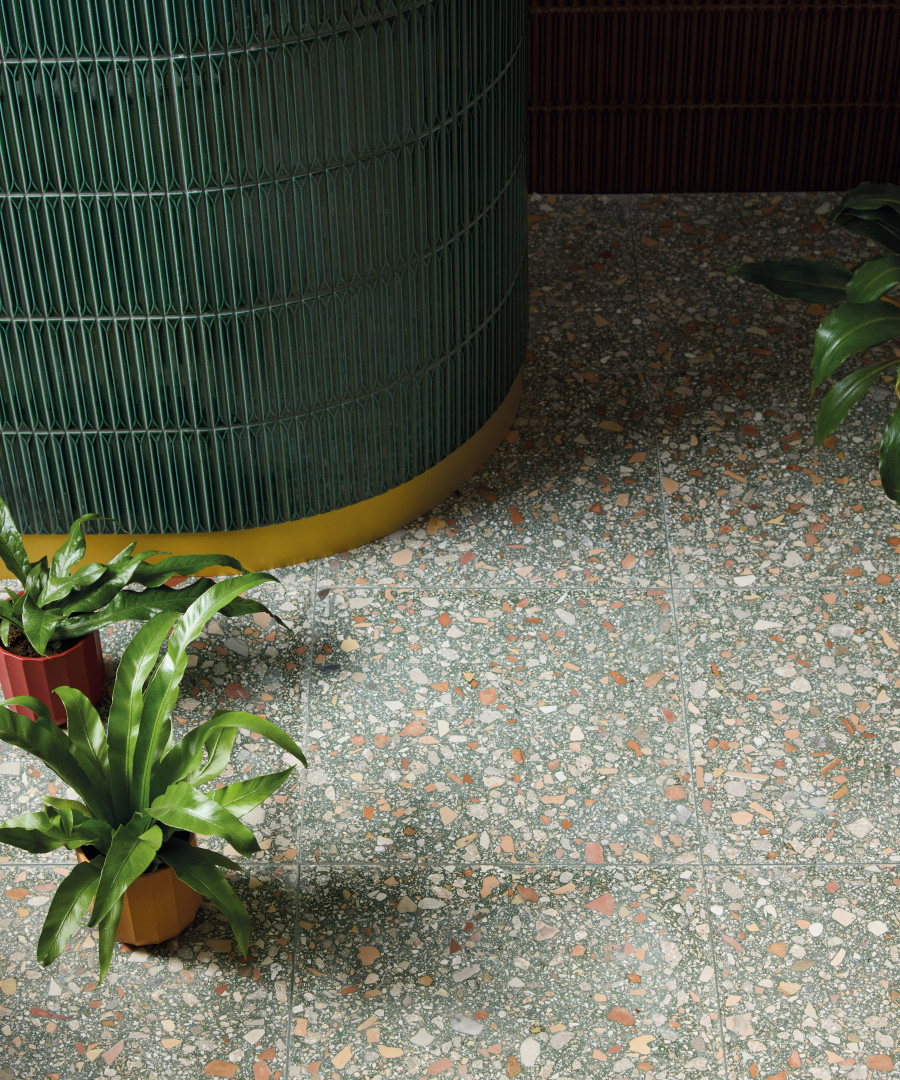
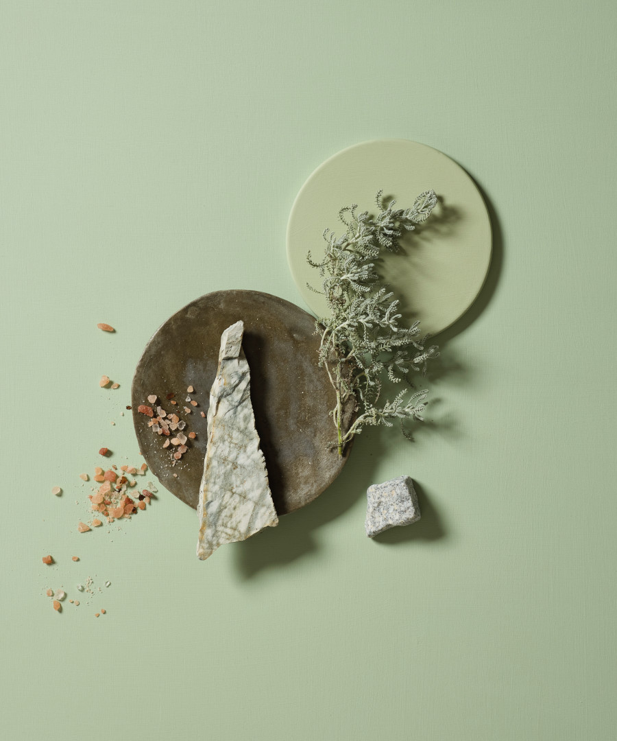
Part of green’s enduring appeal comes down to the simple fact that it connects us to nature. Step outside and it’s the colour we see most in the UK—grass, leaves, moss, forests. At least in this country, where our rain and short summer season ensure that verdant spaces abound almost year-round. Likewise, in hotter zones south of the equator colours like rich rusty red, chocolate brown and sand are ubiquitous for interiors because those are the shades of the local environment. Bringing these greener hues indoors helps create a sense of calm, balance, and restoration. Psychology research even suggests that green promotes focus and reduces stress, making it a powerful choice for living rooms, bedrooms, and even workspaces. In interiors, this natural link plays out in subtle but transformative ways. A sage green wall can instantly soften a room, while a leafy patterned cushion or ceramic vase adds a sense of vitality. Unlike bolder, trend-driven colours, green feels grounding and enduring—it never overwhelms, even when used generously.
Part of green’s enduring appeal comes down to the simple fact that it connects us to nature.
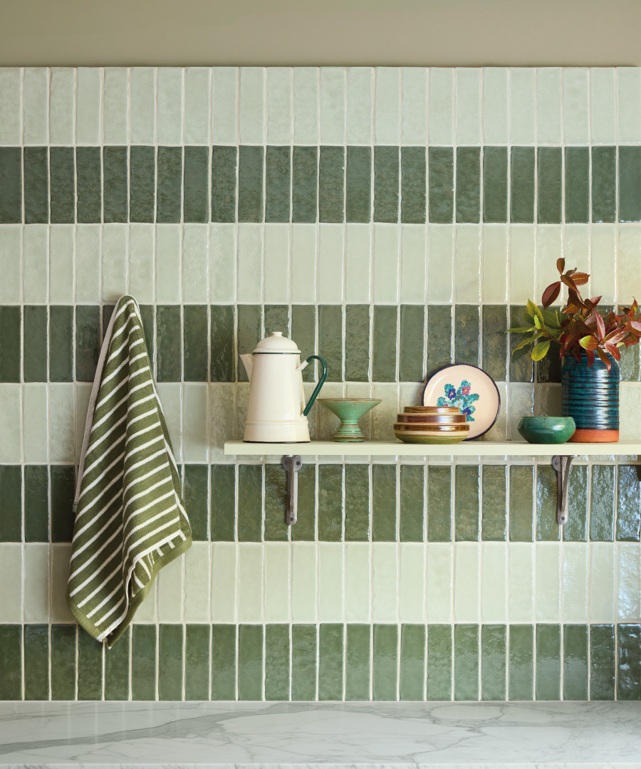
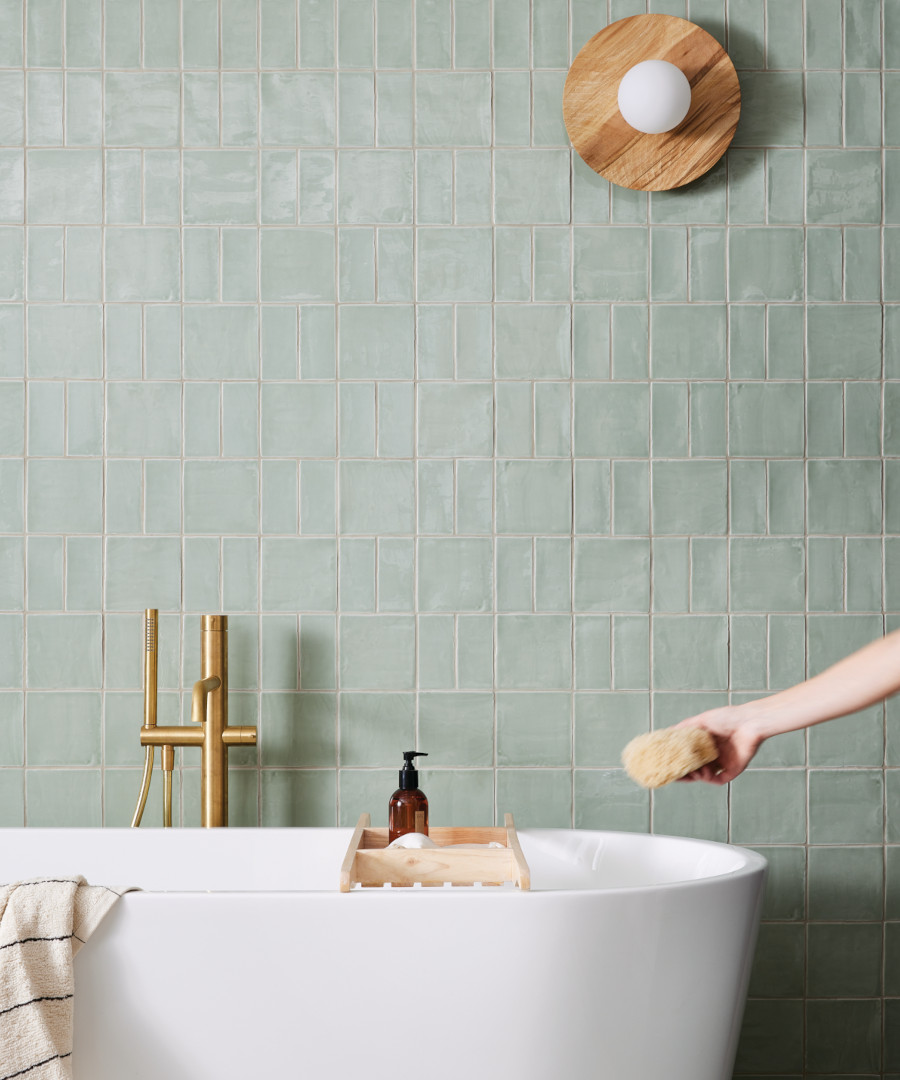
Historically, green has also carried layers of symbolism. In Islamic art and architecture, it is associated with paradise and renewal. Across North Africa, deep greens have been used for centuries in mosques and significant buildings, lending a sense of dignity and continuity. One of the most beautiful expressions of this tradition is the Moroccan zellige tile. These handcrafted glazed tiles, often in jewel-like greens, shimmer with depth and variation. Used across walls, floors, courtyards, and fountains, they embody both artistry and symbolism. Today, zellige tiles remain hugely popular in contemporary interiors—not just for their cultural heritage, but because their imperfect, handmade finish feels rich, textural, and alive. A wall of emerald zellige in a kitchen or bathroom instantly turns the space into a statement.
One of green’s superpowers is its range. There’s truly a shade for every style of home.
Green had another big moment in the late 1970s, when avocado kitchens became a design signature and wallpaper, carpets, and upholstery leaned into olive, moss, and leafy prints. Furniture in deep green velvets, ceramics in glazed jade, and even clothing echoed the obsession with the shade. It wasn’t just a passing fad. Green in the ’70s reflected a growing environmental awareness—people were looking for ways to reconnect with the natural world during a time of social change. Just tune in to a 1978 episode of the BBC’s classic sitcom The Good Life; and you will witness layer upon layer of green clothing, green and mustard interior design and of course a very green garden. What’s interesting is how cyclical design can be: today, avocado and olive tones are back, but in fresher ways—paired with warm woods, natural fibres, and soft neutrals rather than the heavy patterns of mid-century décor.
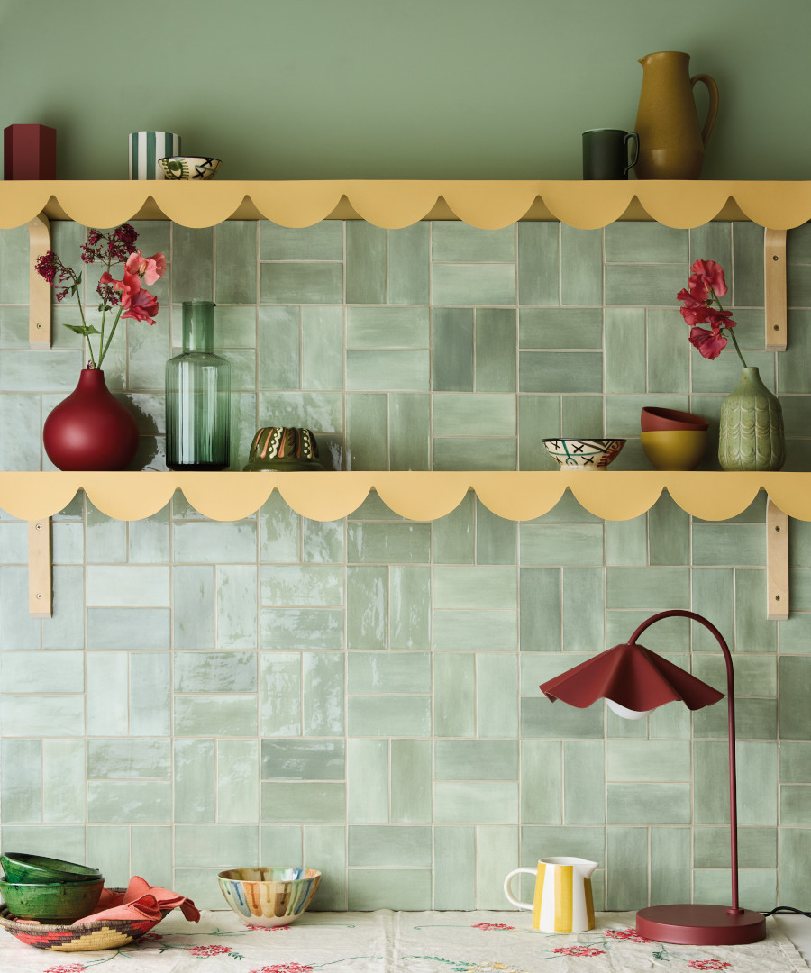
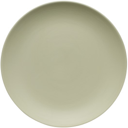
One of green’s superpowers is its range. There’s truly a shade for every style of home: eucalyptus is soft, muted, and perfect for calm bedrooms or minimalist kitchens; moss and olive are earthy and grounded, great for rustic or mid-century inspired spaces; emerald and forest are deep, dramatic, and luxe, ideal for velvet sofas, feature walls, or cabinetry; while leaf and mint are light, playful, and fresh, working beautifully in bathrooms or as accents in bright, airy rooms. Each shade shifts the mood, but all retain that underlying sense of harmony. Green doesn’t shout; it soothes.

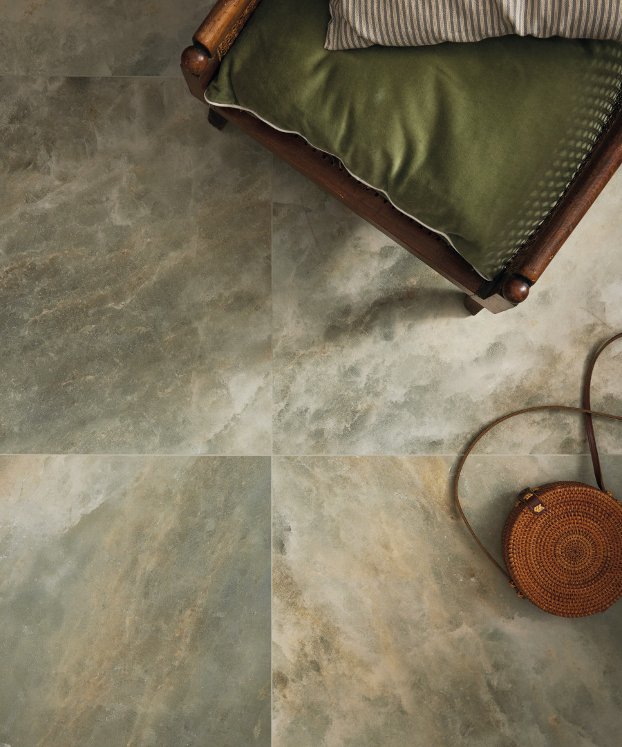

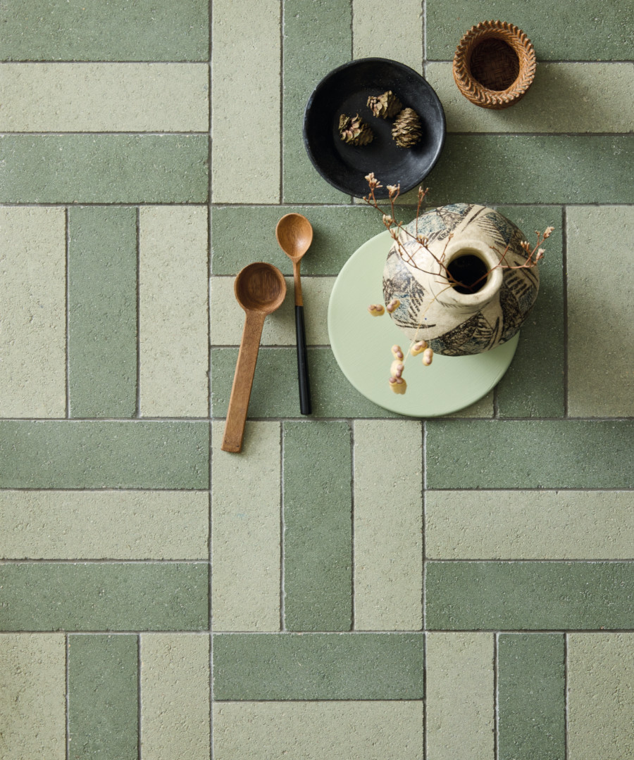
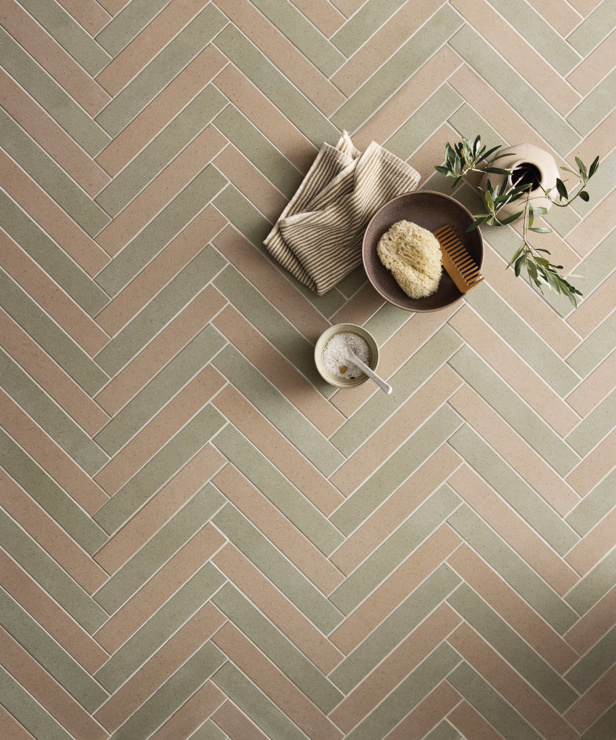
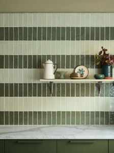
Tiles are one of the most striking ways to bring green into the home. From glossy zellige-style glazed wall tiles to durable porcelain, green tiles work beautifully across both walls and floors. Paired with white, they can be laid in chequerboard patterns that feel playful and graphic, a look that works just as well in modern kitchens as it does in classic hallways. Longer glazed brick tiles in green shades are also popular, especially when arranged in herringbone patterns across walls, creating movement and texture while showing off the richness of the glaze. In bathrooms, a sea of emerald tiles feels jewel-like and cocooning, while in kitchens, a green splashback adds a gentle wash of colour without overwhelming the space. On floors, deep green encaustic or glazed tiles bring drama and depth, especially when balanced with neutral plastered walls or warm-toned woods. Paint and wallpaper also offer endless opportunities. A room wrapped in leafy patterned wallpaper immediately feels alive, while a single mossy-green wall adds cosy intimacy. For those hesitant to commit, accessories like ceramics, cushions, or rugs in varying shades of green provide just the right touch of freshness.

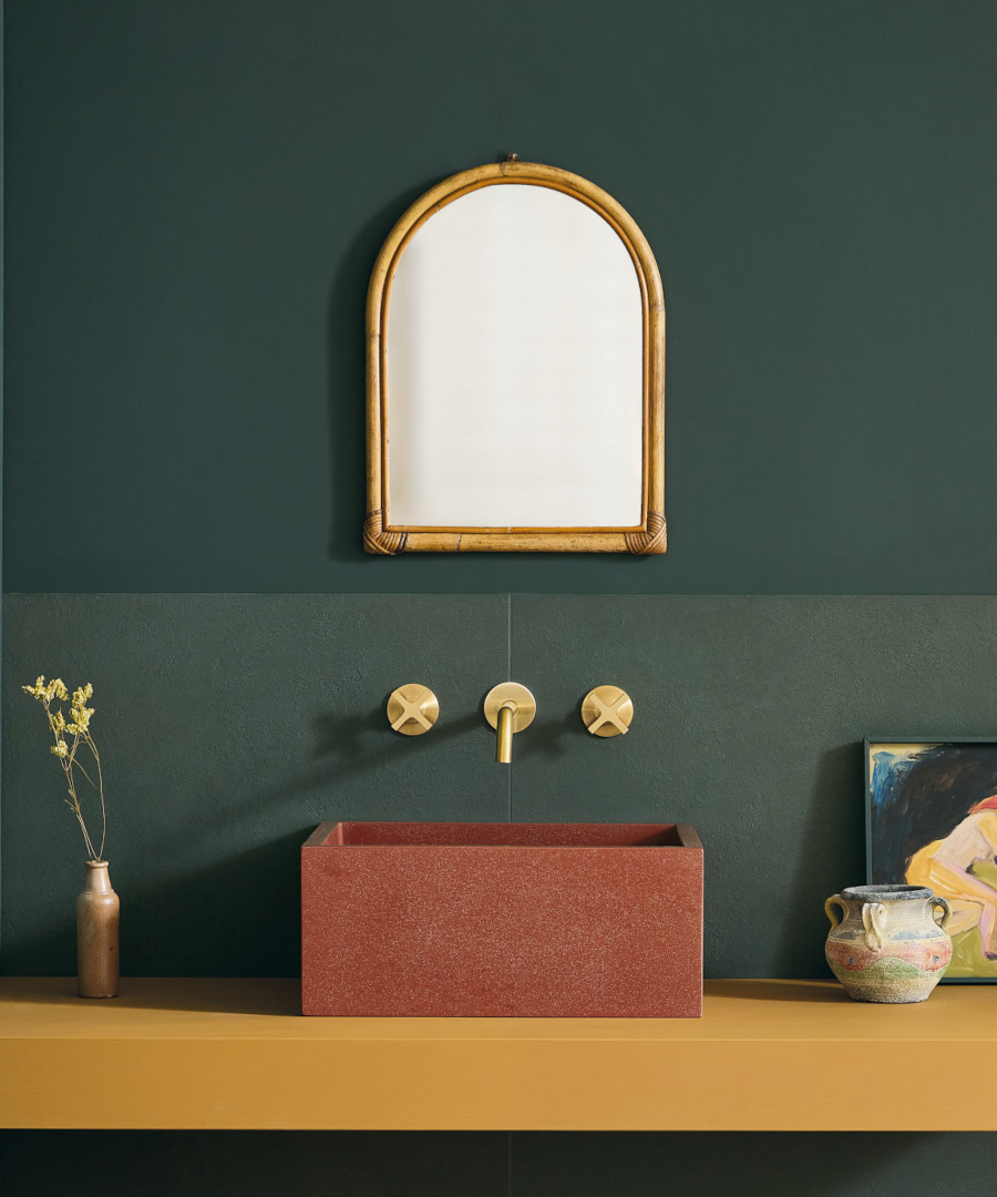

Another reason green remains so enduring is the way it pairs with other shades. It works beautifully with blush pink for a soft, romantic look, while apricot and terracotta highlight its earthy side. Creams and buff tones provide a neutral backdrop that allows green to take centre stage without overwhelming a space. For a touch of luxury, emerald or forest green alongside brass or gold feels opulent and timeless. These combinations give green endless lives—soft and airy in one setting, rich and dramatic in another.
From 1970s wallpaper to centuries-old Moroccan courtyards, green has proven itself as more than just a passing trend. Its popularity endures because it works on so many levels: it’s grounding and restorative, versatile in shade and style, and culturally rich in meaning.
We are even working on adding a number of new greens to the Claybrook Colour paint palette, which itself can be described as ‘green’, being eco-conscious and vegan-friendly. Even though we already have a series of lovely options in the portfolio, we can’t get enough of green and these gorgeous new shades will launch late in 2025.
In today’s interiors—where people crave calmness, authenticity, and a touch of nature—green feels like the perfect answer….still.
-
 Bungalow 22 Lawn Green Small Brick£0.43 eachTotal Price £0.43 total
-
-
-