Chequerboard Tile Patterns
Checkerboard tiles are having a moment. Then again, perhaps they never really left.
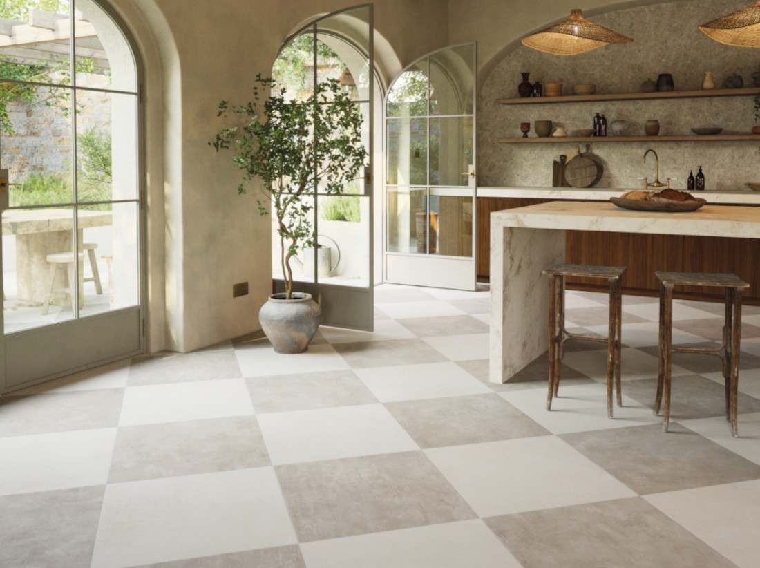
Look closely and you’ll find them everywhere: beneath your feet in grand Georgian hallways, across the floors of old Mediterranean kitchens, in country-house boot rooms and tucked behind the basins of bathrooms that have embraced a little more pattern. They can be formal or relaxed, nostalgic or modern, restrained or wonderfully bold. All from the deceptively simple arrangement of alternating squares.
That is the great trick of checkerboard tiles… or is it chequerboard… either spelling will work. Change black for chalky cream, stone for porcelain or large squares for tiny glazed tiles and suddenly you have an entirely different story. A traditional black-and-white checkerboard floor can feel almost architectural in a London townhouse; softly contrasting limestone brings the laid-back character of a Cotswold country house; while warm terracotta and ivory take the pattern somewhere altogether sunnier.
At Claybrook, we love the way tiles can do this. The format may be familiar, but the combination of colour, material, finish and scale can completely alter the atmosphere of a room at home or in a business. Checkerboard is less a single look than a starting point, one that can take you from grand entrance halls to Mediterranean kitchens, from retro red-and-white walls to quietly beautiful cream and taupe schemes.
Make an entrance
Few things announce an entrance quite like a checkerboard floor. In a Georgian townhouse, black and white tiles feel entirely at home alongside tall ceilings, cornicing, panelled doors and heritage furniture pieces. Think Eaton Square or Chester Square in London, where a strong geometric floor can hold its own against the architecture without needing much else to make an impression.
Classic black and white checkerboard tiles remain one of the most recognisable combinations, but there is no need to make the contrast quite so stark. Pairing two softly contrasting neutrals can give a checkerboard floor a gentler quality, particularly in a period property where you want the tiles to feel as though they belong there rather than looking newly installed.
Claybrook’s porcelain floor tiles offer another way to capture this traditional character while providing the durability needed for busy areas. Larger-format checkerboard tiles can create a calmer, more modern effect in generous hallways and open-plan spaces, while smaller squares can feel more traditional and decorative, perhaps a little homelier too.
The scale of the pattern can make just as much difference as the colour. Large squares have a confident architectural quality; smaller checkerboard floor tiles feel more intricate and old-world traditional.
The Country-house Checkerboard
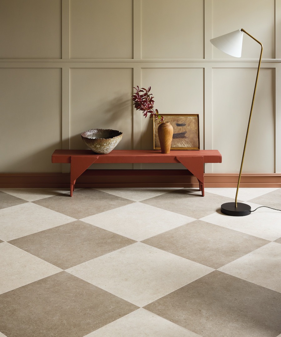
Natural stone tells a different story. Picture the entrance of a Cotswold manor, with limestone squares leading towards an old staircase, a flagstoned passage or a room filled with generations of furniture and art. Here, a little irregularity is part of the appeal. Subtle differences in tone and texture stop the geometry from feeling overly precise and give the floor a sense of history. Limestone checkerboard works particularly well with old fireplaces, oak doors, antique pieces and the everyday objects that accumulate in a much-loved house.
The same approach can be surprisingly effective in kitchens and utility rooms. Larger homes have always had spaces designed around work rather than entertaining, like the buttery, creamery, scullery or kitchen at the back or in the basement of these grander homes. A floor in soft cream and taupe can nod to that history without turning the room into a period recreation. It is also an area where porcelain comes into its own. Hardwearing and easy to live with, it allows the checkerboard to move beyond the entrance hall into spaces that have to cope with muddy boots, cooking, children and all the other realities of daily life.
Villino (below) makes for a cheerful chequerboard, while Allaperto (right) has a more subtle, modern feel.
Checkerboard moves onto the wall
There is no reason to keep the pattern underfoot. Checkerboard wall tiles bring a more decorative quality, particularly when small glazed formats are used. A square tile creates a crisp grid, while a brick shape gives the pattern a more unusual rhythm. Larger formats make a bold statement behind a kitchen island or sink; smaller tiles can introduce a finer pattern across a bathroom or splashback.
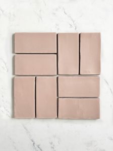
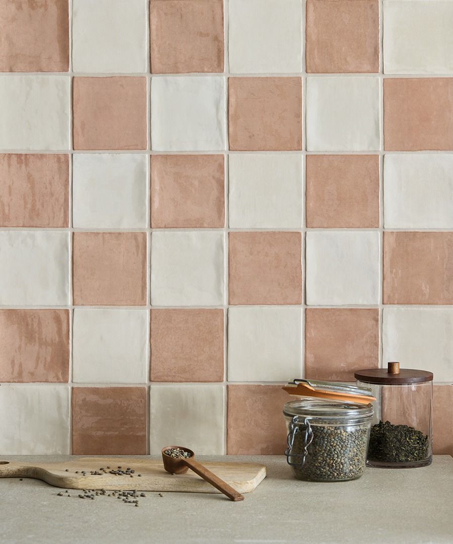
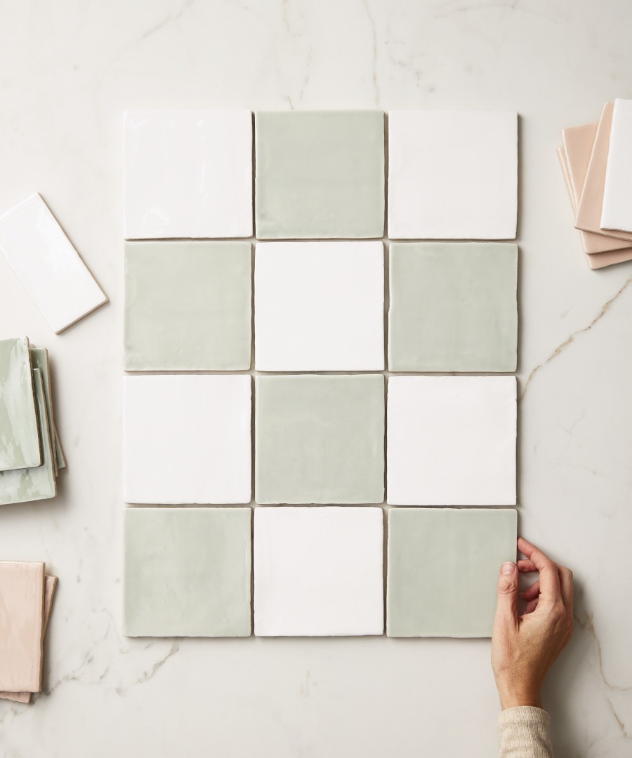
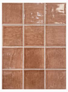
This is also where glaze can make a considerable difference. Claybrook's Tan Tan (pictured below), for example, has the gently undulating surface associated with zellige tiles. Used in alternating tones, the irregular glaze catches the light from tile to tile, so the checkerboard has plenty of movement without needing an elaborate layout.
It is a useful reminder that checkerboard doesn't have to mean rigid perfection. A handmade quality can make the pattern feel much more relaxed and allow the surface itself to become part of the design.
A warmer, nostalgic take
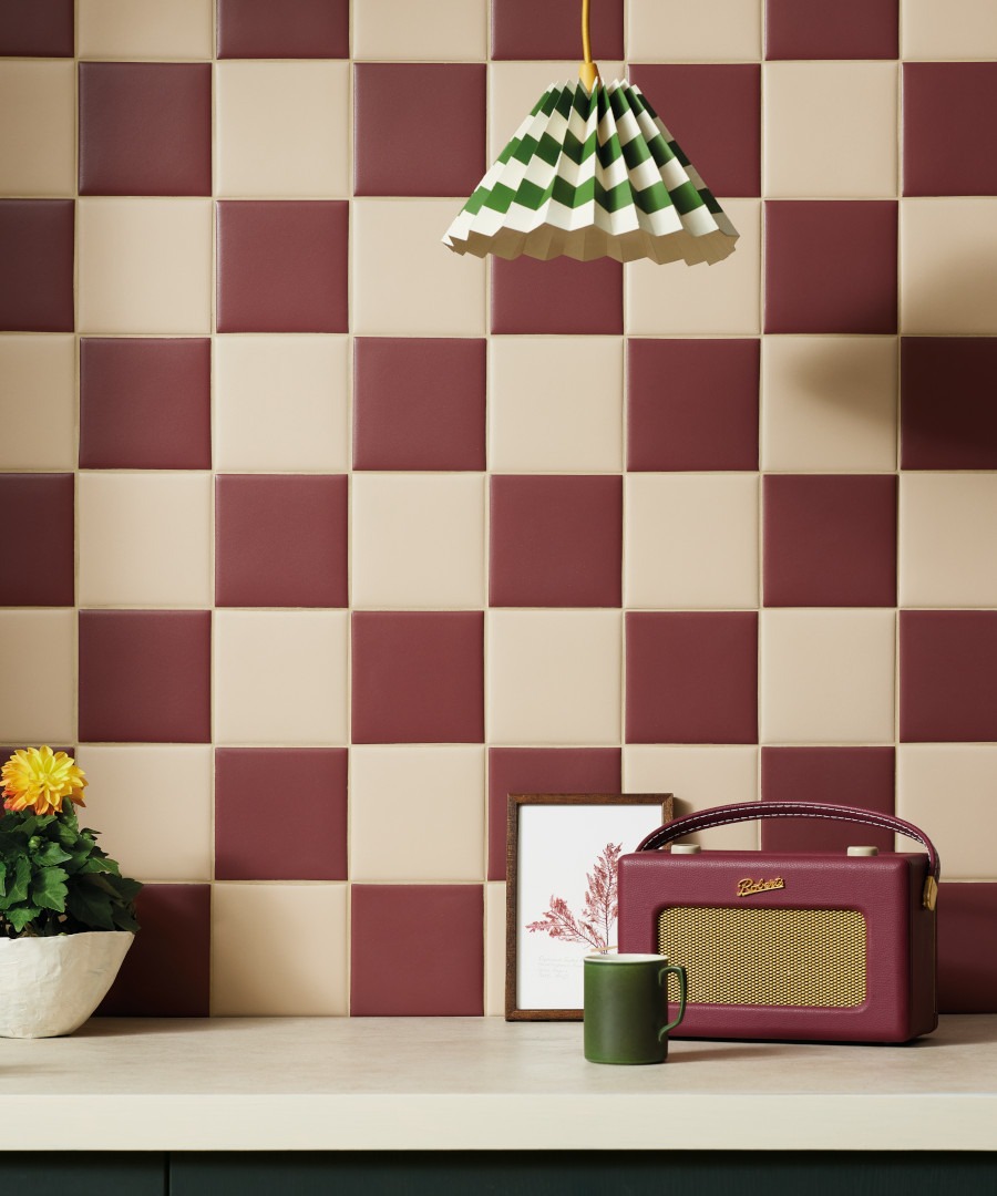
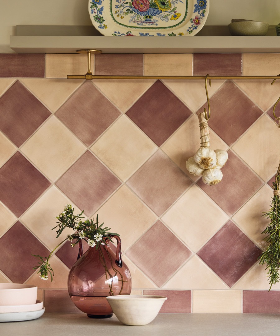
Colour can take checkerboard in an entirely different direction. Bungalow 22 is a natural starting point for a warmer interpretation. Its palette lends itself to combinations of dusty pink, wine, peach and other sun-baked shades, recalling the colours found in old villas, holiday apartments and kitchens with a distinctly country spirit.
Rather than using two colours with an exact, high-contrast relationship, try combining shades that have a little variation between them. The result can feel more collected and less graphic, particularly alongside aged brass, stone, ceramics and natural plaster.
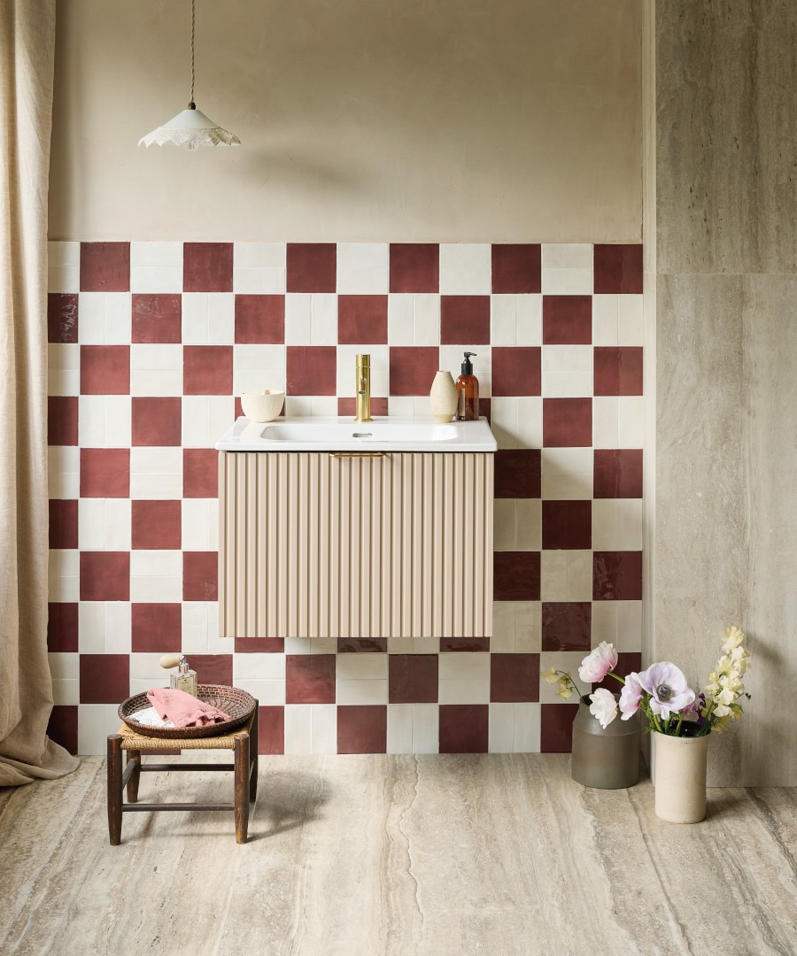
For something with a touch more retro energy, red and white is hard to resist. It immediately brings to mind 1950s kitchens, traditional cafés and old-fashioned sweet shops. Choose a deeper red and a softer white and the combination becomes surprisingly sophisticated.
Or try blues and blacks
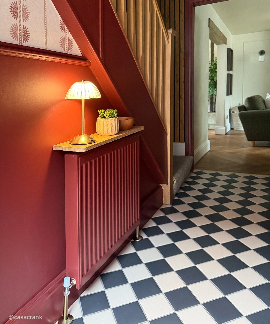
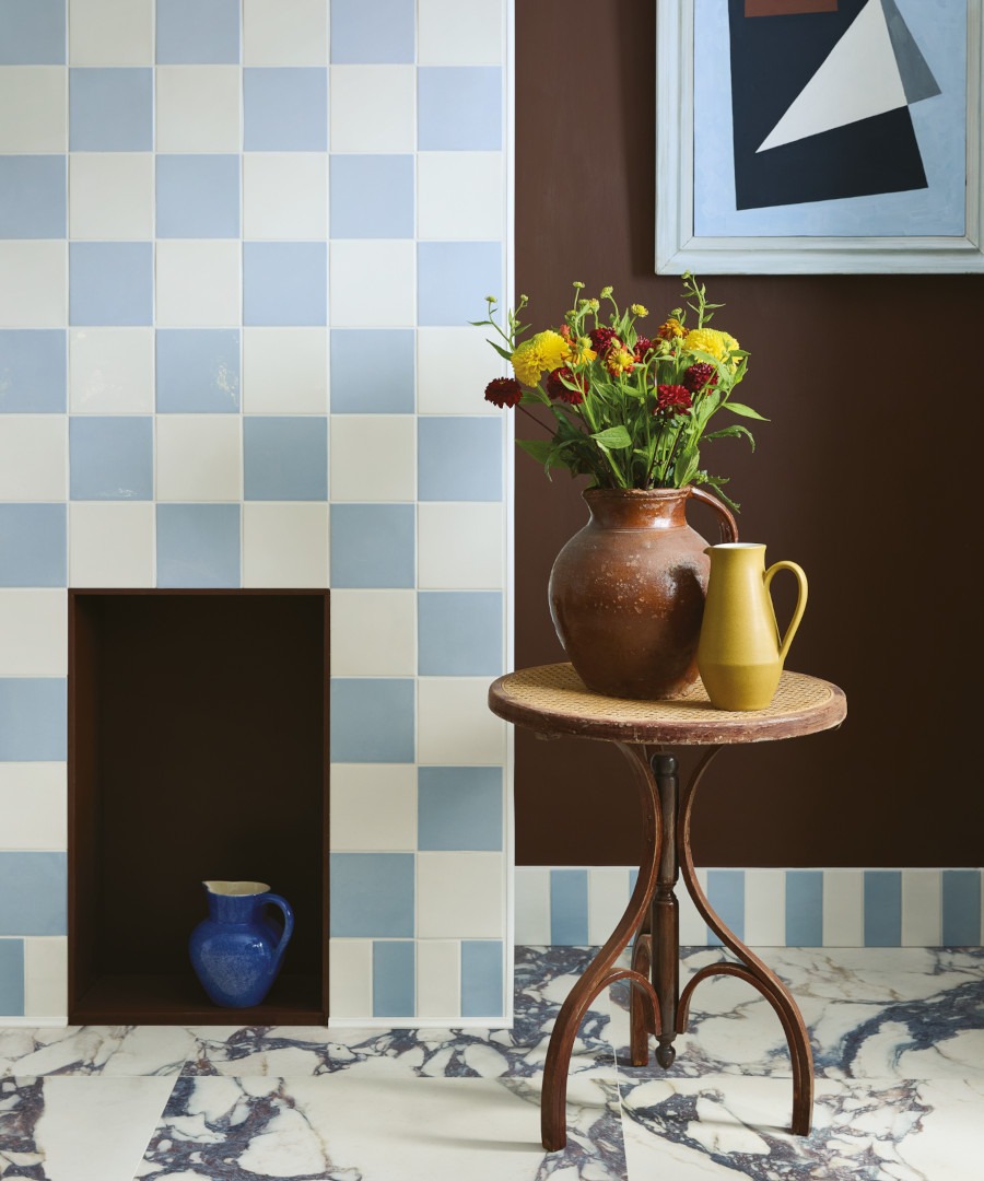
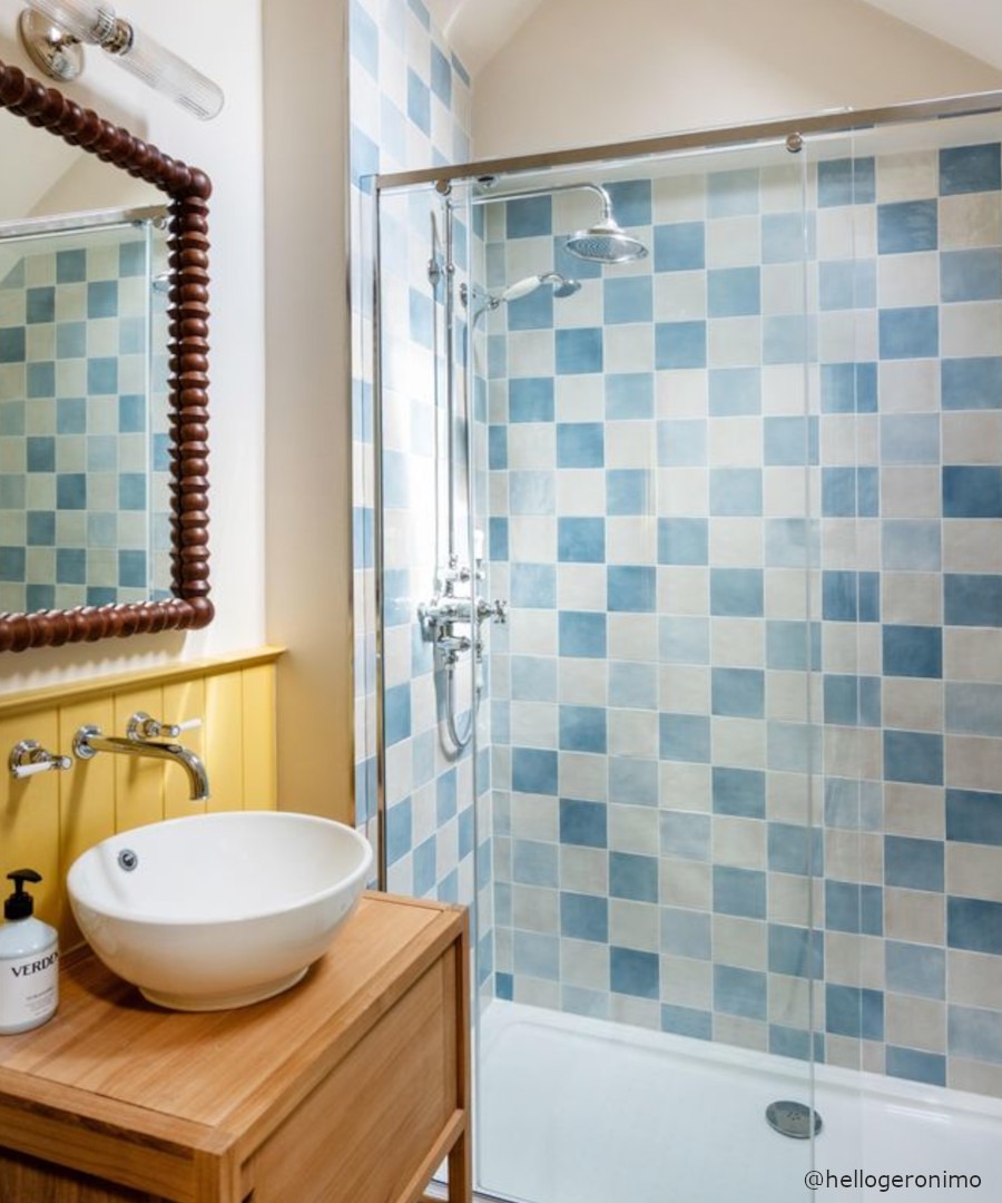
Blue and white gives the checkerboard a fresher character. It works particularly well in bathrooms and kitchens, where a softened blue can bring to mind seaside houses, painted shutters and the slightly faded colours of a summer holiday. Then there is black and white — the combination that needs no introduction. On a hallway floor, it can be wonderfully theatrical, particularly in a Victorian or Georgian house. Used with restrained surroundings, the pattern does much of the visual work itself.
Black and white checkerboard tiles aren't confined to period properties alone. In a modern bathroom or kitchen, they can provide a strong graphic element against plain walls and modern fittings. The contrast makes the familiar pattern feel crisp rather than nostalgic. Just look at the work of designer Beata Heuman for inspiration in this regard.
Idillio Sky and White make an attractive blue and white chequerboard chimney, while Bungalow 22 Pool Blue and Moorish White are a perfect combination for a classic bathroom style.
Playing with scale
One of the easiest ways to change the effect of checkerboard tiles is to change their size. Large-format squares can make a generous floor feel calm and architectural, while smaller tiles produce a busier, more traditional effect. On walls, small glazed squares can create an intricate pattern around a basin or splashback, whereas larger tiles give the arrangement more visual impact.
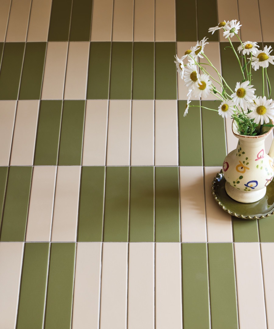
The shape can change things too. Brick-shaped tiles arranged in alternating colours create a looser interpretation of checkerboard, while square tiles give the most recognisable version of the pattern. There is no need to cover an entire room, either. A tiled panel behind a cooker, a section of bathroom wall or a defined entrance can be enough to introduce the idea without allowing it to dominate. It can also help to keep costs down if you have a particularly special tile.
The harlequin effect
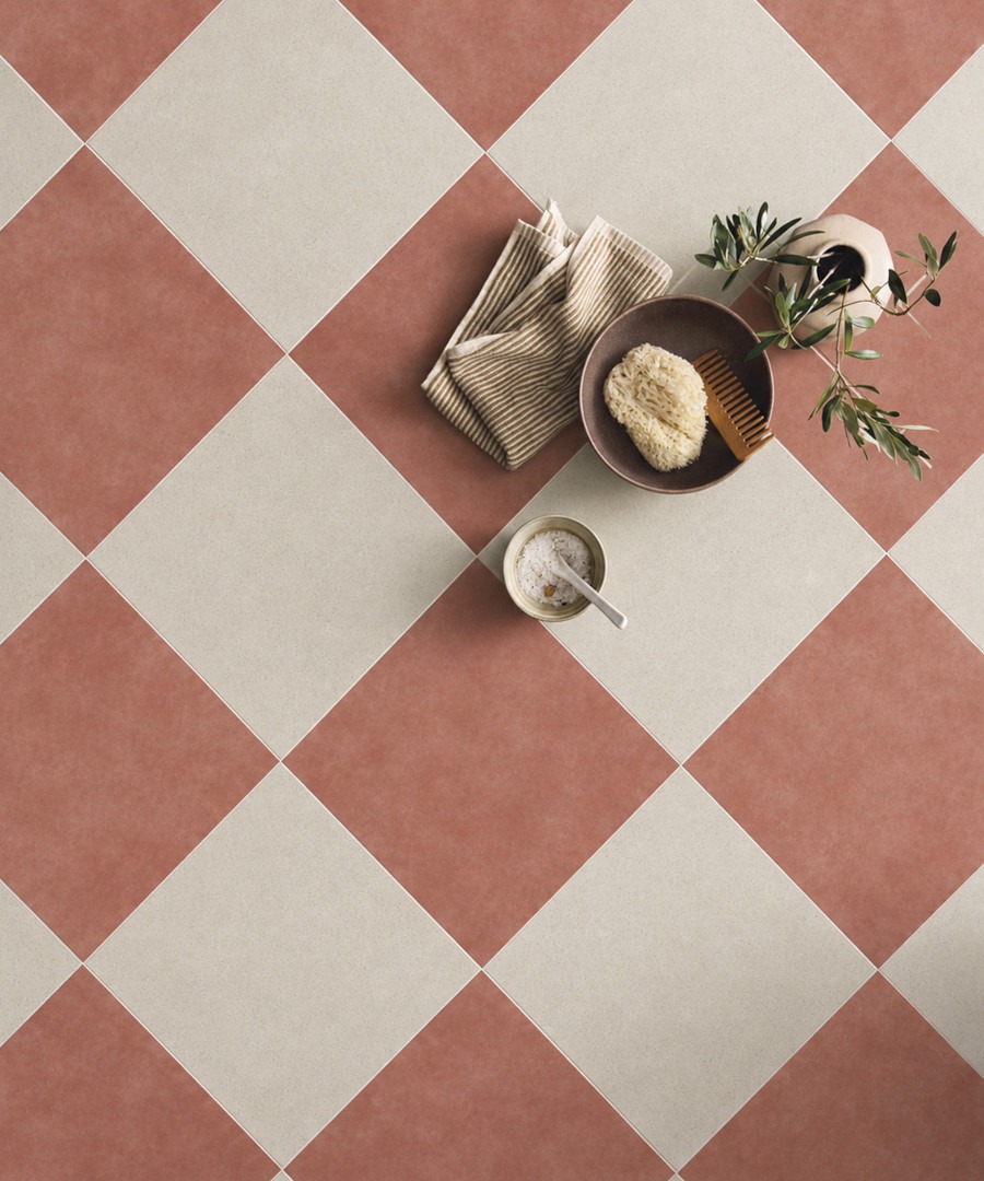
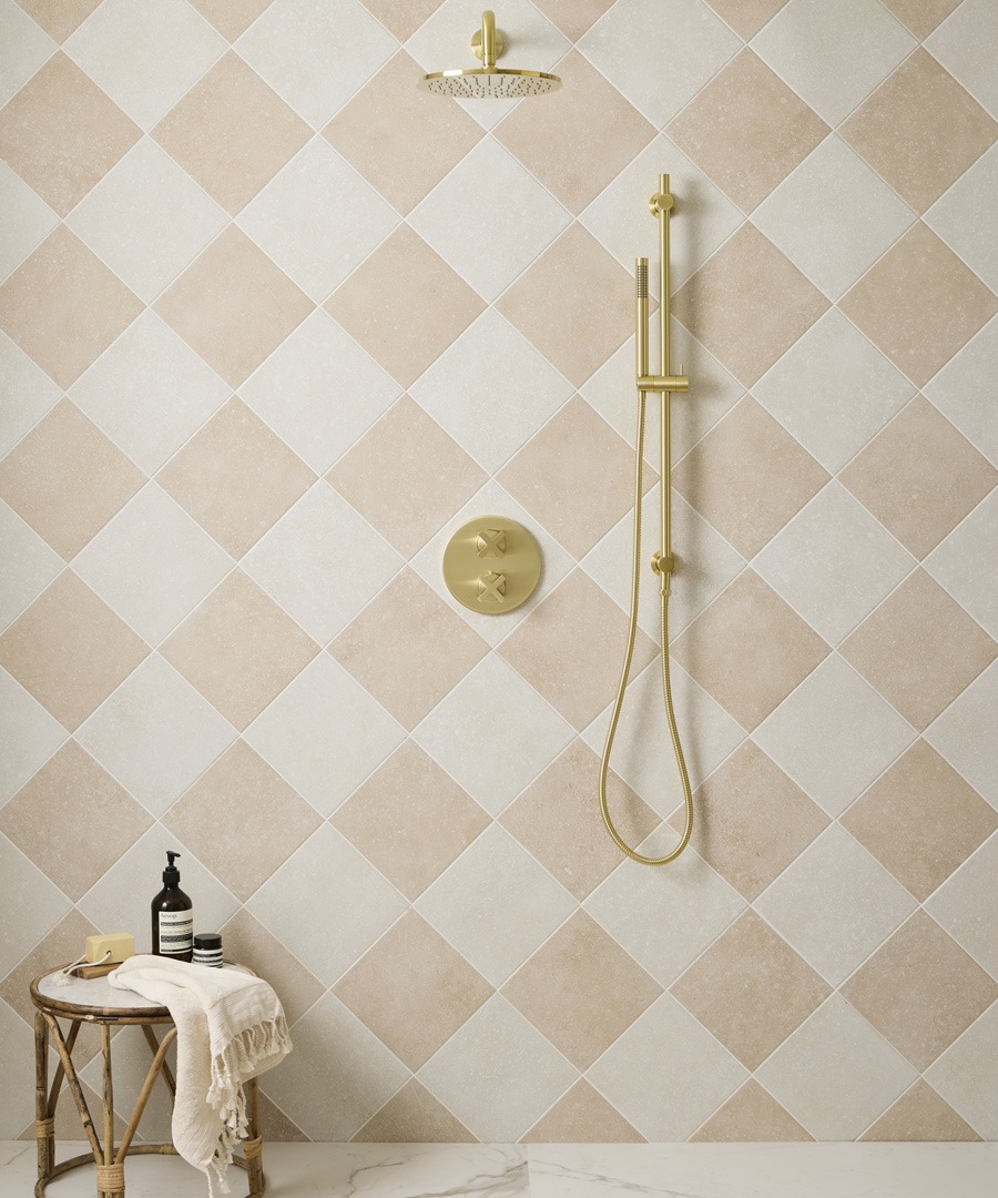
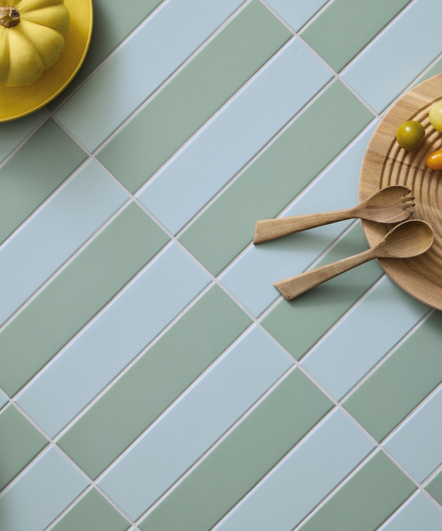
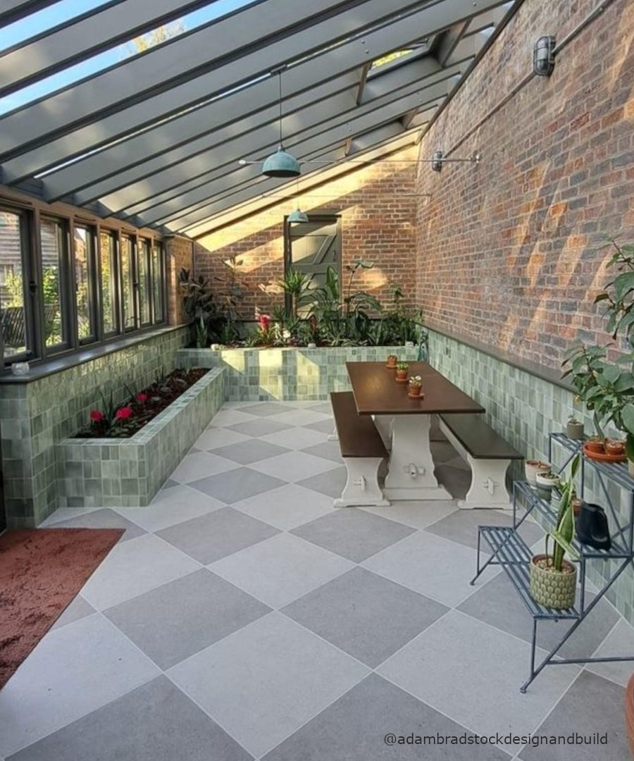
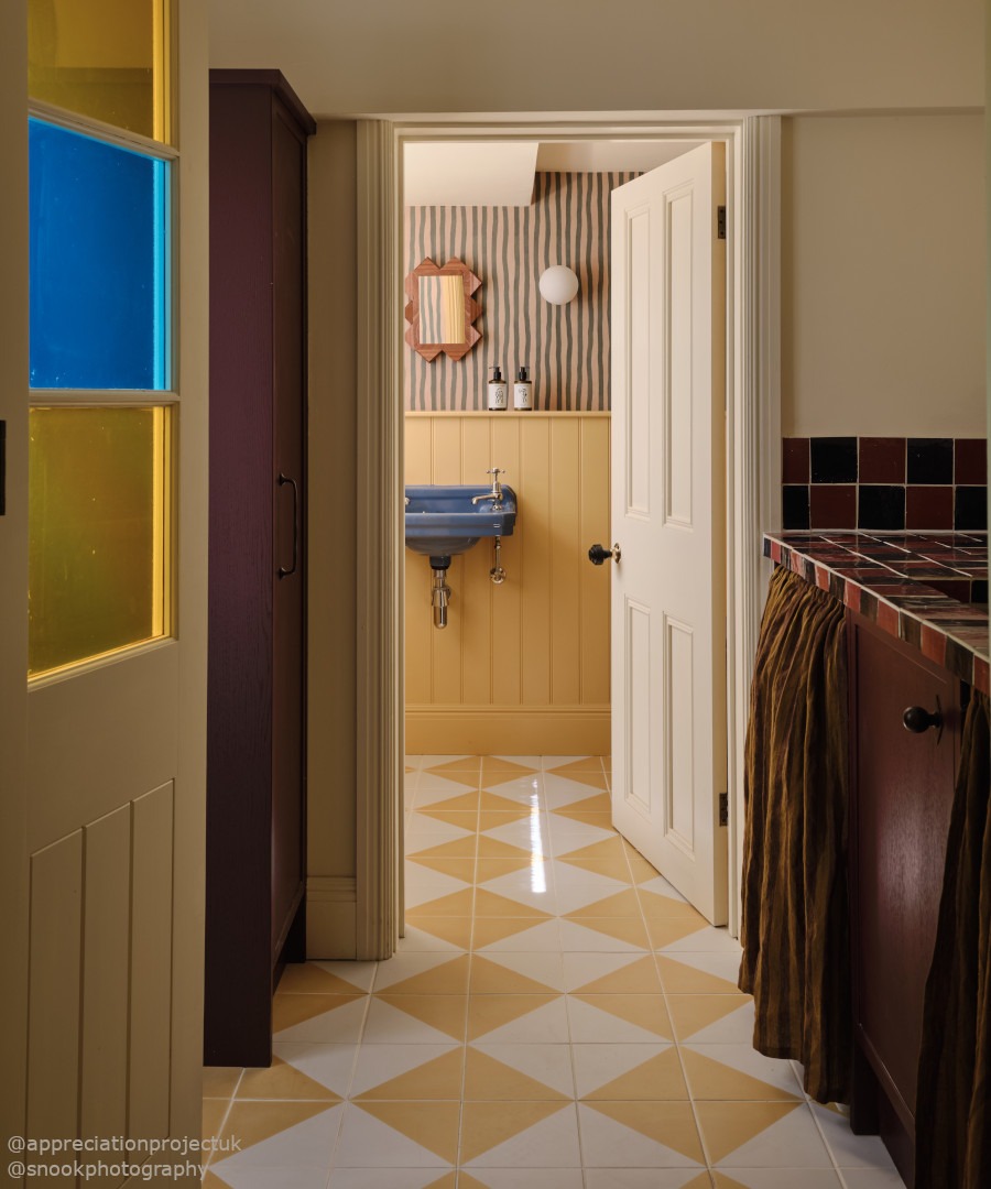
Turn the checkerboard on its point and it takes on an entirely different personality. Often called a Harlequin checkerboard, this diagonal arrangement transforms the familiar square into a diamond, creating a more dynamic pattern with a slightly theatrical quality.
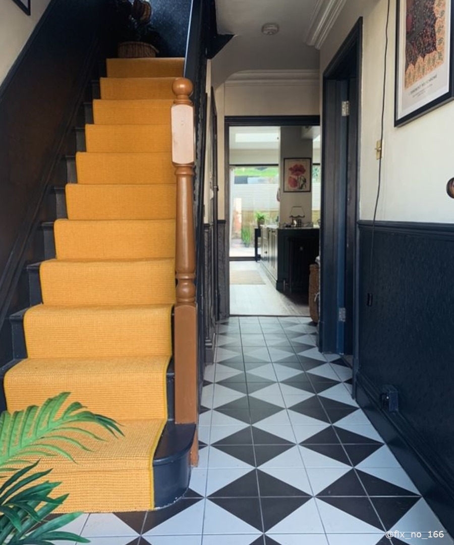
It is particularly effective in hallways, where the diagonal lines can draw the eye along the length of the space, but it can work just as well across a kitchen or bathroom floor. The effect becomes especially striking when there is a strong contrast between the two colours, such as black and white or deep red and cream.
For a gentler interpretation, try two closely related shades. The diamond pattern remains clearly visible, but the overall effect is less graphic and more decorative.
The same approach can be used with wall tiles, creating a decorative backdrop around a bath, basin or kitchen splashback. Whether bold and geometric or softened through colour, laying checkerboard on the diagonal is a simple change that makes the familiar feel unexpectedly different.
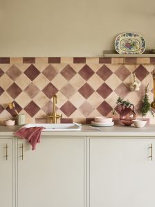
Right, Semaphore tiles in Mayflower yellow create a pretty harlequin pattern bathroom floor. Below, Bungalow 22 pink and peach tones make a Mediterranean dream kitchen.
Why chequerboard still works
Perhaps the reason checkerboard tiles have endured is that the basic idea is so familiar, yet the finished result can be remarkably individual. Black and white porcelain can bring drama to a London entrance hall. Limestone can soften a country-house kitchen. Cream and taupe can give a hardworking room a gentle sense of history. Then there are the combinations that are more unexpected: redder and white for a retro feel, blue and white for something lighter, or two understated shades for a floor where the pattern only becomes apparent as you move through the space. Checkerboard is ultimately less about following a particular style and more about deciding how much personality you want the pattern to have. Make it bold, keep it subtle, play with the scale or let the surface do the talking. From a grand entrance to a small splashback, it is a pattern with a surprisingly long list of possibilities, and one that shows no sign of becoming passé.
-
-
-
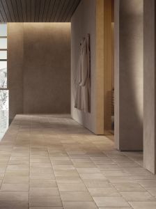 Harbourstone Hunstanton 20.2x20.2£2.52 eachTotal Price £2.52 total
-