Some Sage Advice... and a Cinnamon Roll
Claybrook has just the right shades to achieve the latest looks both in tiles, and also with the launch of twenty new paint colours.
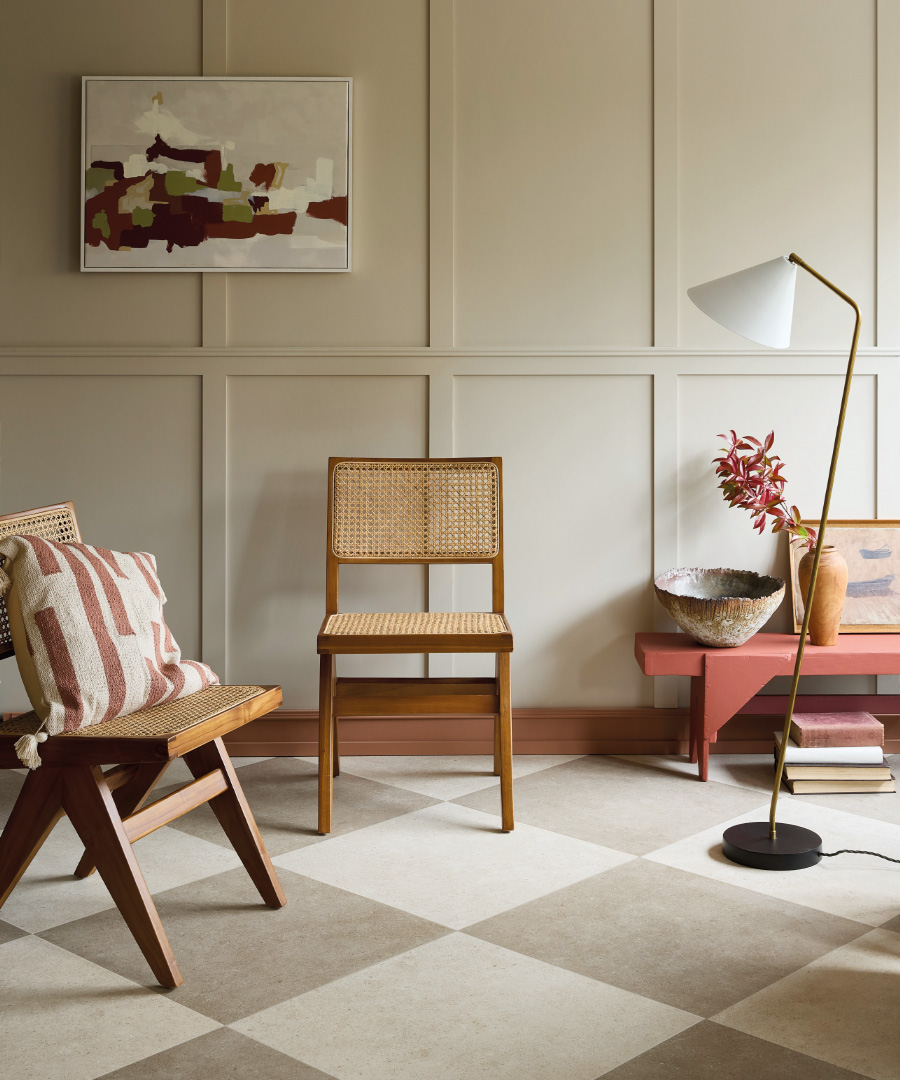
Our latest paint shades
There are imperceptible shifts in decorating, something that happens gradually but then picks up speed as more of us adopt the latest looks. I recently had the exciting job of dropping off some deeds to our old family home, 33 years after the ‘new’ owners bought it. At the sale in 1991 the kitchen was in on-trend pastel grey and pink, the sitting room a powder blue and lemon-yellow scheme, bathrooms were resplendent in peach and apricot tiling. I think you can guess what’s coming; nothing of these interiors remain. Luckily, trends and decor tend to change slowly and without such a time-jump jolt to the senses. One of these shifts in style is at an early stage, and Claybrook has just the right shades to achieve these new looks both in tiles, and also with the launch of twenty new paint colours, in both emulsion and eggshell.
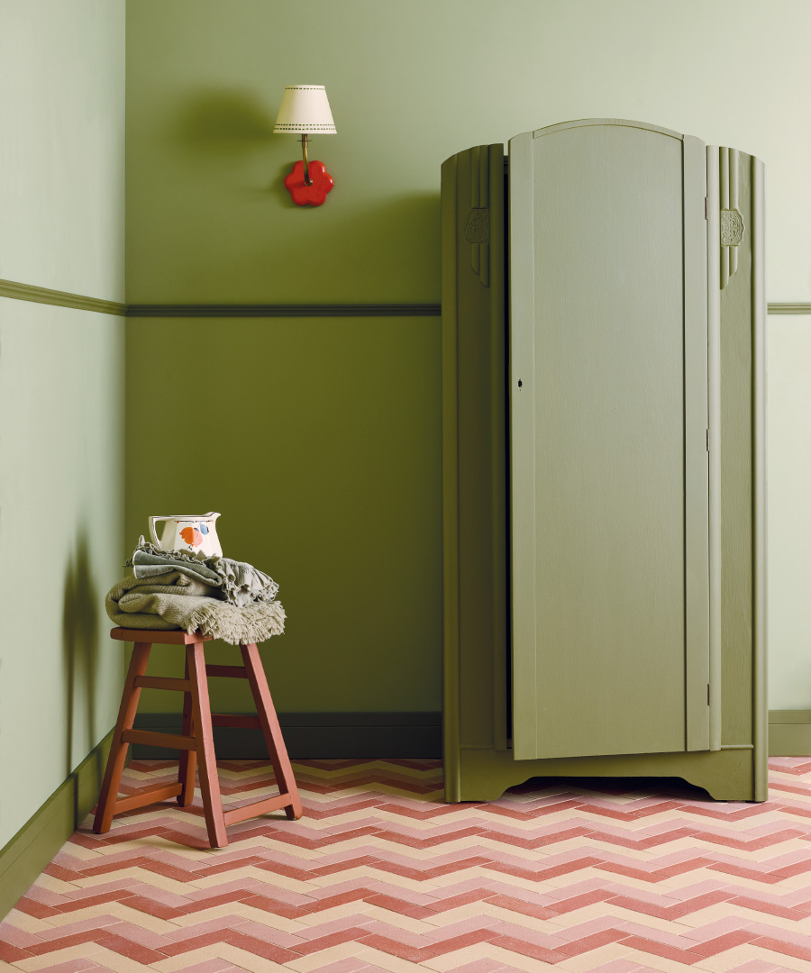
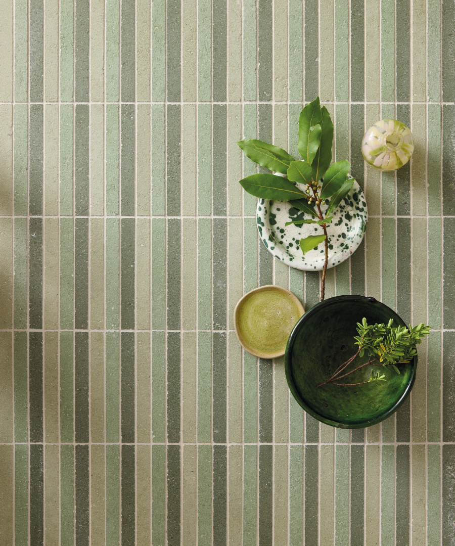
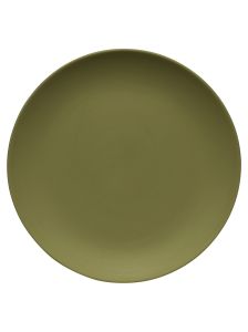
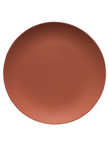
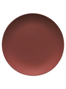
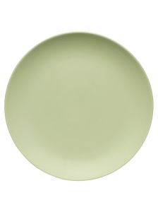
The colours span verdant sage and olive greens on the one hand, and rosy sun-baked hues on the other in the form of mulberry or burgundy. A series of new neutrals bridges the two. They also pair brilliantly with our latest tile collections.
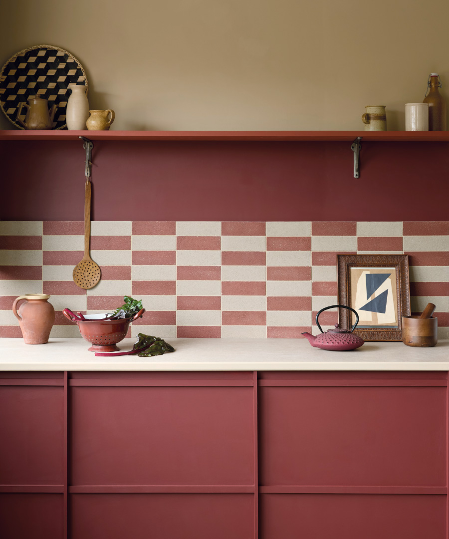
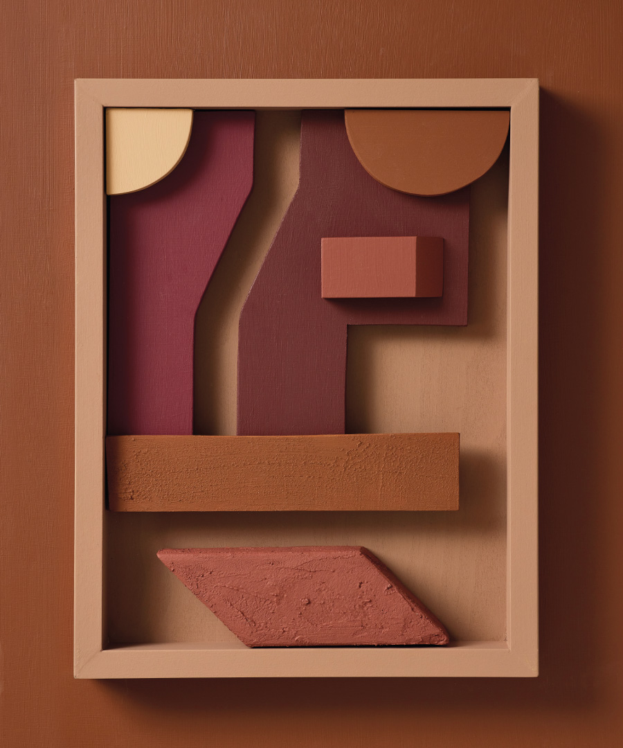
Formella seen in a herringbone design on the floor above, is a beautifully tactile series of largely recycled composite stone tiles, created without the use of a kiln, in an environmentally conscious process. Raw materials like quartz are recovered from quarries in Italy, and mixed as a powder alongside natural pigments and cement. The shades within the collection include plum, sage and stone tones that pair brilliantly with the paint hues like Wine Bar, Sage Advice and Tuscan Trip.These warm plum and fig paint colours work for both dining and sitting areas where a bold but cocooning feel is required, and also in bedrooms for adding a little night-time drama. Oxblood is a shade that also works well on occasional wooden furniture, doors or bookcases in the eggshell finish as a feature colour.
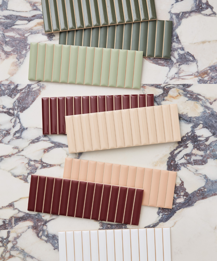

Our fluted wall tile collection in matt and gloss options, also contains these Cherry, Gooseberry and Apple tones seen above to pair with the paints. Tutti Flutti, and who doesn’t love that name?, can be used alongside the paints to form rooms with real character and visual impact.
A mouth-watering array of colours is also the hallmark of the Quench collection (not pictured), with each of the hues named after a delicious cocktail. For walls or floors, the Italian-made tiles are through-body porcelain, making it ideal for higher traffic areas in domestic or commercial settings, with the tones mixing so well with our paint collection.

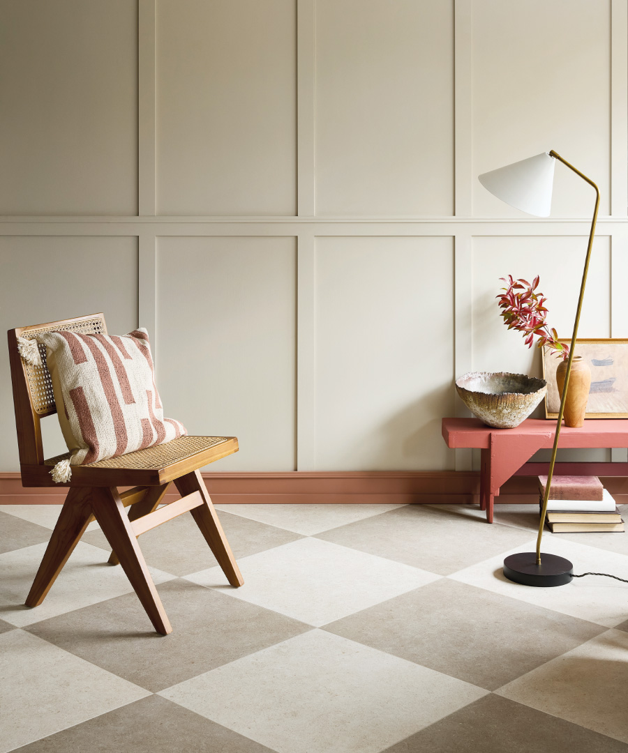
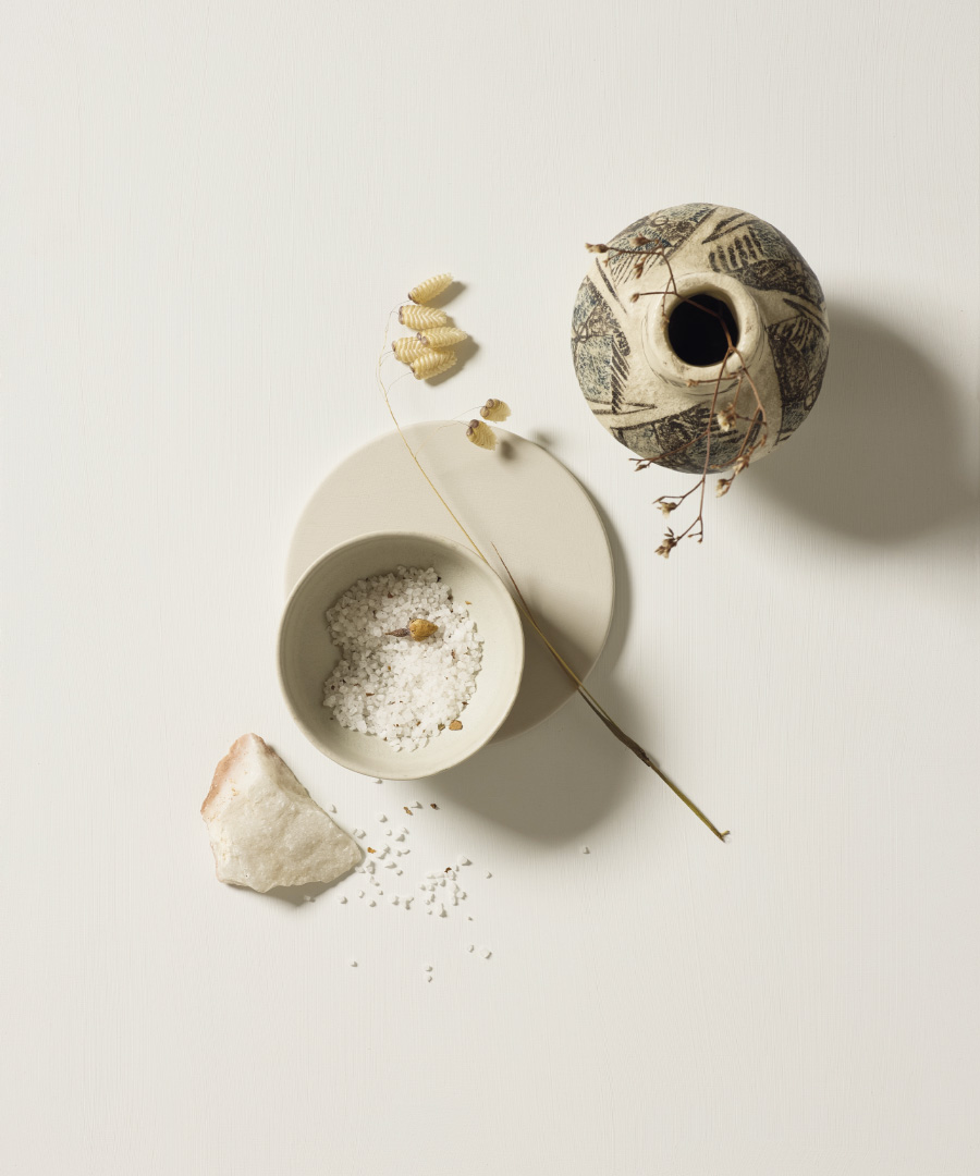
For neutral decorating, the layering of similar beige and stone tones creates a calming look in both domestic and commercial spaces. Framura, a durable porcelain tile range for wall or floor, replicates limestone and is great for kitchens, bathrooms or hallways; the Clam colourway is a particular favourite. Allaperto, seen below in a chequerboard, has a smooth plaster-effect option and a stone-like design. Additionally, the series has tiles for exterior spaces; great for creating a visually consistent indoor to outdoor look.
Made fresh in England for each new order, the colours pack not only a design-punch, but are vegan-friendly and have super-low VOC’s. Free samples are also available from our website of all these new colours and many of the tile samples, so you can compare and contrast shading and how they could work together for your scheme.