Case Study - Poets Corner
How Sarah Limbert and the team at Poets Corner Interiors use Claybrook products, from large-scale projects to simple small facelifts.

Sarah Limbert and the team at Poets Corner Interiors have undertaken a number of projects that utilise products from Claybrook Studio. The London-based team specialise in creating beautiful interiors for residential homes and commercial spaces, from large-scale projects to smaller and more simple facelifts. Sarah, who set aside her career as a lawyer in the City of London to focus on her passion for great design, also offers a high spec shoot location for film, photography and workshops.
Creative Director Rob Whitaker chatted to Sarah about three of the interesting projects undertaken more recently.
Hey Sarah, thanks for sitting down with me, it’s a pleasure to meet you. We’ve loved looking at your portfolio; you’ve worked on some really lovely assignments. Firstly, what made you give up your law career in the first place…a love of design or a loathing of law?
Thank you so much for having me. It was a love of design which led me to leave my career in the law, and a desire to work for myself in a more flexible way. My legal career has served me very well but I have always loved design. That love was reignited when I moved to London to start my legal training contract and I bought my own flat. The design and renovation bug got a hold of me and (together with my now husband), I refurbished four separate properties alongside my day job, over ten years. I felt that a career change was not going to be possible - at this point I was in my mid 30s with two young children. However, when my youngest started nursery I continued to work part-time and I used my weekly “day off” to study and to develop my interior design skills. By the time we had emerged from the pandemic, I had decided to make the move official and I left my role as a Head of Legal & Compliance to set up Poets Corner Interiors.
How does managing client expectations differ from law to interiors?
I feel there are more similarities than differences between law and interior design, as both are client service industries. I joined a law firm in my early 20s, where I was trained to deliver the highest quality client service, so continuing these standards in my interior design work is second nature. Whilst the subject matter of the work is different, the expectations are the same - both clients have problems that need to be solved, and want our services to be delivered in a time and cost-efficient manner. Interior design can be more emotive at times, as we are invited into our clients’ personal spaces - this is something that I am very aware of in every project that we take on.
What attracts you to using Claybrook time and again?
I really like the range of options available at Claybrook. The quality and price point is spot on for our clients and the projects we work on. Our clients also love the accessibility of samples and your lead-times are short which is great when we are working on projects with a tight turnaround. Your team are also super helpful, they know your products well and they are always on hand to help and to give advice.
For the project where you used our Brookhaven marble and mosaics for walls and floor, what was the customer brief?
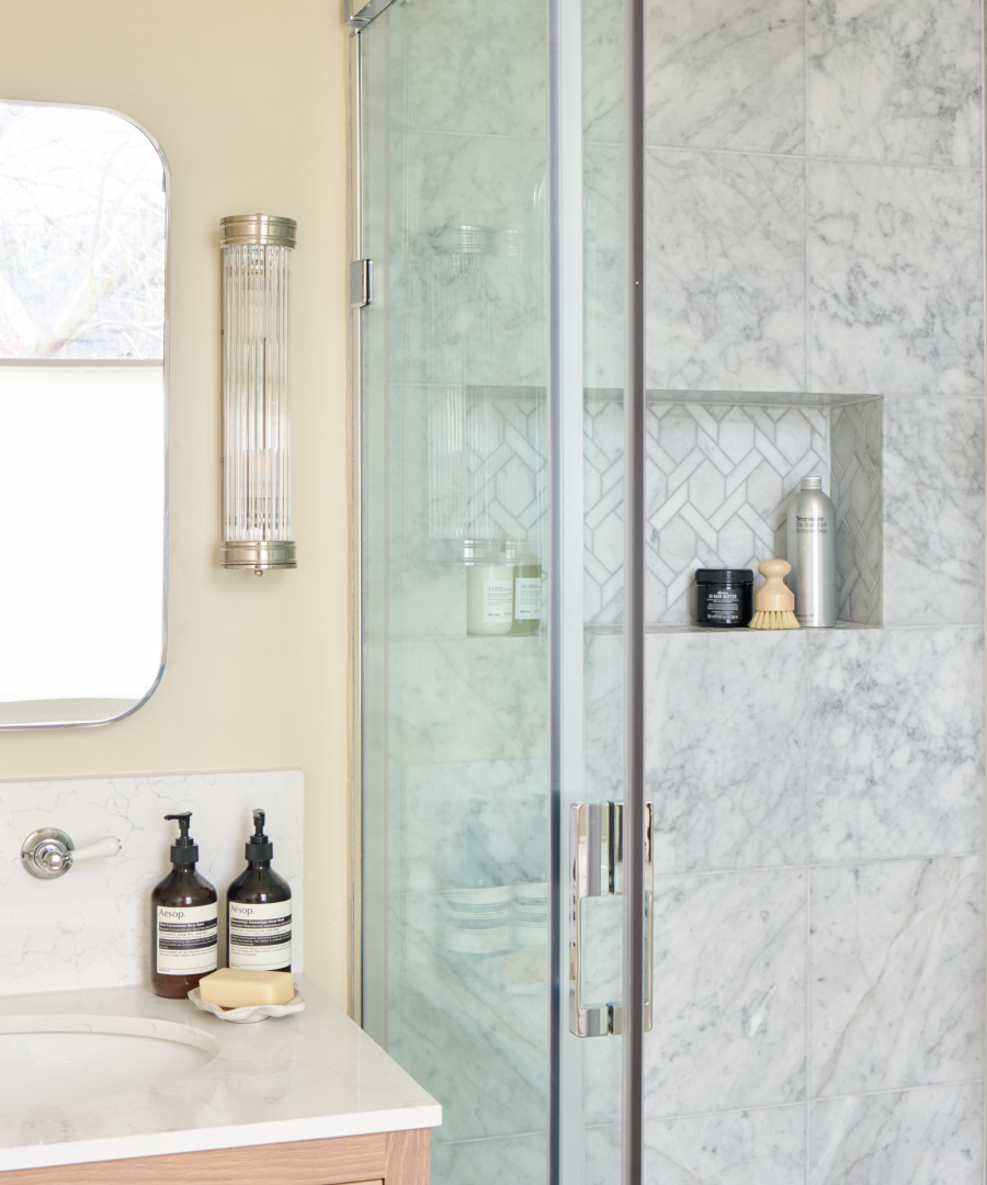
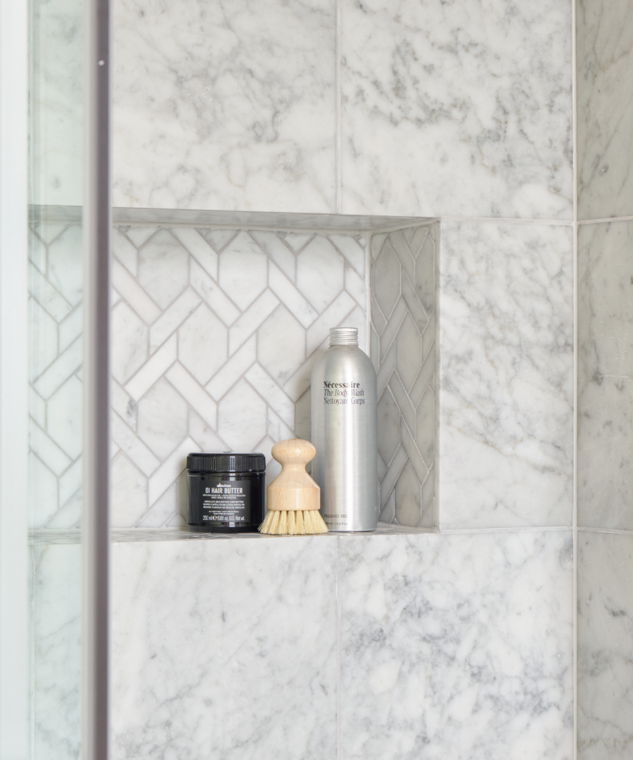
Our client gave us a wide brief with this project. They had inherited an ensuite when they bought their house which had a few issues - the shower was noisy and ineffective and the layout didn’t work. After living with it for a number of years, they wanted a luxurious and adult space. They asked for a large walk-in shower that would be easy to clean. The Brookhaven marble tiles with the dove grey grout was a great choice for practicality (less grout to clean and light grey grout tends to be more forgiving than white). We didn’t want the room to be heavily tiled as this can look a little utilitarian, but we still wanted a seamless look. We liked that we could use the Brookhaven tiles on both the floor and the walls and then mix in other pieces from the collection, such as the mosaics in the shower niche and the marble skirting boards.
What made you choose that colourway?
We decided to repaint our client’s bedroom in a buttery yellow so we knew that we would stick to a light and warm neutral on the ensuite walls. We had also chosen an oak vanity so we felt that the room could take the cool tones of the Brookhaven grey marble and that this would be a nice contrast to the warmer tones in the ensuite and the adjacent master bedroom.
What does the addition of the skirting in marble add do you feel?
Personally, I feel that the skirting in marble makes the room feel much more polished than using a wooden board or continuing the floor tiles. I try to avoid wooden skirtings in bathrooms as even properly treated wood can suffer water/moisture damage over time.

Can grout colour make a difference?
Absolutely! We felt that the dove grey worked best with the Brookhaven marble range and coloured grout can be more forgiving over time. The reality is that all grout needs to be cleaned and maintained but choosing a coloured grout can help you with this. I rarely use a bright, white colour and I find an off-white can sometimes look a little aged and yellow (even when its not!). When looking for a lighter toned grout, I find that Ardex Jasmine White is a good option and if a grey grout is too cold, then their Gentle Dawn colour is a great alternative as it comes up slightly warmer.
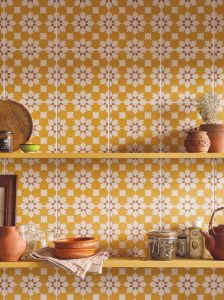
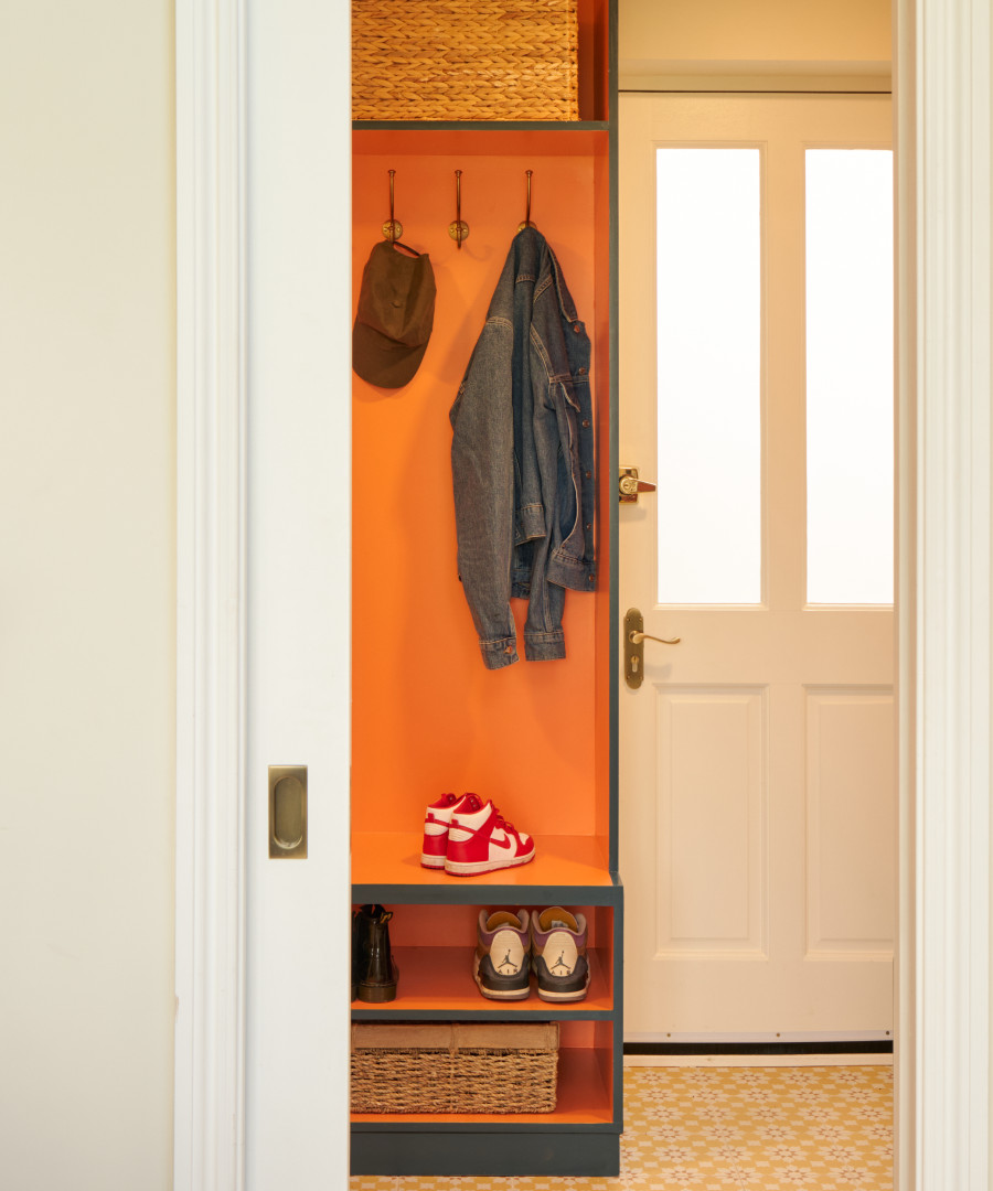
I’ve seen some shots of a utility room you did where you chose our yellow Discotheque Bronski tiles. it’s quite a sunny and decorative option, your choice or the client’s?
We actually found the tiles together! My client’s favourite colours are yellow and orange and she really wanted to bring them into her home. They are not easiest colours to work with but we felt that the utility would be somewhere we could bring them both in, and I suggested starting with the flooring. We were doing some research very early on in the project when the yellow Discotheque Bronski tiles popped up and they became the starting point for the room. We ended up painting the outside utility joinery in Farrow & Ball’s Hague Blue and the insides in Myland’s (very vibrant) Lolly Pop!
Is porcelain always a good choice or do you prefer more natural materials?
I absolutely love the look and feel of natural materials but they are not for everyone or every home. Using a porous material in a busy household is rarely a good idea from a practical point of view. I tend to use them in places where there is less footfall, like an ensuite or an adults only space. We often use porcelain in our projects because it is robust and very easy to clean. We find that patterned porcelain tiles can be used to replicate the designs so often found in the cement tiles that everybody seems to love! We are also starting to move towards porcelain for worktops in the bathrooms and kitchens we design.
What’s your favourite part of the design and build process?
Every stage has its highlights and its challenges but my favourite part has got to be the end of a project, when everyone is excited about the new space or just after completion when our clients start to realise and report back on how much our designs have improved their day to day living.
We love a before and after shot, a case in point being the pics we saw of a London bathroom where you utilised our Semaphore Nina tiles. What made the biggest difference in the overhaul of that space? The colour combinations work so well together.
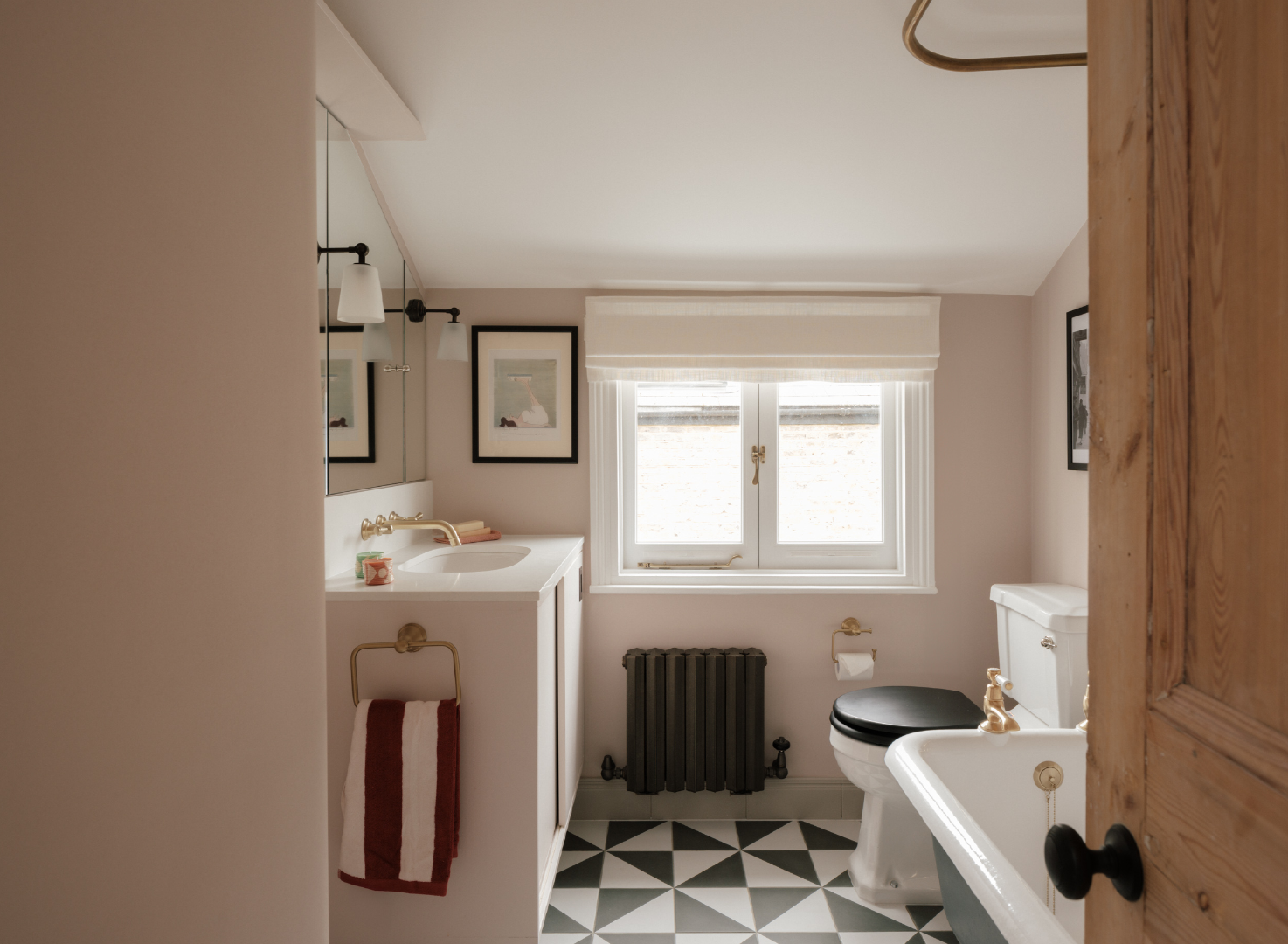
Thank you. The bathroom had black floor tiles and the walls were painted dark green - this was draining all of the light out of the room. Adding your Semaphore Nina tiles and painting the walls in a very subtle and light pink really moved the dial. We also designed the storage in the room to make the most out of every millimetre of floorspace.
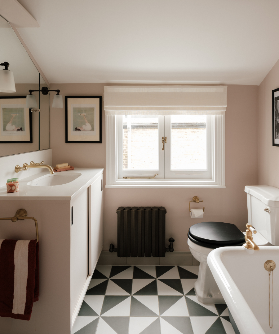
We spotted you used our Osaka Semba tiles for skirting, what made you opt for those instead of classic boarding?
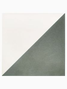
We felt that the green/grey tones of the Osaka Semba skirting boards complemented the floor tiles really well. The Nina floor tiles can read as black and white in photography but as you know, they are a lovely forest green colour. As this is a period property, we felt that they complimented the style of the house and the original features that ran throughout. The crackle glaze finish added texture and interest to the room and I really do love the finished look of tiled skirtings. They were also a practical choice as this is a family bathroom so we were anticipating lots of splashes! We didn’t want wooden skirtings to become an issue in a few years time.
What’s been your favourite project of the last couple of years?
All projects have their highs and lows but I have really enjoyed the diversity of our projects over the last few years. We have worked on residential period homes, new builds and even a stately home. My favourite projects tend to be the ones which have the biggest challenges because solving problems for our clients is the reason I do this job!
What’s next for Poets Corner?
We have some brand new projects starting in January 2025 which is exciting. I would love to expand our team and collaborate with some of our favourite brands and suppliers. Lots to think about and to look forward to!
Check out @poetscorner_interiors on Instagram to find out more or visit www.poetscornerinteriors.co.uk.
Images © Richard Oxford
-
-
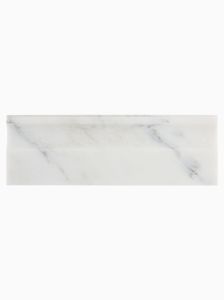 Brookhaven SkirtingRegular Price £34.99 each Special Price £26.25 eachTotal Price £26.25 total
-
-