How do trends start?
There is no doubt we are seeing a gradual end to the ubiquitous use of grey as an anchor colour to many schemes. All trends have an arc where at first they seem fresh, exciting and aspirational. This urge to adopt a style is not so much about following the herd as it is about viewing something new and different and wanting it for ourselves. It sets the stage for us reinvent ourselves or our homes, and to mark the passage of time. That was then and this is now, is a comforting refrain to tell ourselves. I wanted that, but now I’ve developed, matured and refined my taste and now I want this. I’ve worked hard and I deserve the best, and the best is what is now, modern and up to date.
Who decides what this ‘now’ style is?
Well, market researchers and people working in applied social sciences figure out what is going on in the markets of art , design and fashion. If there is no-one in house with the vision to set a corporate strategy for the future in aesthetic terms, these folks doing the analysis can be hired to advise larger corporations on what to do to develop their brand and proposition. They use research into behavioural economics and group discussions to filter out the material aspirations of consumers, who defers to who, and utilise what is called Nudge Theory. Essentially, they understand the methods by which behaviour is influenced and who by.
However, at a different level all together, and possibly the originators of these ‘now looks’, is the independent interiors studio or trader, driving changes in market style one project at a time. A case in point - Cath Kidston started in the early 90’s with original vintage ware; 50’s table cloths, polka dot aprons etc. The proposition felt new, stylish and personal. This became replicated stock not original vintage over the next five years, as demand outstripped supply. By 2010 there were stores worldwide, but by 2020 the look felt inauthentic, leading to a falloff in sales and mass store closures. In 30 years, the vintage look had gone full cycle. It arrived, it exploded and was then snuffed out as other looks came to the fore. Exit stage right.
A curated and edited collection of blah, blah, blah
Enter stage left - the Hipster. A new version of luxury aspiration was developing, a cynic might say a uniquely middle class idea of virtue signalling, of architectural and interior gentrification; anything hand finished was rebranded as artisanal and crafted, and suddenly everyone is a curator. Although it at first appeared to be a kind of independent entrepreneurialism, to adopt the style inevitably resulted in conformity, after all, aren’t we all ‘curating’ and making decisions and choices about our lives second by second? If shops or websites didn’t curate, they would sell literally every object on planet earth, so claiming to sell a curated bundle of products seems a rather obvious statement. By 2018, if your café didn’t have brick walls, chalk boards and mismatching furniture you would struggle to attract clients to buy the coffee. Famous style commentator Peter York (born Peter Wallis, so guilty of a little rebranding himself) commented recently, “if it’s handmade by nuns you’re onto a winner – though often it’s ‘artisanal’ product not made by artisans curiously”.
So, in this interiors world where we feel we are reaching our own conclusions about taste, but are probably being subtly steered, what is next after grey?
At Claybrook we are happy to be open about our likes and dislikes. Working on bathroom and kitchen tiles has forced us to get imaginative over the years in terms of decoration and colour, not to mention in shape and form from hexagon and square, to herringbone and chevron.
We cannot be all things to all people, but we do try and offer options across different price points to suit myriad styles, so regardless of the tribe you belong to, or aspire to belong to, we’ll have a gorgoeus look within our wall and floor tile collections.
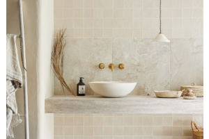
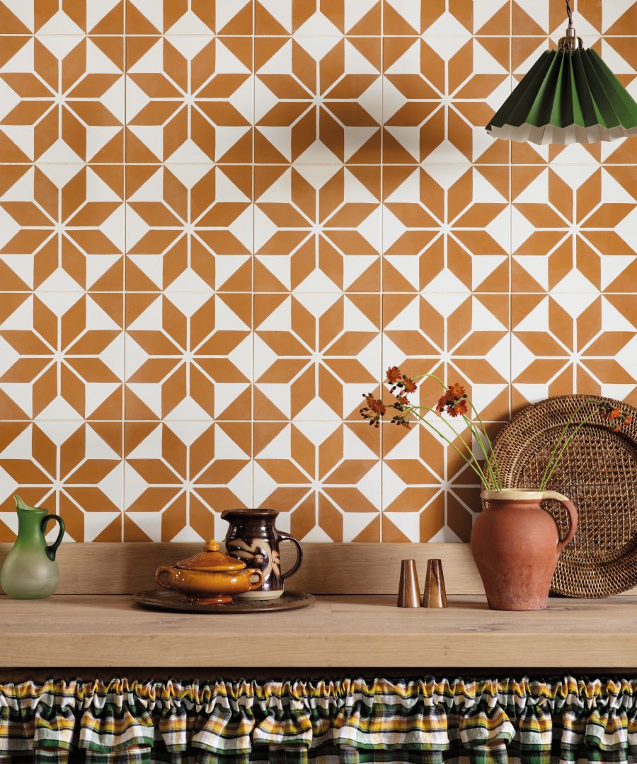 Superstar Visage tiles
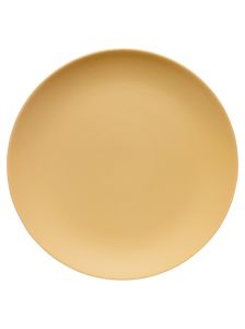
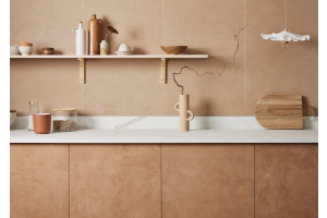
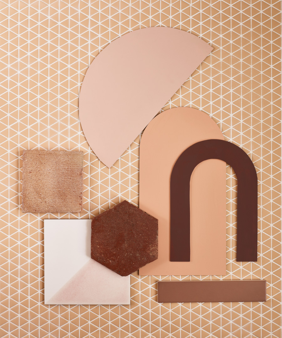
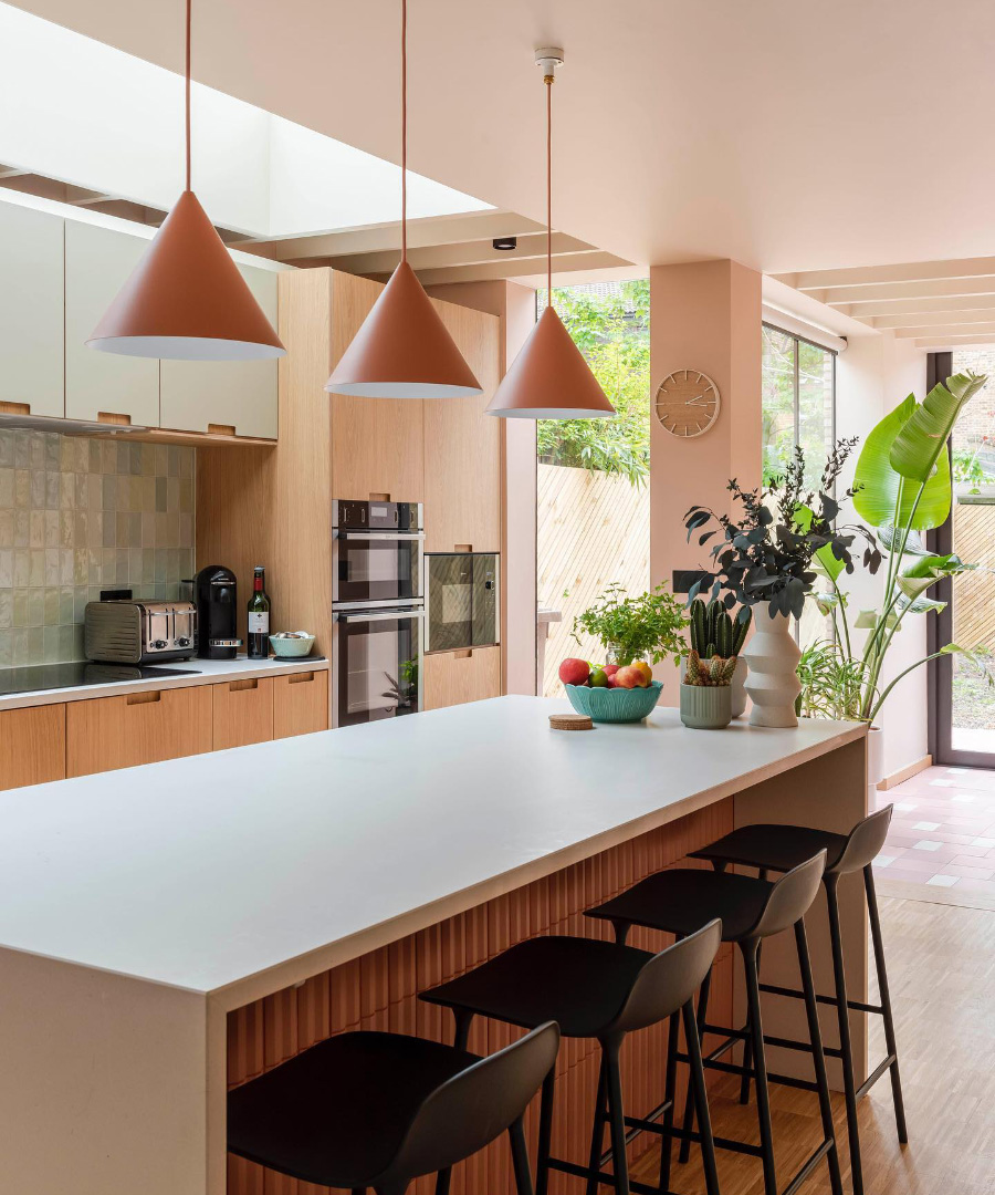
What we are loving currently in terms of colour is all shades of brown; from soft golden tan to rich terracotta toffee-like hues. These natural options work really well alongside natural and tactile materials like suede, oak finishes or linens and cotton. This love of nature has translated to colours within the vegan-friendly Claybrook paint palette as well as in our tile collections.
 Confiserie Sorbet Triangle Mosaic with a selection of Claybrook tiles and paint
 Beautiful customer kitchen painted in Kate Blush
(credit @homemilk, @nphotographer, @sandlerwray)
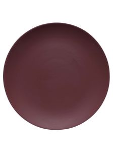
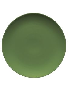
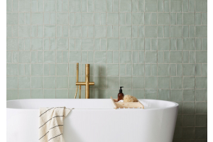
We are also falling for gorgeous greens; from rich emeralds to softer moss and avocado. They combine so well with both blush pink and apricot hues. The pairing was often seen 40 years ago when every self-respecting mock Tudor style home had at least a smidge of green velvet fringed upholstery alongside pink carpet, cushions or lampshades. Greens also work brilliantly with aubergine shades, colours that will continue to grow in popularity well into the autumn. Should we fear being manipulated into groups of style genre? Well no. In a world of climate change, political turmoil and cost increases, choosing what colour to paint your walls or how to tile your bathroom should just be fun.
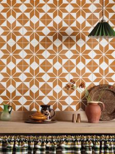
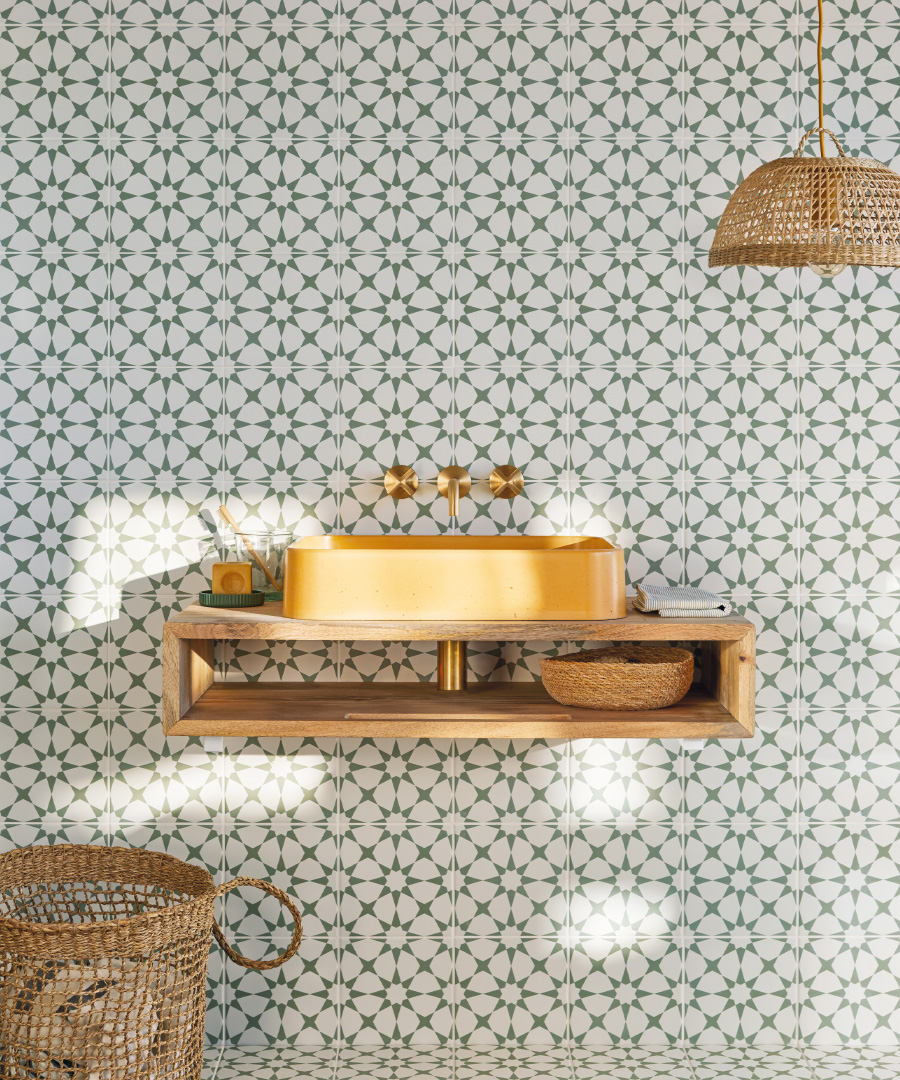 Discotheque Ultravox tiles with Beton Rocard basin in Moutarde and Bournbrook taps

HOUSE GUEST - COUNTRY & TOWN HOUSE PODCAST
For more on what Creative Director Rob Whitaker has been working on for 2022/23, tune in to the House Guest podcast from Country & Town House.