Tiles through the Decades
Rob Whitaker takes a look at how tile styles have evolved, from the 1950s to the 2000s.
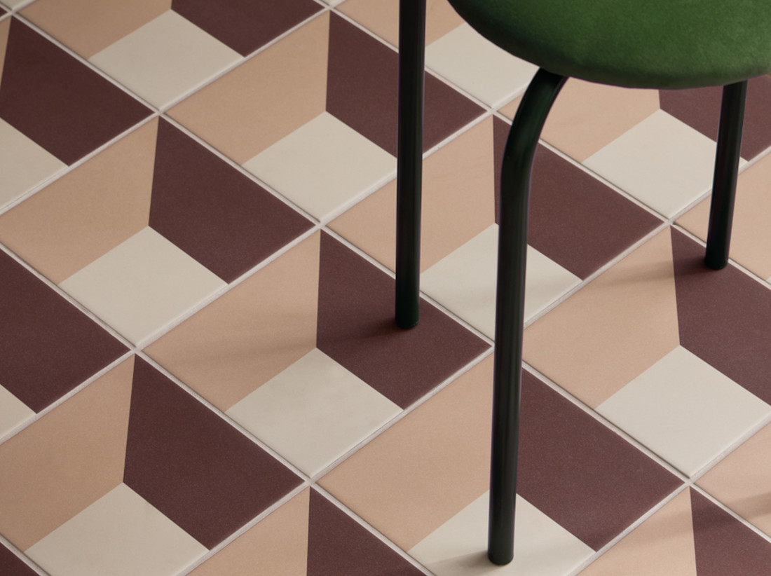
From pastel bathrooms and jade-green kitchens to terracotta floors and shimmering glass mosaics, every decade has left its mark on the way we decorate our homes. Tile trends are particularly revealing: colours, patterns and materials that once defined an era have a habit of returning, often with a distinctly modern interpretation.
From post-war Britain in the 1950s through to the colourful confidence of the 1990s and the glossy finishes of the early 2000s, take a nostalgic journey through six decades of tile design, and discover how to bring the character of each era into your own modern refurbishment.
The 1950s
Pastels and Post-War Optimism
The 1950s brought a welcome sense of optimism to British homes. After the austerity of the post-war years, colour began to return to interiors, with soft pastel shades creating a feeling of freshness and modernity. The Festival of Britain in 1951 also captured the country's enthusiasm for a brighter, more forward-looking approach to design.
Bathrooms were increasingly becoming an important part of the home, and coloured sanitaryware and tiles introduced personality to these practical spaces. Powder blue, soft pink and gentle jade and mint greens were particularly characteristic, often combined with crisp white for a clean, cheerful look. I for one grew up in a 1957 detached home with a distinctive family bathroom; jet black gloss wall tiles paired with a canary yellow bathroom suite, a look considered aspirational at the time. The bathroom door even had three portholes cut out vertically down the centre of the door with frosted and ribbed glass for privacy.
Tile designs at this time tended to be relatively simple, with small squares and rectangular formats arranged in orderly layouts. Colour was the main decorative statement, with contrasting borders, trims and occasional checkerboard details adding interest.
The influence wasn't exclusively British. Across the Atlantic, the American love affair with pastel bathrooms became particularly famous, with pink, blue and green bathrooms becoming icons of 1950s domestic design.
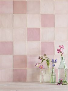
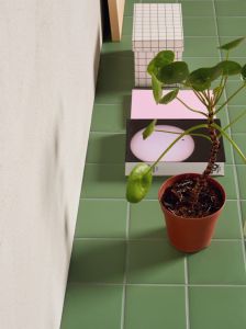
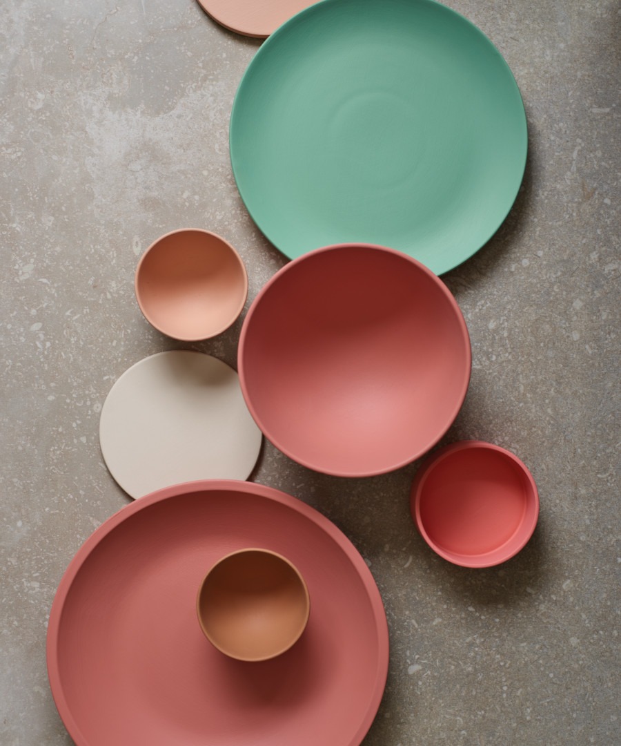
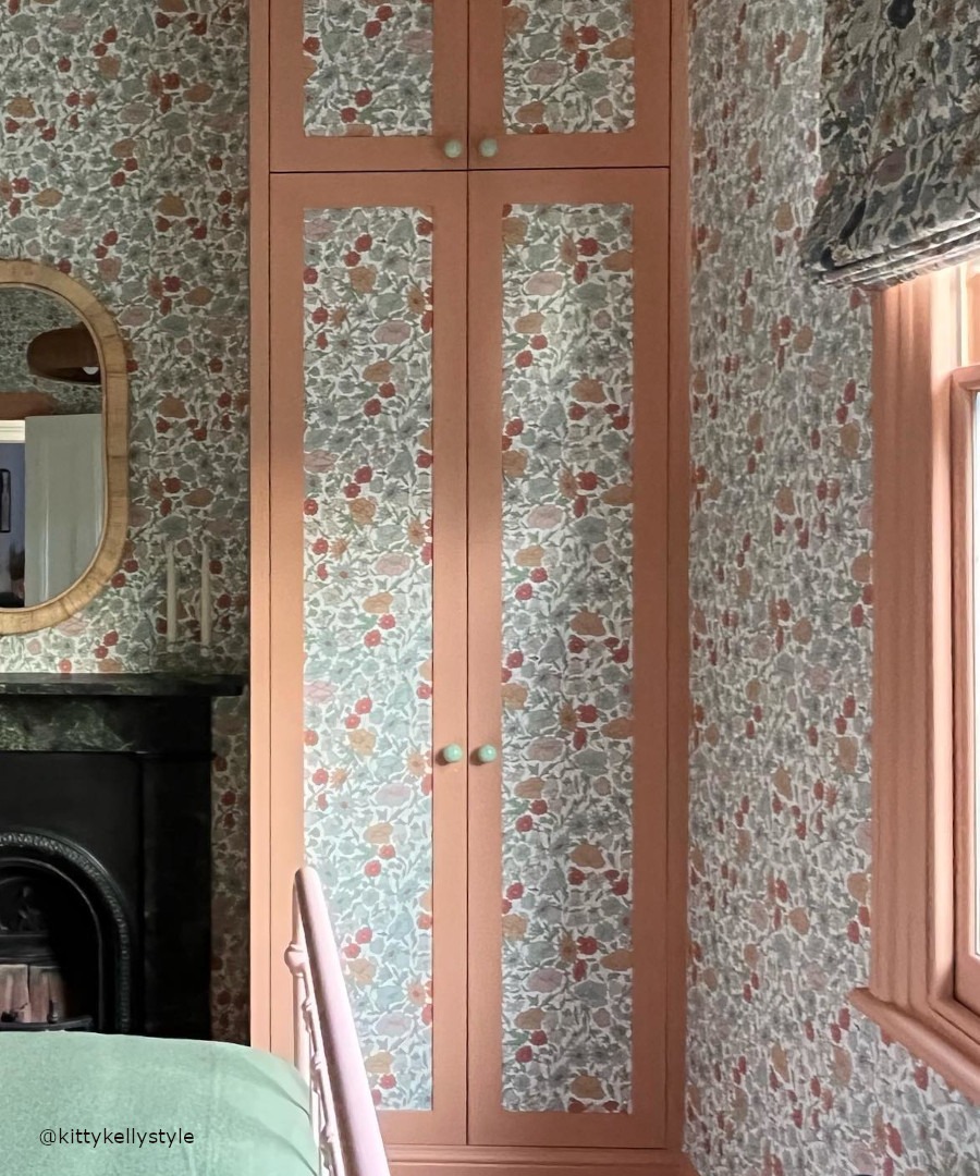
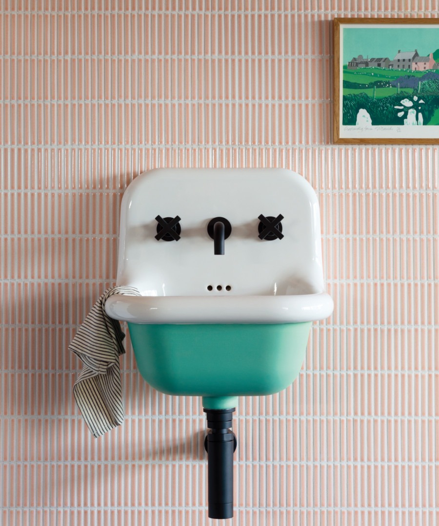
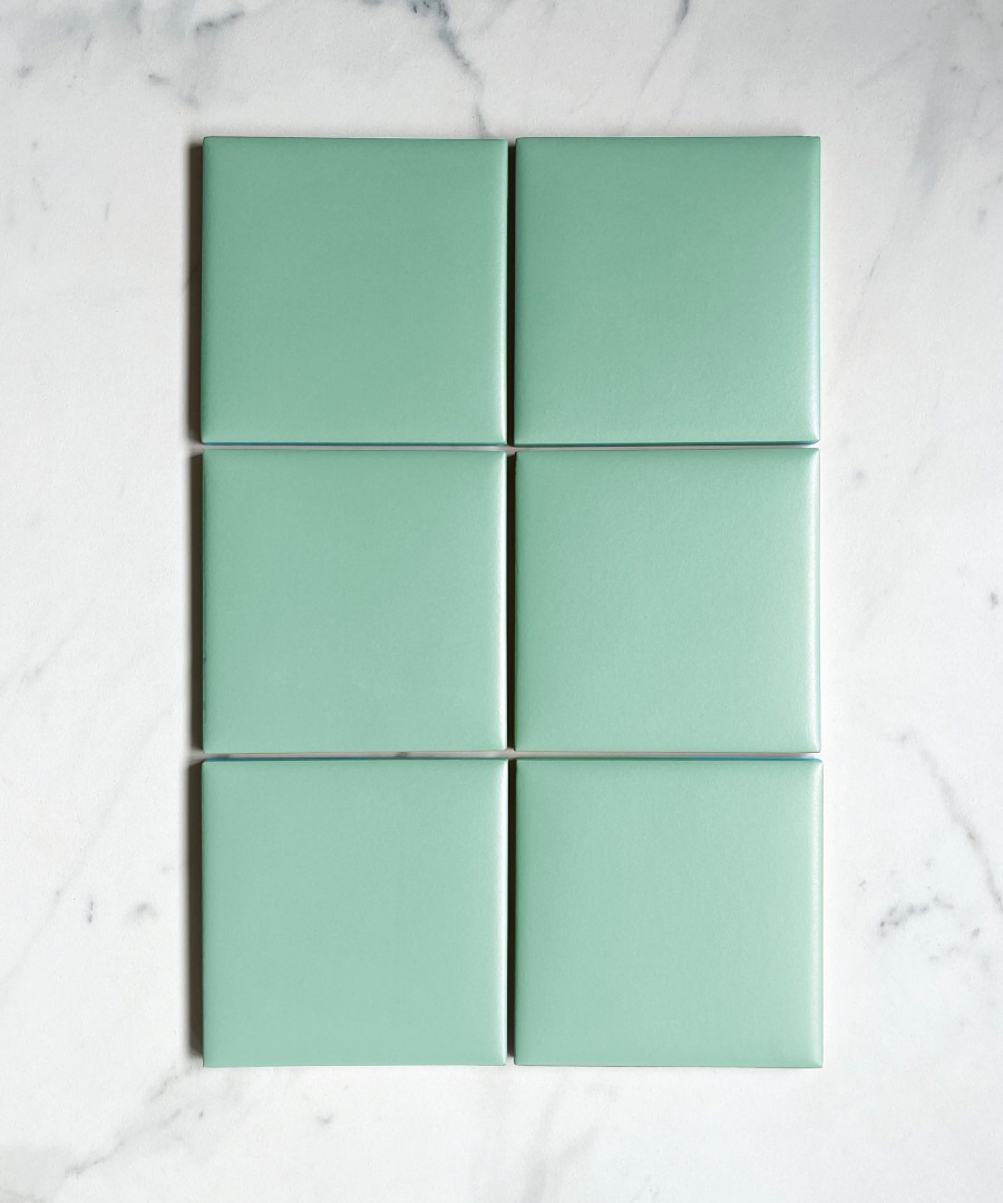
Today, these colours feel surprisingly fresh. A soft pink wall tile paired with a warm neutral paint, or a jade-green tile contrasted with crisp white, can capture the optimism of the period without recreating a retro bathroom. Get the look: our Moulay for walls has variation from tile to tile and the Rosewater colourway would be particularly good for recreating a 1950s feel. The Kromatic tile in Mint would be a great green for enlivening a bathroom or kitchen. Decorate with 50’s Fun, Coral Sea or Peach Juice paints for complimentary pairing.
The 1960s
Geometry, Pattern and Modernism
If the 1950s were about optimism, the 1960s were about experimentation. British interiors became more adventurous as modernism, Pop Art and the Space Age influenced everything from furniture and textiles to tiles and wallpaper.
Geometric patterns were everywhere. Hexagons, diamonds, circles and angular repeats created a strong graphic quality, while larger patterns gave floors and walls a much more expressive role. The clean lines of mid-century furniture provided an ideal counterpoint to increasingly decorative surfaces.
There was also a growing appetite for international influences. Moroccan and Mediterranean-inspired patterns brought intricate geometry, earthy colours and a sense of craftsmanship. Terracotta, cream, blue and green could be combined in increasingly adventurous ways.
The decade's fascination with pattern makes it particularly relevant today. Rather than covering every surface, contemporary interiors can use a bold geometric tile to create a focal point, perhaps across a kitchen floor, hallway or shower pony wall, and allow the surrounding architecture to remain relatively quiet.
Our patterned tiles and vegan-friendly paint colours make it possible to capture the spirit of the 1960s without turning a room into a period set. Look for strong geometry, larger-scale pattern and colours that have enough character to stand alongside mid-century furniture.
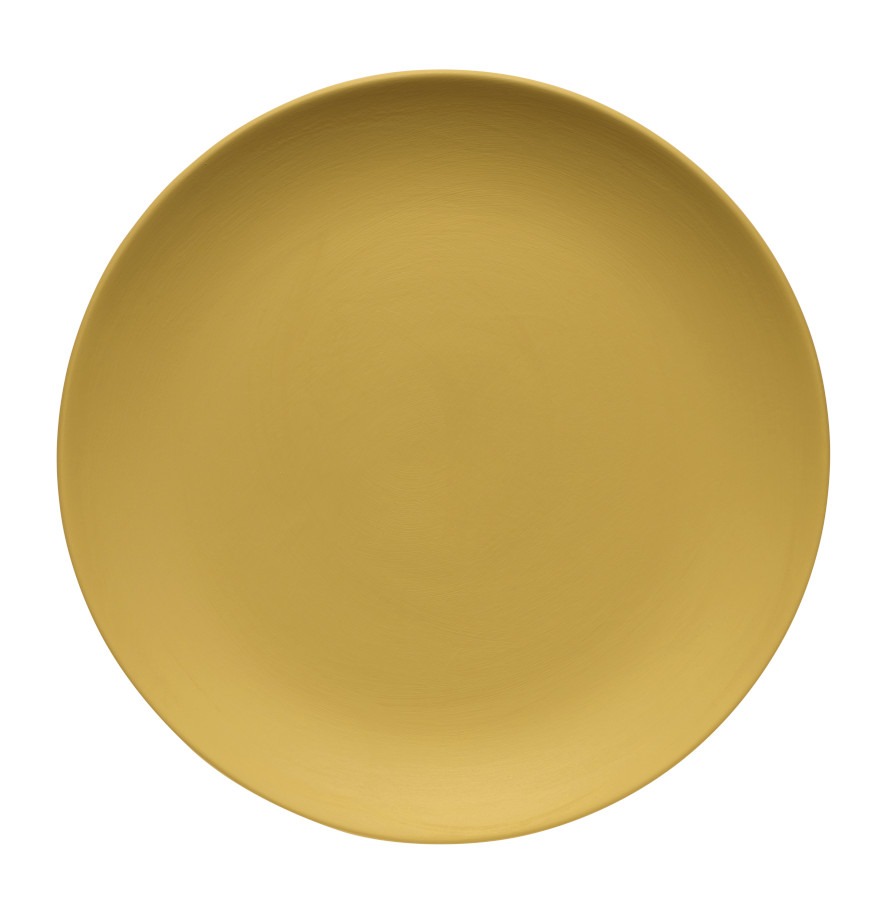
Get the look: Our Isola Bella Cassettone mosaics could work brilliantly for the more decorative, Mediterranean-influenced side of the 1960s. The collection has four colours and patterned Cassettone mosaic designs, allowing you to bring in geometry without it feeling too rigid or modern. For paints try the Claybrook Blue for a strong inky tone, or Bellicose for a citrus style mustard shade.
Isola Bella Cassettone mosaic tiles give a 1960s Mediterranean mood, with Bellicose Emulsion for a citrus mustard accent shade.
The 1970s
Avocado, Harvest Gold and Earthy Tones
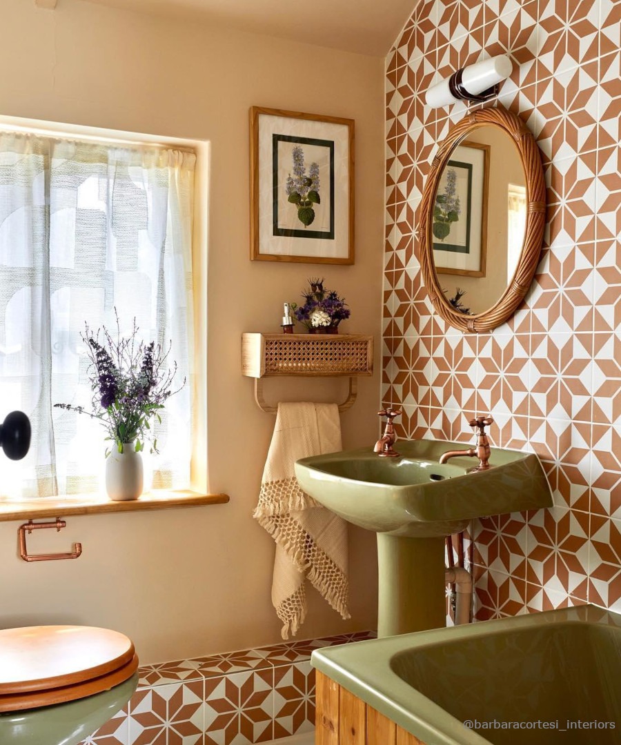
The 1970s brought colour firmly back into British interiors, but this time in deeper, warmer and earthier tones. If there is one decade that immediately conjures a particular tile palette, it is the 1970s: avocado green, harvest gold, warm brown, cream, rust and terracotta.
Bathrooms and kitchens refurbished at this time were often surprisingly colourful, with tiles, sanitaryware and accessories working together in a single tonal scheme. Avocado green became particularly iconic, while mustard yellow and harvest gold provided a warmer alternative. Brown and cream offered grounding neutrals, often combined with timber, cork and other natural materials.
Pattern was just as important as colour. Repeating geometric and floral designs appeared on walls and floors, creating interiors that were layered, expressive and distinctly less restrained than those of the previous decade.
The palette was international, too. Avocado green became one of the defining colours of 1970s American kitchens, appearing on everything from cookers and refrigerators to smaller appliances and cookware. Its popularity lingered into the early 1980s; even Mary Beth Lacey of Cagney & Lacey dreams of a new side-by-side refrigerator “in California avocado”, complete with an automatic icemaker.
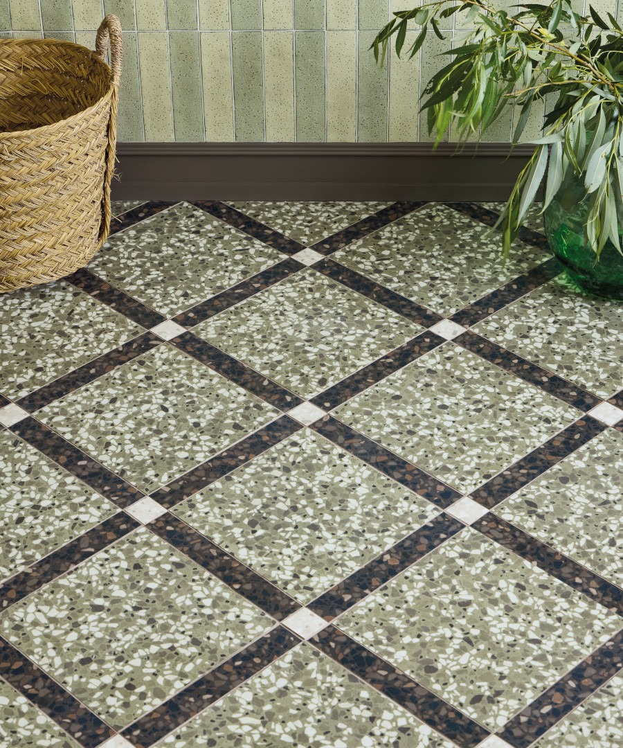
Today, the trick is to take inspiration rather than recreate the decade literally. A muted olive or avocado-inspired tile can look sophisticated with warm cream paint, while terracotta and rich brown introduce the earthy character of the period without overwhelming a room.
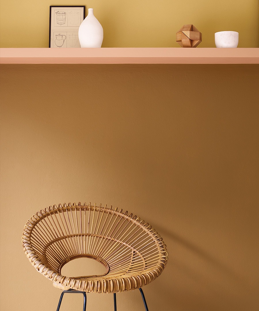
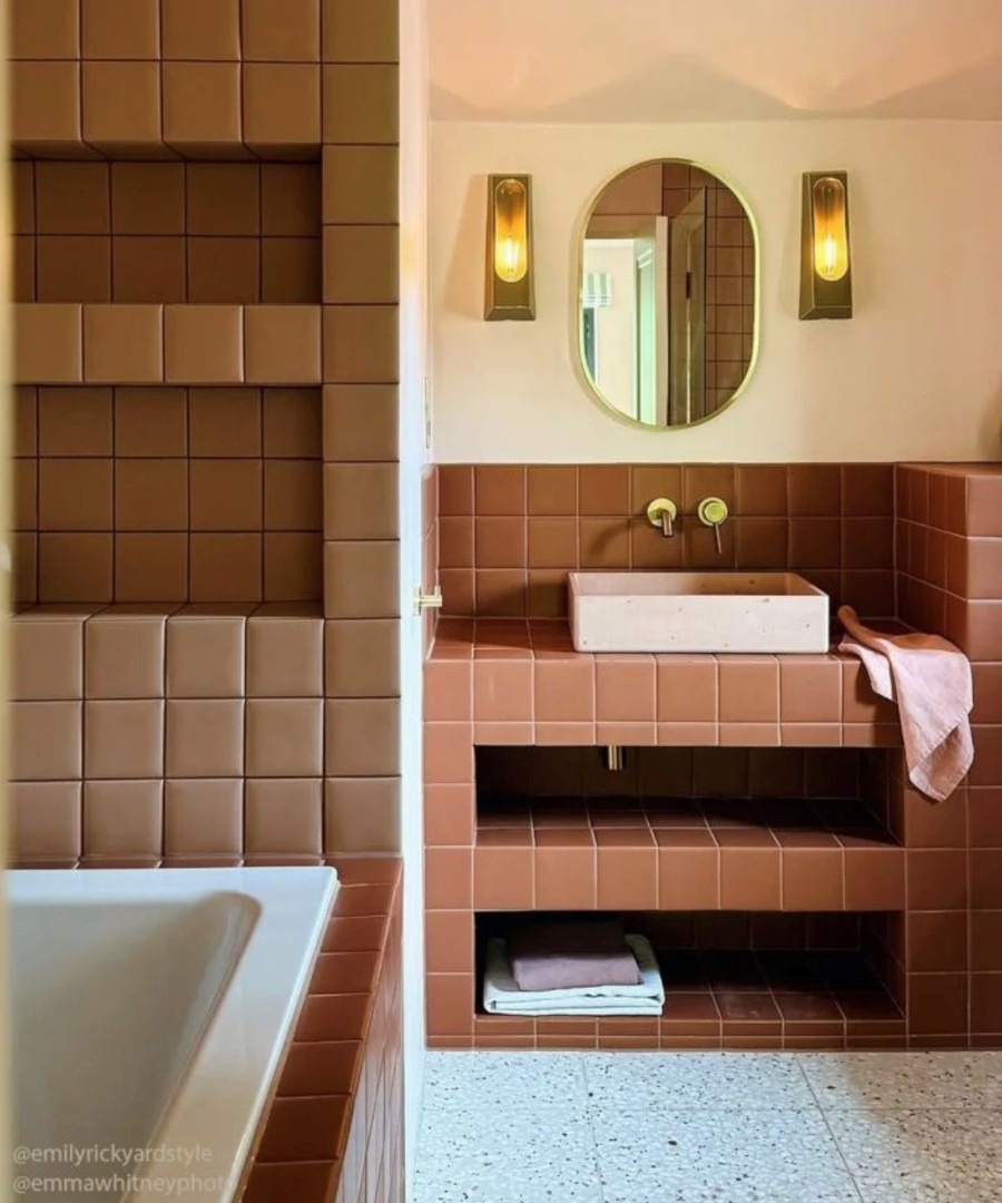
Get the look: The decorative tiling seen here, part of our Discotheque patterned porcelain wall and floor tile series, is a good example of how avocado tones can be introduced to schemes without being too dominant. Or try the Vintage Vibes in Mocha, designed specifically with retro aesthetics in mind. It is brilliant used solo or laid out as a chequerboard pattern with a cream variant and is great for walls or floors. For paint look at 1974 or Sweeney Brown for classic mellow colours from the era.
The 1980s
Peach, Pink, Blue and Teal
The 1980s softened some of the earthier colours of the previous decade and embraced a lighter, more decorative palette. In British homes, pastel shades became a familiar sight, particularly in bathrooms and kitchens: pale blue, soft grey, blush pink, peach, aqua and soft teal created rooms that felt cheerful, polished and slightly glamorous.
The decade wasn't afraid of colour coordination. Walls, tiles, sanitaryware and accessories could all be chosen from the same carefully matched palette. Glossy finishes, mirrors, glass and brass details added another layer of decoration, reflecting the 1980s fascination with glamour and shine.
Pastel blue and pink were particularly evocative, while peach and apricot brought warmth. Teal provided a stronger contrast and worked beautifully against pale blues and creams.
American design certainly influenced the decade with tv shows like Moonlighting and Miami Vice showcasing strong 80’s aesthetics, but British interiors developed their own distinctive interpretation, from colourful bathrooms to the increasingly confident use of decorative paint.
The modern revival of 1980s style is less about reproducing the whole look and more about rediscovering its colours. A powder-blue tile with a tonal wall colour can feel wonderfully calm, while a peach or blush tile can add warmth to a bathroom. For something more dramatic, use teal as an accent against softer shades.
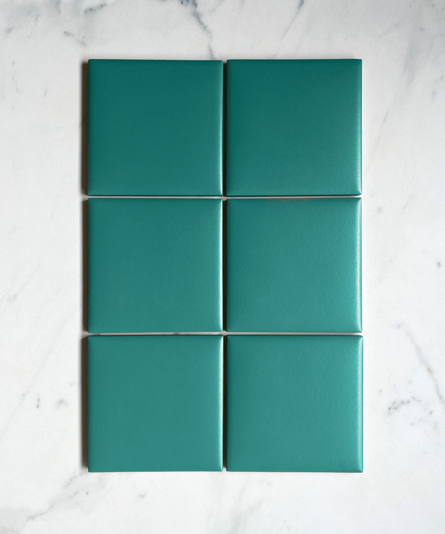
Get the look: Combine Fogg grey paint with Powerpuff for a pastel pairing on walls or furniture or Kromatic Peacock for a teal wall or floor tile in kitchens and bathrooms paired with Discotheque Alphaville for a decorative twinning in pastel tones.
Kromatic Peacock with Discotheque Alphaville patterned tiles make a great 1980s pair.
The 1990s
Terracotta, Beige and a New Confidence with Colour
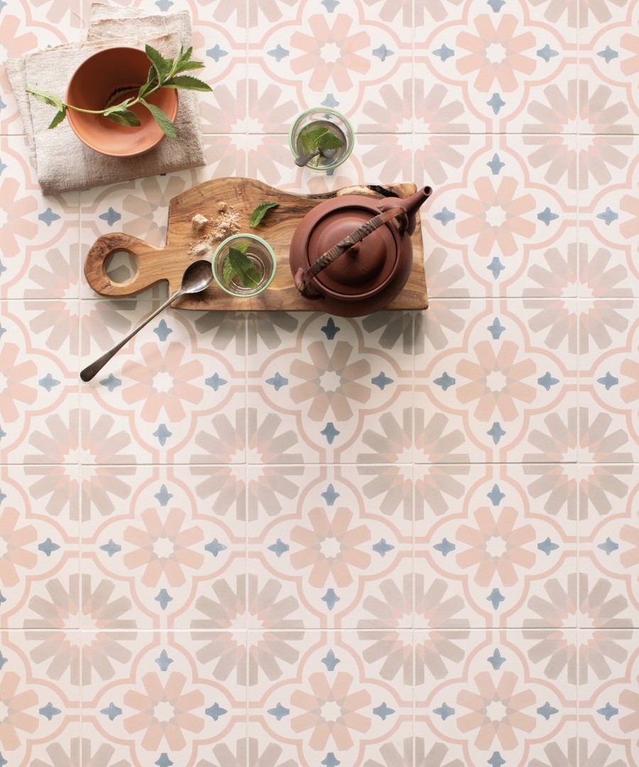
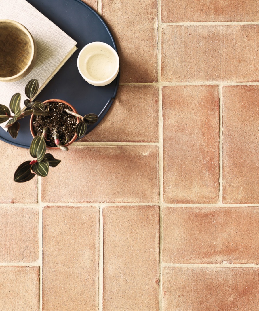
The early 1990s brought a noticeable reaction against the decorative excess of the previous decade. British interiors became relaxed and informal, with terracotta, beige, cream and warm stone shades creating the much-loved Mediterranean look.
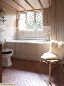
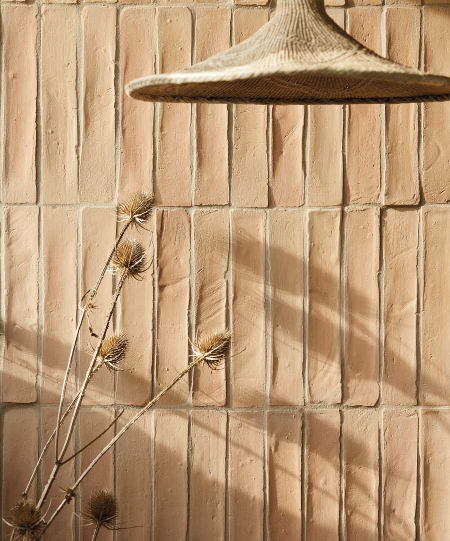
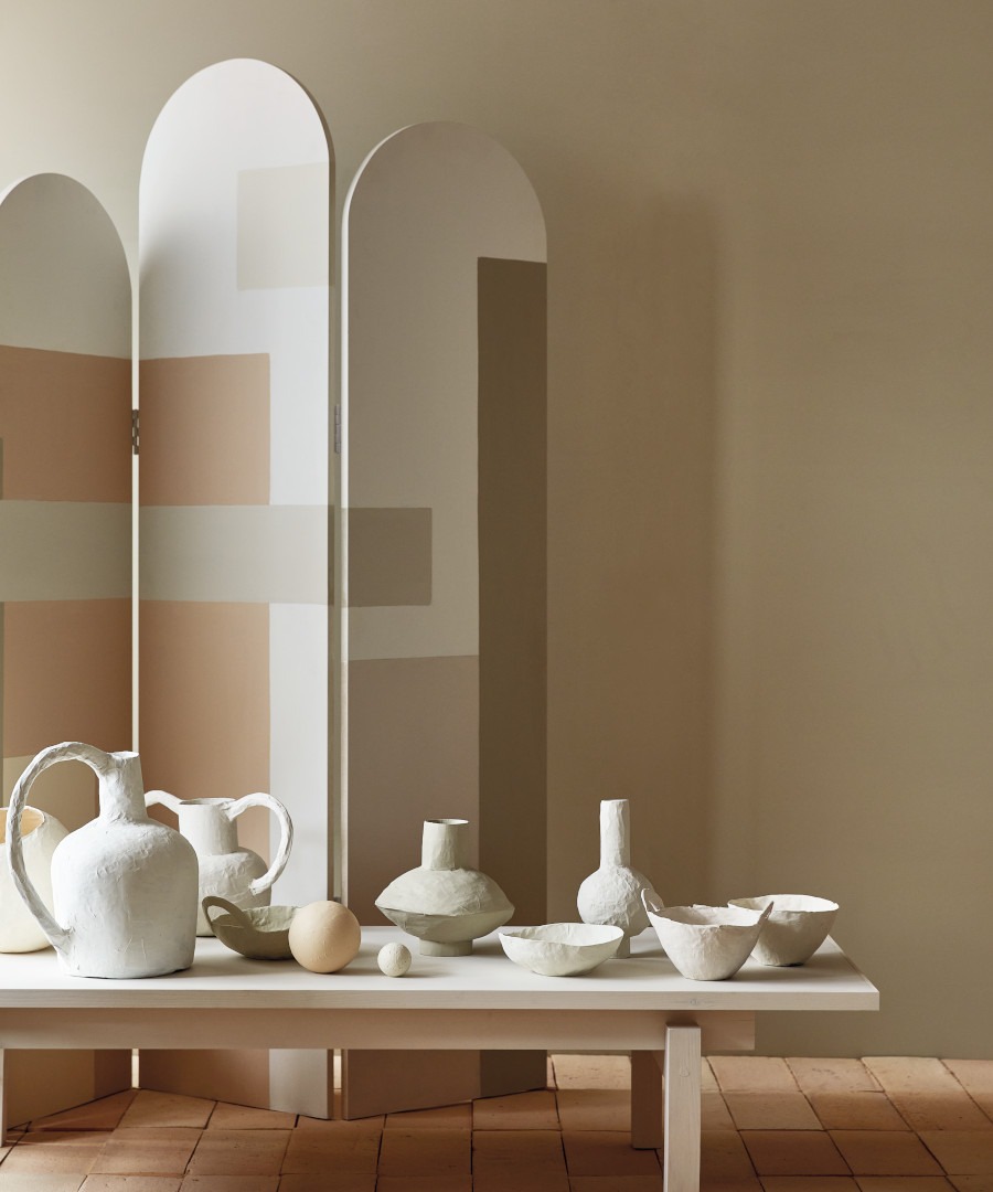
Terracotta floor tiles were particularly popular in kitchens, hallways and conservatories, often combined with cream walls, rustic timber and painted furniture. Beige and natural stone tones created an easy, neutral backdrop, reflecting the decade's growing interest in relaxed, comfortable interiors.
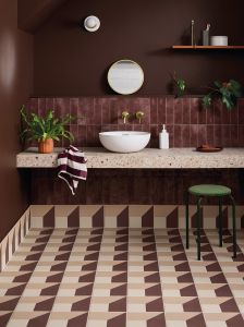
But by the second half of the decade, colour was becoming much bolder. British decorating culture became increasingly adventurous, and television played a major role. Changing Rooms, which launched in 1996, famously encouraged homeowners to embrace dramatic paint colours and unexpected combinations. Deep reds, rich burgundy, teal blue and jewel-like shades began appearing alongside more familiar neutrals.
That contrast makes the 1990s particularly interesting today. You can take the softer route with terracotta, cream and beige, or embrace the decade's later confidence with a deep red or striking cobalt.
Either way, the palette works beautifully with today's more refined tiles. The result can feel nostalgic without looking dated — particularly when bold colour is balanced with natural stone, simple ceramics or contemporary porcelain.
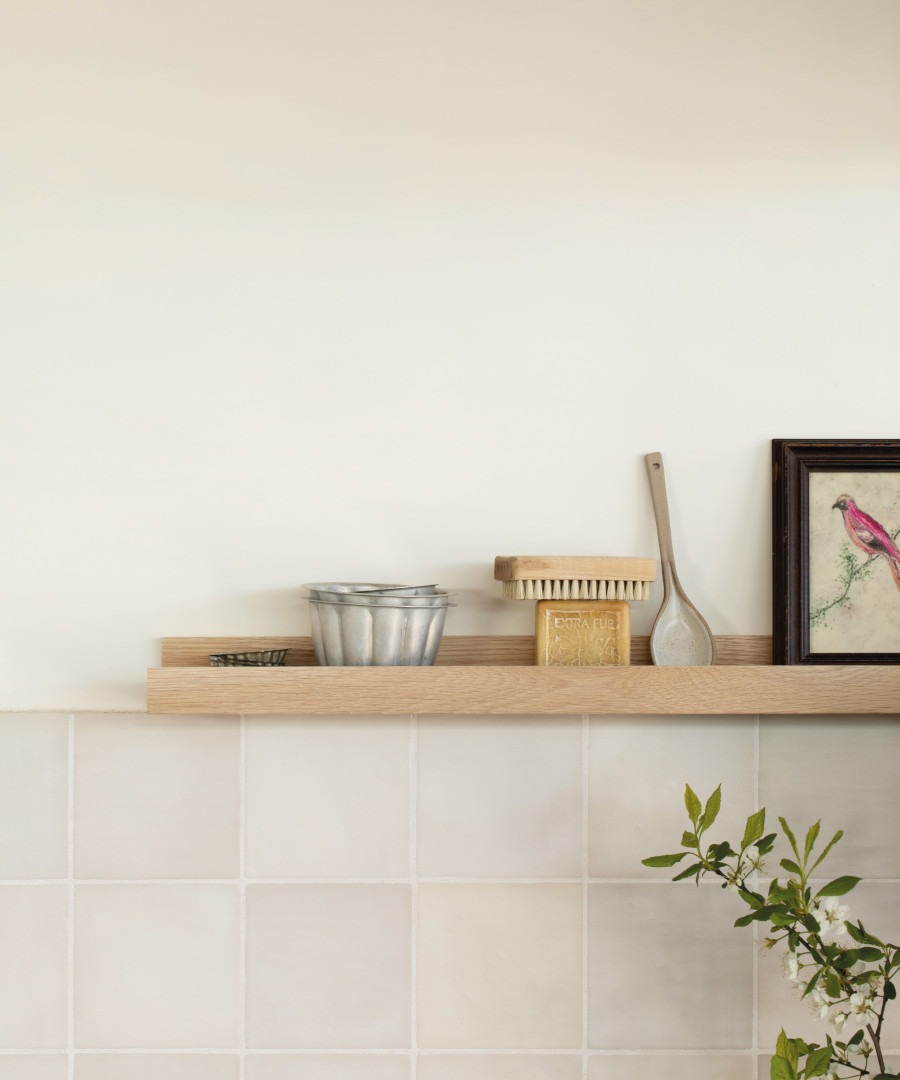
Get the look: our Handmade or Villa Terracotta collections work brilliantly for creating a warm and tactile feel for floor or wall, and when paired with soft neutral tones in paint like Plaster Cast or Seashore, form rooms with just the right 90’s mix of comfort with style.
The 2000s
Glass Mosaics and Shimmering Colour
By the early 2000s, interiors were becoming brighter, cleaner and more polished. The rustic warmth of the early 1990s had evolved into a more contemporary aesthetic, with bathrooms increasingly influenced by the idea of the home spa.
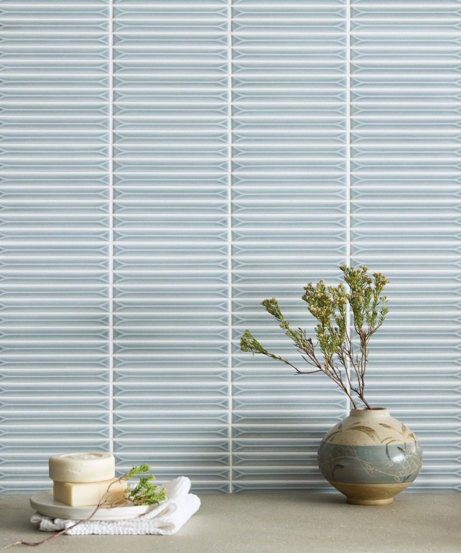
Glass mosaics became one of the defining tile looks of the period. Small-format tiles introduced colour, shine and movement, catching the light across shower walls, splashbacks and decorative borders. Aqua, turquoise, blue and green were especially popular, while iridescent finishes added another layer of shimmer.
The appeal of glass was partly practical, but its visual qualities were just as important. Against larger-format floor and wall tiles, a mosaic created a change in scale and texture, while its reflective surface could make smaller rooms feel brighter.
The look was often quite polished: glass mosaics were paired with chrome fittings, sleek sanitaryware and increasingly minimalist furniture. It marked a significant shift away from the rustic, heavily patterned interiors of previous decades.
Today, the glass mosaic is still an easy way to introduce colour and texture. Used selectively inside a shower, behind a basin or as a decorative detail, it can add a subtle reference to the early 2000s without feeling overly nostalgic.
Get the look: Try our Kitami glazed mosaic in the Saroma colourway for a similar feel, or paints in Somerset Stone or Safari Jacket for a neutral feel so reminiscent of a time when eastern simplicity was seeping into design.
Kitami kit-kat mosaics in Saroma, and Safari Jacket paint reflect the trend for eastern simplicity in the 2000s.
From Retro to Reimagined
Looking back at six decades of tile design reveals just how cyclical interiors can be. Pastel pinks, jade greens, geometric patterns, avocado, terracotta, cobalt and glass mosaics have all had their moment — and many are finding their way back into modern homes and more commerical projects like hotels and bars.
The key difference today is that we don't need to recreate an entire decade. Instead, we can borrow the colours, patterns and materials that made each era distinctive and reinterpret them for the way we live now.
From a single geometric floor to a jade-green splashback or a shimmering glazed mosaic, sometimes one well-chosen tile is all it takes to give a room a sense of history and personality.